Blog Archives
Board Game Review: Bruges

Bruges at Christmas time. Image via short-breaks.com
Bruges is a city located in northwest Belgium. It is also a game by famed designer Stefan Feld. And today I am reviewing it for you.
Disclaimer: I have only played Bruges twice, but I review games after one or two plays because I usually won’t give them another shot if I don’t like it after two plays.
Bruges: Is this another Feldian Point Salad?

Bored Europeans on the cover of another Euro game.
In the game Bruges players will try to win by garnering the most points. Players will attempt to earn points from buildings, people, canals, and reputation.
But the unique part of the play in Bruges is that cards serve multiple purposes. The colors of the cards matter (there are five colors). Each card can allow you to do one of the following things:
- obtain workers of that color
- obtain guilders equal to the pips on the die of that color
- discard a threat marker of that color
- build a house
- build a canal section of that color
- add a person to an existing house
The game is played until one of the two card decks runs out. Each round players will draw to a hand limit of 5 cards. Then they will play four turns each where they are choosing from the actions above.
There are many choices to make during a game of Bruges. From choosing which deck to draw your cards, to deciding whether to go for canals or houses and people. The decision space in this game is immense and yet it is limited. How can I make such a statement? The reason I make that proclamation is that with the 5 cards you have in your hand each turn, each card presents 6 options. So there are 30 things to decide from in each round. That’s a lot. But on the other hand, you will likely not actually be choosing from those 30 things. You will likely be choosing from a subset of those options based on the gameplan you have. So while there are plenty of decisions you could make, you are probably going to choose from a few of the options available to you. Also, the threats in the game can steer some of your decisions, which can be frustrating and relieving at the same time.
Here’s a look at the game (Image from BGG User henk.rollerman):

Bruges plays 2 to 4 players in about an hour. It has a bit of a learning curve, but I think it fits the Feldian mold nicely.
Here’s What I Like:
OPTIONS: I love options and a large decision space in games. I don’t love when decisions are made for me. Bruges allows me to have the liberty to play just about however I want. I can play as dumb as an ox or as brilliantly as a fox. Feld has made an open decision space where players have full control of their gameplay.
MULTIPLE-USE CARDS: I like when a designer or publishing company can provide multiple ways for components to be used. As I mentioned above, each card can be used to do any of those 6 options. That’s pretty cool.
Here’s What I Dislike:
STRUGGLE FOR SUCCESS: Though you get four turns in a round to do stuff it usually feels like only two of those turns move you forward. Often you are using turns to discard a threat or to take two workers. These don’t feel like fulfilling actions in the game. And that can be frustrating.
STRUGGLE FOR MAJORITIES: There are 12 points available if you can gain the majority in the categories of people, canals, or reputation. That’s a pretty cool thing. What’s not cool is that it can be very difficult to gain the majority from someone who already has it. That can be frustrating. While emotion in games is a good thing, negative emotions should be limited. Struggling for the majorities invokes negative emotions.
Designer Perspective – What I would change:
I think I would try to drop some of the frustration and increase the positive emotions in the game. Feld is a designer who loves resource limitation as a form of tension in games. One way that I would change Bruges is to allow for more success and turn the game into a more rewarding experience. A simple way to do that is to change the “take 2 workers of the card color” option to this:
- Take any two workers OR take 3 workers of the card color
This change alone would open the game up quite a bit, make it less frustrating, and allow players to do more while not changing the overall feel of the theme of the game. I think I’m going to try this as a house rule next time I play!
Beer Pairing:

A fine Belgian brew!
Being that the game is based on a Belgian city I have not choice but to pair it with a Belgian beer. And since I like the game quite a bit I’ll pair it with a Belgian beer that I like quite a bit. That beer is Duvel.
Duvel is a full bodied lager that is refermented in the bottle. It is hopped with Saaz-Saaz and Styrian-Golding hops. It weighs in at 8.5% abv, so don’t drink too much at a time.
The next time I play I’ll try to make sure I enjoy the game with a bottle of Duvel!
Overall Rating:
I am a fan of Feld’s games. My favorite is The Castles of Burgundy. Bruges offers some pretty interesting gameplay, but some elements seem more mechanical rather than thematic.
On the whole, this is definitely not the typical point salad that some other games can be. This game requires some work to put together a good number of points. In typical point salad games, everything you do gets you points. That’s not the case with Bruges, and I count that as one of the game’s strengths.
This is a game I can see myself playing multiple more times. I’ll rate Bruges a 7 out of 10 on the BGG scale.

Good game, usually willing to play.

Monday Brews 1-13-14
Welcome back to Boards and Barley! I’m so glad you’re here. Every Monday I write an article that let’s you know what beer and board games I enjoyed over the last week. I also give a little insight into my design ventures of the past week. It was another slow week in terms of beer and games, but the game design portion of my life picked up a bit.
Let’s start with the Barley…
The Barley:

That’s a chair I could sit in!
Gray’s Busted Knuckle Irish Ale: I enjoyed this Wisconsin brew while my brother visited. We got some amazing fried cheese curds and a beer. This was an enjoyable Irish ale that I would get again.
Fleming’s Scotch Ale: I had another of my homebrews. I think it is now stronger than the original 6.6%abv. I might have to measure that again. This one really packs a punch.
New Glarus Spotted Cow: Another Wisconsin beer was enjoyed while a friend was over. We watched some football and enjoyed a beer and some ranch pretzels. That makes for a pretty good evening.
Deschutes Red Chair Northwest Pale Ale: I am not an IPA or Pale Ale guy in general. I don’t care that much for hoppy beers. But this one was quite good. It wasn’t too hoppy overall and it had a hint of a sweet finish with a mild floral aroma. I would drink this again and I think it could be my gateway to IPAs.
Capital Winter Skal: I enjoyed this while playing Nothing Personal. This is a mighty fine brew from a local brewery.
The Boards:
Nothing Personal: My friends played this at GenCon while I was on a panel about Protospiel. They have played it several times since then. I finally got to play it last night. And it was awesome! Nothing Personal has an amazing level of back-stabbing, promise-breaking, deal-making interaction that I haven’t seen in any other game. There is a lot to keep track of in this game and it would be easy to make mistakes and get left behind. I’m glad I finally had the opportunity to play it because it was a lot of fun.
Tenzi: I got my friends to try this out last night. Each player has 10 dice. You roll them and try to get all of your dice to be the same number. The first player to get all of theirs the same is the winner. There are a bunch of variants in the rules that you can try out. But this was a thoughtful Christmas gift from my mom because she knew I wanted dice for game design purposes and she got me dice that are also a game. Thanks mom!
Designer’s Corner:
This prototype box will suffice for now.
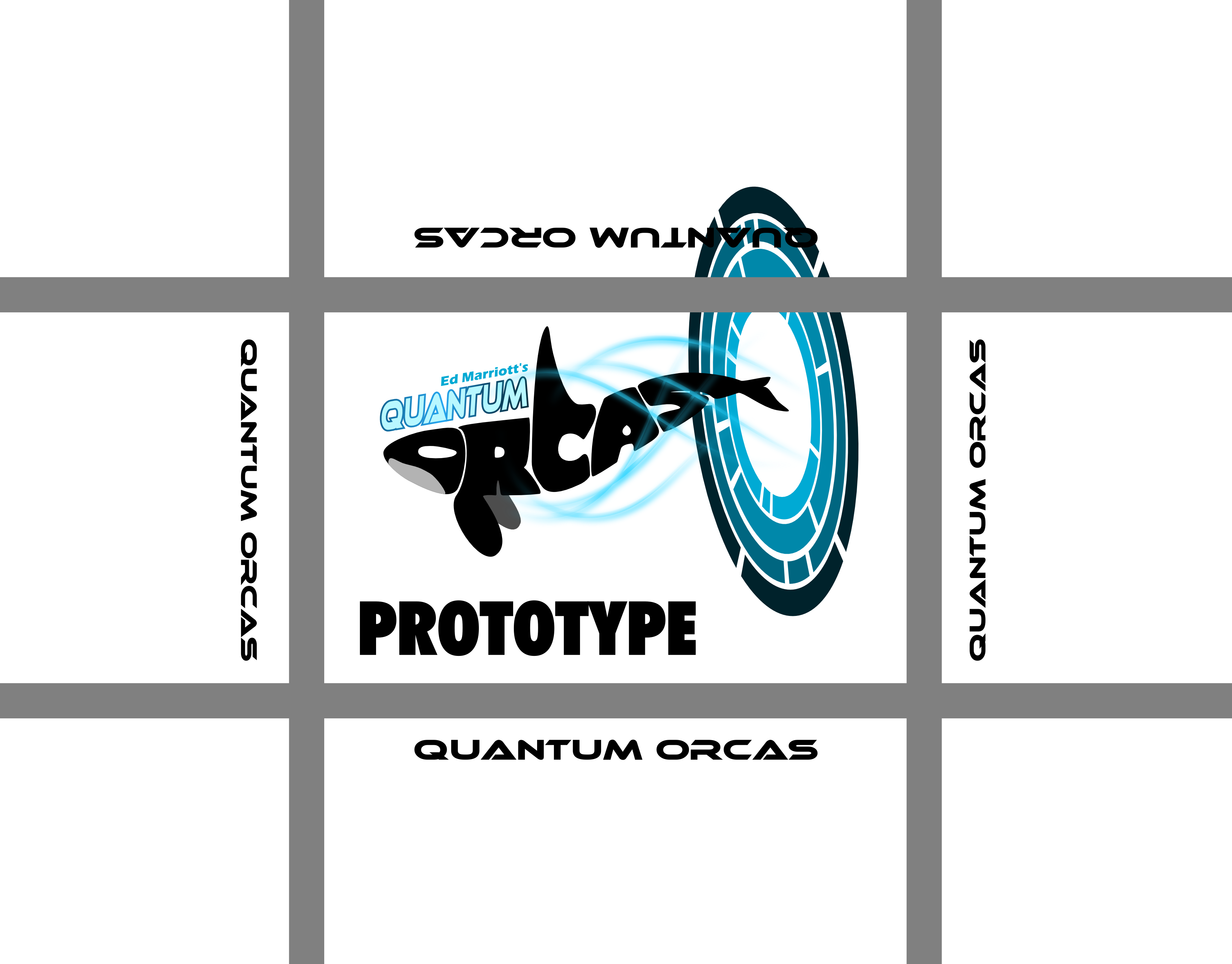
Last week I worked a little bit on Quantum Orcas. I want to put together a version that I can purchase from The Game Crafter. It is amazing how much artwork really goes into a game. Not only do you need art for the cards, chits, tiles, etc. You also need artwork for the box and the rulebook. Then if you want to have a nice sales page on TGC you need artwork for that page. There is a lot of behinds the scenes artwork that is needed to complete a game.
So last week I put together a bunch of art and Quantum Orcas is getting closer. I still need to do more playtesting to make the game go from playable and “not bad” to something that is enjoyable that people will want to play. I’ll keep you posted.
The other progress I made last week was to come up with new mechanics for Brooklyn Bridge. I have shared the concept of the mechanics with several friends and none of them said it sounded awful. So I might have something there! I am pretty excited about the new utilization of workers. Brooklyn Bridge is a worker placement game, but it uses workers in ways I have not seen before. So I’ll plow forward with this to make it playable in the near future. My goal is to have tested it several times before Protospiel-Milwaukee in March.
***
So that’s the Boards & Barley I enjoyed and the game design progress I made last week. How was your week?
Flavor Text: What’s the Verdict?

Flavor text on this card: “Ribbit”
Yesterday I solicited opinions on Twitter regarding flavor text:
I was interested in finding a consensus on whether or not it is worth the time to add flavor text to cards, or game components in general. I was pleased with the number and variety of responses the tweet received.
For those who do not know what flavor text is, here is a definition from Wikipedia:
Flavor text is the name given to text for action figure character backgrounds, playing cards, or within the pages of a role-playing game’s rulebook. While appropriate to the product’s or game’s story concept, it usually has no effect on the mechanics of the game, but instead serves to add realism or characterization to the item in question. Flavor text is often the last text on a card or on the rear of a toy card or package, and is usually printed in italics or written between quotes to distinguish it from game-affecting text.
Flavor text is used to full effect in Magic: The Gathering. Here is a page from Wizards of the Coast listing some favorite flavor text additions to cards (Thanks to Matt Loomis for the link). While the flavor text in the M:tG cards is typically used to describe the character on the card, I think there are other ways of utilizing flavor text. But before I get to that, let’s take a look at a few of the responses I received from my tweet…
All Those in Favor:
Adam Buckingham: “It’s fun, but I tend to ignore it mostly.”
Seth Jaffee: “I like flavor text, gives me something to read while waiting for others to go. But don’t bury game text in flavor text!”
Isaac Shalev: “I love it when it’s good. MTG is the best-in-show at it. Evocative, haunting, immersive.”
Thomas Eliot: “Enjoyable! I love the flavor text on Professor Pugnacious: it’s all thematically appropriate quotes”
Stephanie Straw: “Noooooo! I *love* flavor text! But if you do it, don’t just toss it on there. Make it LEGIBLE and allow it to add value.”
David Chott: “Thanks for reporting back! I like flavor text, but have been leaning against using it in Lagoon to reduce cognitive clutter.”
All Those Not in Favor:
I was surprised at how few negative responses there were. I thought more people would hate it and wish it didn’t clutter things up.
Alex Strang: “Usually distracting IMHO”
Grant Rodiek: “I’m generally against it mostly because most people are bad at writing. Being creative does not mean good at writing.”
Check out Grant’s awesome blog post about flavor text!
All Those Who Are Indifferent:
Nolan Lichti: “When it’s tiny, like in Ascension, I don’t mind, and it can be enjoyable. Just don’t sacrifice clarity of game play for it.”
Matthew Riddle: “I ignore it but it doesn’t bother me.”
Danny Devine: “I also always ignore it, but as long as its clear that its flavor text “italicized and tiny” I don’t mind it.”
Jason Smith: “rarely look at it except when I’m bored from waiting on other players to take their turn”
Chris (@copax): “I rarely look at it to be honest. I’d prefer larger iconography or more detailed “power” descriptions”
Chris Darden: “ignored”
64oz Games (Richard): “I think it depends a lot on the game. On a Euro style game I expect it to be ignored, but a more thematic one it could be read”
Rob Lundy: ignored… “Unless it’s funny…. like…. very funny”
Brian Henk: “I believe it can add some fun to the experience, but it’s not worth the complexity of more words on the cards.”
My Verdict: I Favor Flavor!
Based on the feedback I think flavor text can be used on game components, but that it should be done in subtle, non-distracting ways.
The M:tG cards include flavor text to immerse you more into the world of the game. That works really well. It is there for those who want to read it, and others can ignore it. And it occupies a portion of the card that would likely otherwise just be background art.
So I am in favor of flavor. I like it when subtle, creative, and clever information can be added to a game that further immerses you into the world of the game under the following conditions:
- It doesn’t distract.
- It doesn’t take long to read – keep it short!
- It adds to the game’s experience.
Thanks to everyone who responded to my tweet. I am planning on using flavor text for Quantum Orcas, but only on the backs of cards that do not flip during the game. Since I have the backs of those cards available I could easily slap on the logo or some artwork. But I decided that I would prefer some flavor text instead.
The bottom line for Quantum Orcas is that people can completely ignore it. And that won’t bother me at all.
Monday Brews 1-6-14
It is -16 degrees out (as of 7am) and I’m happy that I don’t work outside. I think I’d rather have a foot of snow than -16 degrees. Never the less, today is Monday, so I am reporting on the Boards & Barley that I enjoyed last week, which sadly were few.
The Barley:
Redhook Game Changer: I had the privilege of a private tour (my wife and I were the only guests on the normal tour, so I can refer to it as a private tour) at Redhook in 2010. It is a really awesome brewery in the wine country region northeast of Seattle. They also have a restaurant, which was greatly enjoyable. At the time they did not offer The Game Changer. But I am glad to have tried it. It is a “sessionable” ale according to the website, with 25 IBUs and 4.6% abv. I’d get it again if it happens to be present.
New Glarus Cabin Fever Honey Bock: For a New Year’s party we were hosting I chose to purchase an assortment of local New Glarus beer. This Honey Bock may be one of my favorite beers. It is very clean and has an excellent taste. The honey presence is very mild, but adds significantly to the beer. I wish this were offered year round, though it is probably good that it isn’t.
New Glarus Snowshoe: The other seasonal New Glarus brew I purchased is the Snowshoe Ale. It is an Irish Amber and is deeper in color than the Honey Bock. It is also a very enjoyable brew. New Glarus’ two winter seasonals are outstanding!
The Boards:
Kingdom Builder: We played this on New Year’s Eve with 8 people. And it was pretty awesome. We played with teams where you would site opposite your teammate and you would both play at the same time. We also expanded the board to have 8 sectors instead of 4. I got some cubes from my design supply for the extra players. Overall it worked pretty well with 8. Since the scoring conditions are public knowledge there isn’t a huge disadvantage to any player in the game. And, as with all games of Kingdom Builder, it does sort of come down to the terrain cards that you get.
Balderdash: With the right group Balderdash can be really fun. We had the right group on New Year’s Eve. Unfortunately I am terribly bad at being the reader. I laugh way too hard and people can tell that when I’m laughing it’s not the right answer. But overall, this game can be a lot of fun.
Designer’s Corner:
It was a pretty low key week for me overall. On the design front I came up with two new ideas, neither of which I really want to pursue. One was about a game themed around the White Pass & Yukon Route but focused on how many horses you can keep alive. The other was about the Phoenix and the game would revolve around the idea of the Phoenix dying several times in the game and being reborn, which would change what you can do in the game. So you would have to maximize what you accomplished right before the Phoenix died.
While I think those are both awesome game design concepts, you will recall my article last week about my goals for the year. I’ve already got 6 games that I want to “finish” in 2014. If I start to take on new game concepts then I’m afraid I wouldn’t end up completing any of them.
This week I plan to incorporate some bonuses to Quantum Orcas that will help incentivize players to visit the wormhole locations. If that works well enough, then it will be time for 20 playtests. After 20 playtests, if the game works and is enjoyed by players, then I’ll put together the artwork and post it to The Game Crafter. That is my path forward with Quantum Orcas.
Also this week I plan on moving ahead with a full Trading Post redesign. A while ago I tweeted an image for the redesign:
What I want to accomplish is to make the game centralized on the concept of obtaining goods and trading them. So i now have different areas of the board where your workers can go to obtain different types of goods. They then bring them back to the trading post and trade them for points/abilities/bonuses. Also, the trading portion of the game is now extended to player-to-player trading, which is something that should have been in the design from the beginning. So I’ll sit down and work on the overhaul of Trading Post and see if I can turn it into something fun and awesome!
***
So that’s what I’ve been up to. Did you enjoy any Boards or Barley last week?
Monday Brews 12-30-13
Welcome to the final Monday Brews of the year! Oh what a year it’s been. Last year this blog didn’t even exist. And now I have tens of readers a day. The three of you who keep refreshing the page are awesome!
But seriously, this blog has been a lot of fun to write and I sincerely thank you for taking the time to read it. I only hope that you’ve learned something about board games and beer. I’ll have a “2014 Goals” article later this week which will cover my big plans for 2014. But today is Monday, so let’s see what Boards and Barley I enjoyed in the past two weeks (I was traveling last Monday):
The Barley:

Have you ever had a smoked beer?
Alaskan Smoked Porter: I enjoyed this beer and the Paulaner while listening to bluegrass at an awesome local establishment. I think a full glass of a smoked beer is about twice as much smoked beer as I can handle. It was a pretty solid smoked beer, though.
Paulaner Salvator: I used to think I liked this beer, but I didn’t care for it during the bluegrass. I’m wondering, now, if the smoked beer beforehand wrecked my palate.
New Glarus Fat Squirrel: A local brew that was brought to a game night, this brown ale is an excellent cold weather beer.
Gray’s Bully Porter: Didn’t I mention a few weeks ago that I thought I was all Portered out? Oh well. This was also available at game night so I gave it a try. It was pretty good.
Central Waters Mudpuppy Porter: I love the name Mudpuppy. And the beer was pretty good, like the Gray’s. Unfortunately all these porters I enjoyed are all blending together and I can’t quite recall if one was better than the others.
Leinenkugel’s Snowdrift Vanilla Porter: Well, this one stands out from the other porters since it has the vanilla flavor. It also has a nice crispness to it. Or perhaps it stood out in my memory because I enjoyed it with my in-laws during our Christmas morning. Newton’s Oatmeal Stout: This homebrew of mine will sustain me over the winter. (4.2% abv)

I love the bottle label!
Fleming’s Scotch Ale: This homebrew of mine will make me tipsy over the winter. (6.6% abv)
Sierra Nevada Celebration: They love a good IPA or Pale Ale over at Sierra Nevada Brewery. But this IPA isn’t so IPA-ish. It doesn’t seem as hoppy as some of those hop-forward breweries who push the limits of the IBUs in their beer. I think I liked it, but I’m not sure I would drink it again.
Monk’s Stout DuPont: The typography on the bottle is awesome! The beer inside in interesting. Made in Blegium at Brasserie DuPont, this is the first beer I’ve had from the brewery. I think I need to try it again before I really form an opinion, but I think I liked it.
The Boards:

Too awesome to NOT make a game about them!
Sequoia Grove: This was supposed to be an entry into the Dice Hate Me 54 Card Challenge. The premise is that you are a researcher of trees, otherwise known as a Dendrologist. Your goal in the game it to grow the largest, widest sequoia tree possible. You can add height and girth to the tree during the game. My entry worked and was playable, but wasn’t up to the high quality expected in the Dice Hate Me line of games.
Backyard Astronaut: This is my friend Adam’s entry into the 54 card challenge and it IS up to the high quality of the Dice Hate Me line of games. It is a fantastic game and I believe it has a real shot in the contest. Nicely done A-Game!
Viticulture: Other than some cards being more valuable than others I think this is a pretty enjoyable worker placement game. It won’t take the place of Stone Age, but this is definitely a game I’ll play again. I like how you have to “save” some workers for the winter phase of the game.
Qwirkle: This game has made many a showing in 2013 and I imagine it will be the same in 2014. It is easy to teach and understand. It plays quickly. And if you have the travel size you can take it just about anywhere!
Compounded: I’ll write more about this game in tomorrow’s article. Over Christmas I was able to teach this to a new player and she won the game. It is easy enough to understand, it has a lot of awesome interaction and the theme is great! If you haven’t played it I highly recommend picking up a copy.
Dam It! Redux: You can learn more about my beaver game on it’s page. I tried reducing the game for the Dice Hate Me 54 Card Challenge and I succeeded… sort of. I successfully reduced the game to 54 cards. The game worked and the few playtesters that I played with said it was fun. But as a designer I knew it just wasn’t quite there. So I didn’t send this in. On the upside I do think this is something that I can finalize and put for sale on The Game Crafter.
Le Havre – The Inland Port: I received this for my birthday back in August and finally got to play it. It is a very interesting game of resource management that I royally lost. I’ll probably trade this game since it doesn’t get played very often. It just seemed like it was an abstract game in the Le Havre theme.
Agricola – All Creatures Big and Small x2: This game, however, had the awesome feel of Agricola. It was tight. It was nerve wracking. It was a nice mental battle. And it has the nice elements of Agricola without the fiddly cards and the need to feed your family. I’ll be keeping this one and I hope to play it again soon.
Kingdom Builder x2: I was able to set up and play a 6 player game of Kingdom Builder. The house rule for this is to add two more kingdom boards so that it is a 2 wide by 3 high board. Since all the scoring conditions are shared there is no real disadvantage to anyone by bumping it to six players. I hope that Queen Games has a few more expansions up their sleeves for this one.

Missing 14 years worth of cards.
Ultimate Outburst: My mom got me this game for Christmas because 1) I don’t own it, and 2) it’s not like all those thinky games I have. We played it together as a family and it was actually quite fun. We played men vs women and the women won. The big downside to the game was that its from 1999 and the information on the cards reflects that.
Tenzi x20: A while back I bought Farkle Party at a thrift store but it had no dice in it. (It had jewelry). I wanted the dice for prototyping purposes. My mom bought me Tenzi because instead of just 40 dice, it is also a game. You must roll your dice so that they all come up the same value. First person to get all their dice the same wins. It was a very thoughtful gift and I am happy to have the dice for design purposes. Thanks mom!
Carcassonne – The Discovery: This is an interested take on the Carcassonne world. You only have four followers and you don’t get them back right away when something is finished. That’s because you can remove them before their thing is completed, or simply wait and never remove them. I’m not sure if I liked it so I’ll have to play it again.
Scoville: I played with my family and was able to play with “final” artwork that I had printed out. While I didn’t have all of the final artwork I had enough to realize that it’s gonna be awesome! Hopefully the art can get wrapped up so we can launch the Kickstarter campaign in January, but at this point I’m not holding my breath.
The Little Prince x2: This is one of those game I was happy to get at GenCon this year. The gameplay is awesome. However, I have no nostalgic connection with the book on which the game is based, so I would prefer a retheme. Make it about colonizing Mars or something like that.
Euphoria: The second Stonemaier Game on the list and another worker placement game. This time your workers are dice and their values matter. I’ll definitely play this again as the first play was steep with learning. Overall I thought it was fun and I think that will be the case after a second play.
Designer’s Corner:
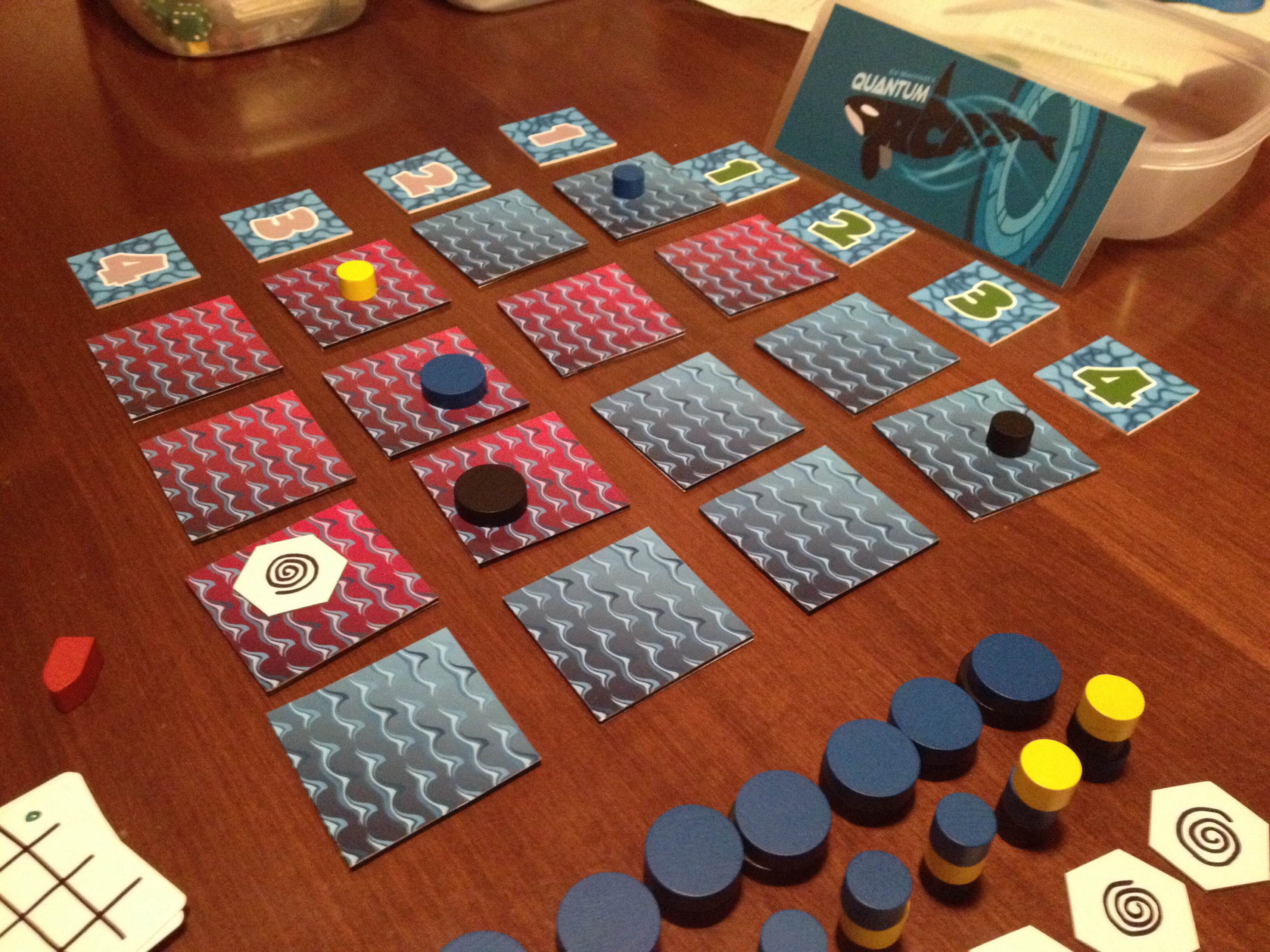
Quantum Orcas is getting there!
I have recently been making excellent strides in the design department and I owe it all to the 54 card challenge. That challenge really lit a fire under me and I tried as hard as I could to come up with something worthy of the challenge. I now have a new mechanic that I plan to utilize to the fullest in a future game design. It may or may not be awesome, but it is at least innovative.
Also I designed a card game version of Scoville that plays quickly and has the feel of Scoville. I already have it prototyped and I’ve soloed it twice. The next step is to put it in front of my friends for their analysis. I’m really excited about it.
I also worked on Quantum Orcas. It is now a better game, which wasn’t hard to achieve. I added oceanic wormholes (think of them as eddy currents) that open up the game quite a bit. I also changed things up a bit to eliminate the All-or-Nothing nature of ties. I’m hoping to submit my friends to this one as well. This is a game I would probably put up for sale on The Game Crafter, but probably not pitch to publishers. We’ll see where it goes.
And I’ve got big plans for 2014. I’ll have an article on the 1st about my Boards & Barley goals for the year, so you can look forward to that.
***
There you have it… the final Monday Brews of 2013. What Boards and Barley did you enjoy over Christmas?
