Monthly Archives: April 2013
My First Brew: Alberti Amber

Yes… Yes we do!
If you’ve been following this blog then you know I’ve purchased my first beer brewing kit. 2013 just seems like a great year to get started. I’ve wanted to brew for about 5 years now. So it’s about time I leveled up in Manliness and actually brewed.
Achievement Unlocked!
Two Saturdays ago I connected my propane tank to my turkey fryer and boiled some wort! It was an interesting learning process and I’m proud to be able to report on it today on B&B!
Pre-Brew Nerves
Some of us who run, and by “us” I mean “you,” have experienced something known as Raceday Nerves. It’s where you’re all nervous before you start a race. I’ve been there too. I ran a couple half marathons two years ago and have definitely had those butterflies. Why do I bring that up? Because for some reason I had a little pre-brew jitters. I guess it was because I was hoping to not mess up.
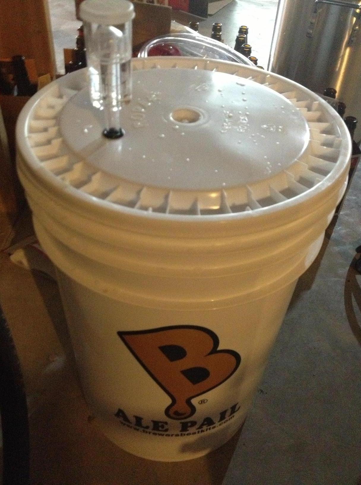
There was nothing I could do about the nerves so I just got to it. Here’s my homebrew setup:
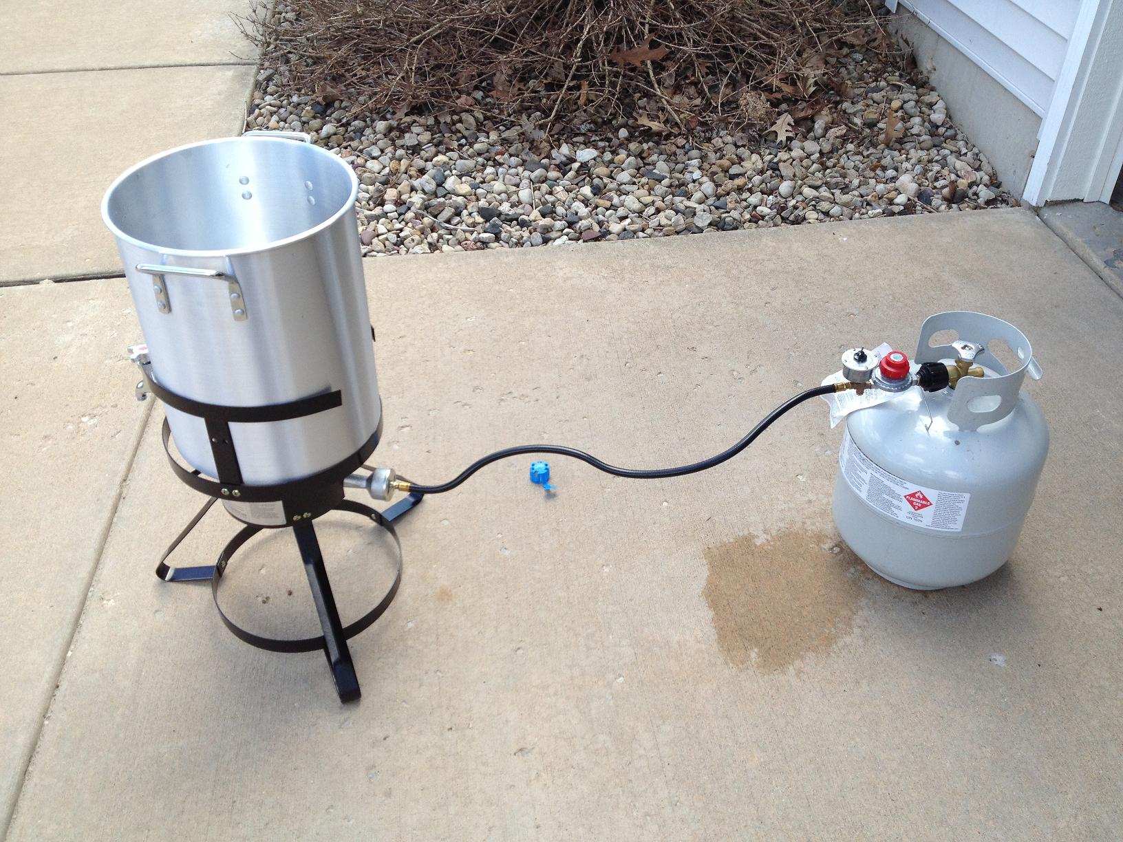
This way the stink was outside rather than inside with my wife!
It looks all shiny and new there. That lasted about 3 minutes until the flames started to cause the black paint on the turkey fryer stand to bubble, crack, and burn away! Yikes. And of course as the paint and the bolts were flaming my neighbor walked up and asked what I was up to.
Who wants to boil some Wort?
Pre-warming for precise Wort extraction!
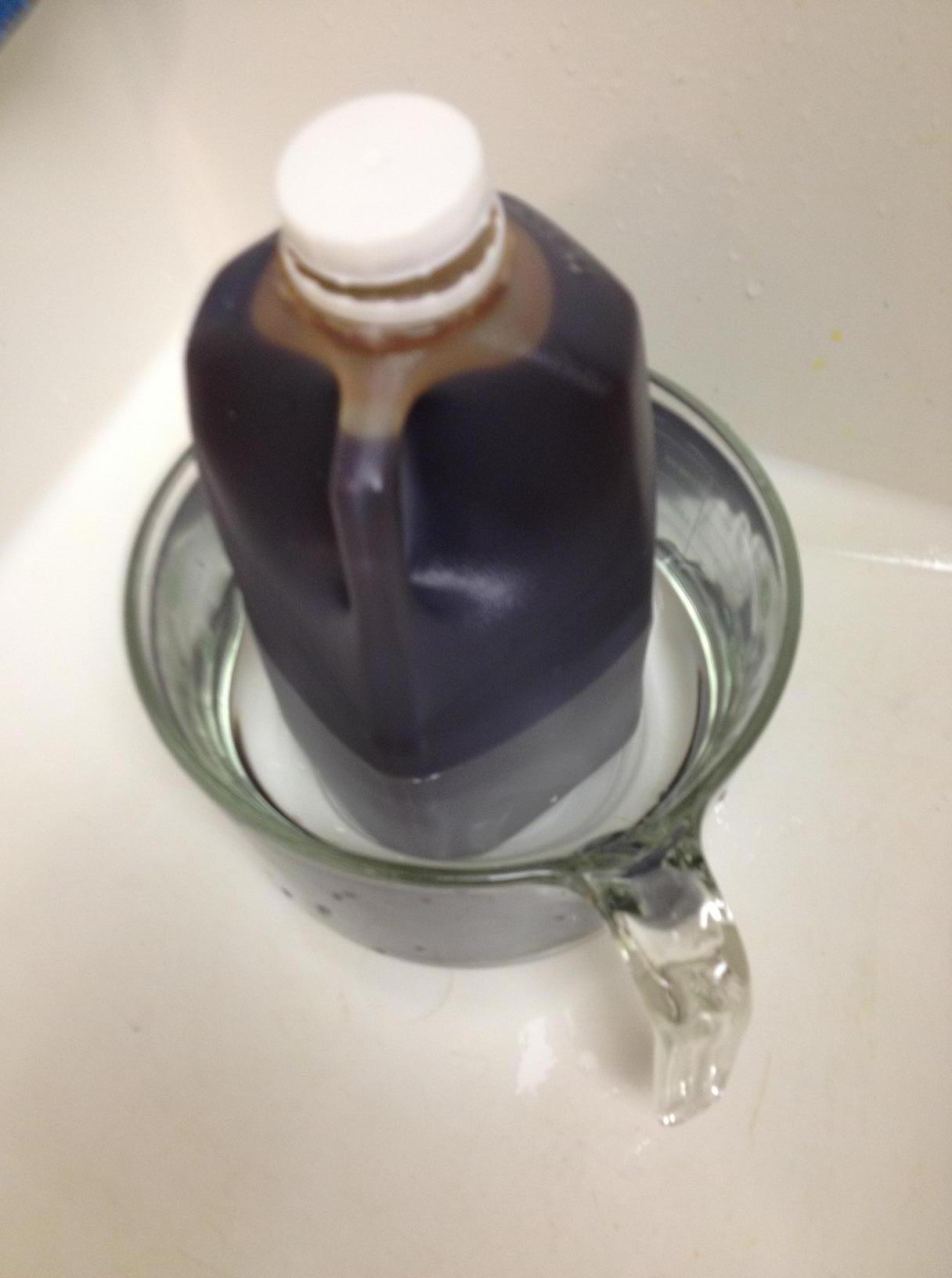
For my first brew I wanted it to be as simple as possible. That means I was brewing with a pre-made extract. This is a liquid that comes in a half gallon jar. You can see it over there →
Brewing this way is pretty “easy.” You just boil the wort for about 40 minutes, then cool it, put it in the fermenter and add the yeast.
Eventually I will get to the point where I’ll be choosing the grains and hops that I use so that I can brew actual, legit home recipes. But as a first timer I think I made a good choice.
In some ways it relates to board game design. I could have chosen to go with a complicated all-grain brew and thrown a bunch of awesome stuff in there. But it probably wouldn’t have all worked together, especially on the first try.
In board game design it seems like it would make sense to put a bunch of awesome mechanics together and expect an awesome game. But what ends up happening is you get a game where things feel non-thematic, unrelated, and almost like they’re work. *Cough* Archipelago *Cough*
So I didn’t want to put a bunch of awesome stuff together and hope for the best. I took this first batch as an opportunity to learn a little bit!
Gettin’ Hot in the Pot

Beware of the “Foam Over”
With my wort warmed up and the water boiling I was ready to begin! I was pretty nervous about this part. Reading through the directions it was pretty clear that this part could involve a “foam over,” not to be mistaken with a comb over.
Fortunately my turkey fryer is a 7.5 gallon pot and I was only boiling 2 gallons of water and the wort. There were a few times that the foam rose up near the top. If I had been boiling it on the stove it definitely would have foamed over.
By using the knob on the turkey fryer it was pretty easy to control the heat to the pot. Therefore any time I saw the foam building I was able to turn down the heat just a bit and watch the foam dwindle. I was really thankful that I paid for the turkey fryer since it gave me so much peace of mind when boiling the wort.
Here a peek into the pot:
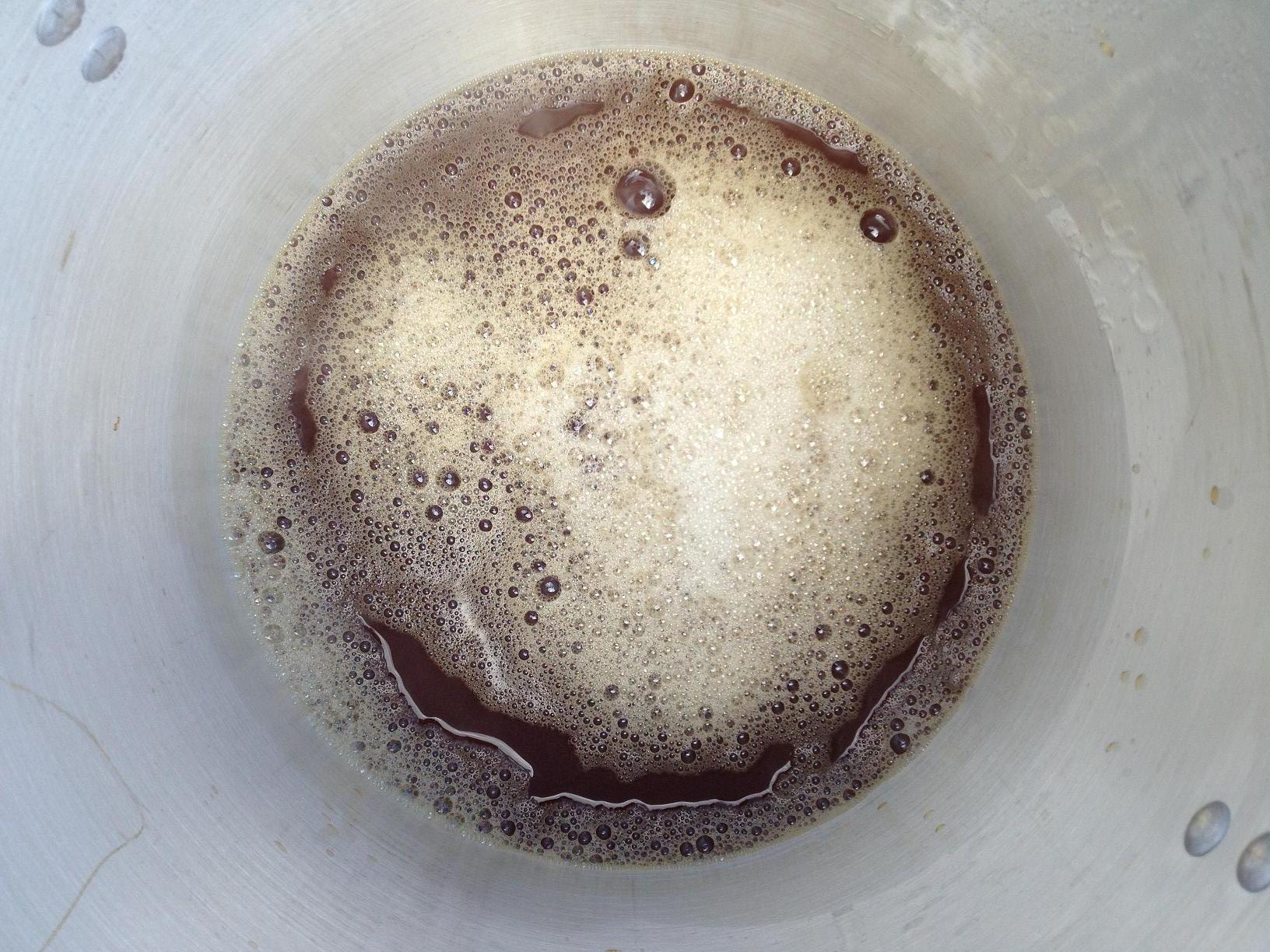
I wish I knew if this looked right!
When the wort started boiling I added the Willamette hops. After 30 minutes I added a half ounce of Kent Golding hops. And then after 8 more minutes I added another half ounce of the Kent Golding hops. And two minutes later it was done!
Am I a Brewer Yet?
Once the wort was boiled and the nervous part was over with it was time to cool the wort. I filled my utility sink full of ice water and placed the whole pot right in there on a metal trivet. With active stirring it cooled the wort pretty quickly. In a previous article I had mentioned making a wort chiller. I may still do that, but this cooled it down in about 12 minutes.
The next part was a little tricky too. It was time to transfer it over to the fermenter, which is a fancy word for plastic bucket. Without much hesitation I poured it right in. It felt really good to be done with the boiling portion of the brewing process.
Here’s what I left behind in the pot:
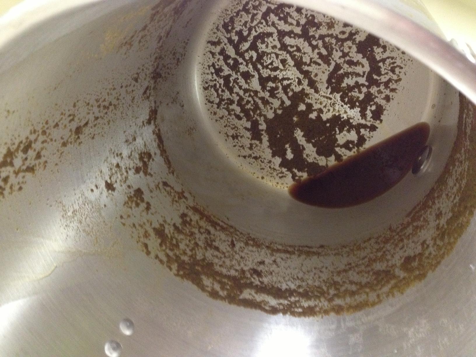
Some might call that “nutrition.” I call it grit!
So the beer was brewed. What’s next?
The Waiting Game
X-ray vision would have been great so I could see how my beer was doing!
With the boiled wort in the plastic bucket (I just can’t call it a fermenter) it was time to wait. I was super excited about the waiting game. I was really looking forward to seeing some bubbles coming through the fermentation lock.
I was prepared to see no bubbles. My confidence in my brewing ability was so high that I was expecting to fail.
Fortunately a day later I saw the first bubbles! It was a great moment in my life. I put it right up there with taking the ACT for the fourth time in high school and that moment in baseball practice when I got hit, well… you know where.
So the bubbles, while exciting, really weren’t much to look at. I figured they would happen. I was just slightly worried that it would foam over through the fermentation lock.
Thankfully it did not. And I was able to move onto the second stage of fermentation… the Carboy!
Carboy is a Cool Word
So the next step is to transfer the beer over to the glass carboy. This doesn’t have to be done, but all the books and experts make it sound like it’s the right thing to do. So I did it.
I had purchased an auto siphon, which really made the transfer pretty easy. I hoisted the bucket up on a box and cracked it open. It really smelled good! I put the siphon in the bucket, being careful to keep it off the bottom, and then pumped and let it do its work.
Here’s how it looked during siphoning and after all was said and done:
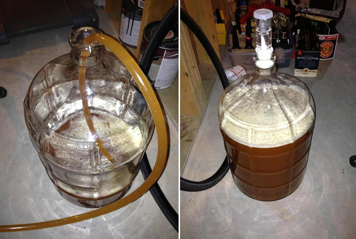
Siphoning (left) and fermenting (right)
I AM a Home Brewer! What’s with “Alberti?”
So at this point my beer has been in the carboy for about 4 days. It is a little cold in my basement where it is fermenting and I think that has caused it to ferment less than it perhaps should have. But the bottom line is that there are several gallons of my own beer sitting in my basement!
So the next step will be bottling at some point in the next week or so. That should be interesting. I bought a bottom up bottle filler, though. That should help the process a bit!

Like cracking a cipher, let’s crack an Alberti Amber!
So why did I name it “Alberti Amber?” This beer is named after Leon Battista Alberti, who was a 15th century Renaissance man. I like to consider myself sort of a Mediocre Renaissance Man and so it’s fun to name these beers after men I look up to. Alberti is a favorite renaissance man of mine due to his Alberti Cipher work in cryptography. I have a little man crush on unsolved ciphers and maybe my beer will help me solve some of them. Probably Not.
So it’s been a fun, if nerve-wracking, process brewing my first batch of beer. I think the second time will go much smoother. Or at least I’ll be more comfortable with it. All I have to do is figure out what style of beer I want to brew next! Helmholtz Honey Bock? Franklin Cream Ale? We shall see!
GDP: Playtesting Big Picture
Perhaps the most important step in the Game Design process!
First things first… should there be a space between the words “play” and “test”? Does it matter? I prefer them together so for the duration of today’s article I will refer to it as playtesting.
Today I am continuing a series of articles about my take on the Game Design Process (GDP). It’s Friday so there’s probably a few of you out there who will be playing games tonight. And I’m guessing a few of you will be playing unpublished games that need playtesting. So this article should be of some assistance today!
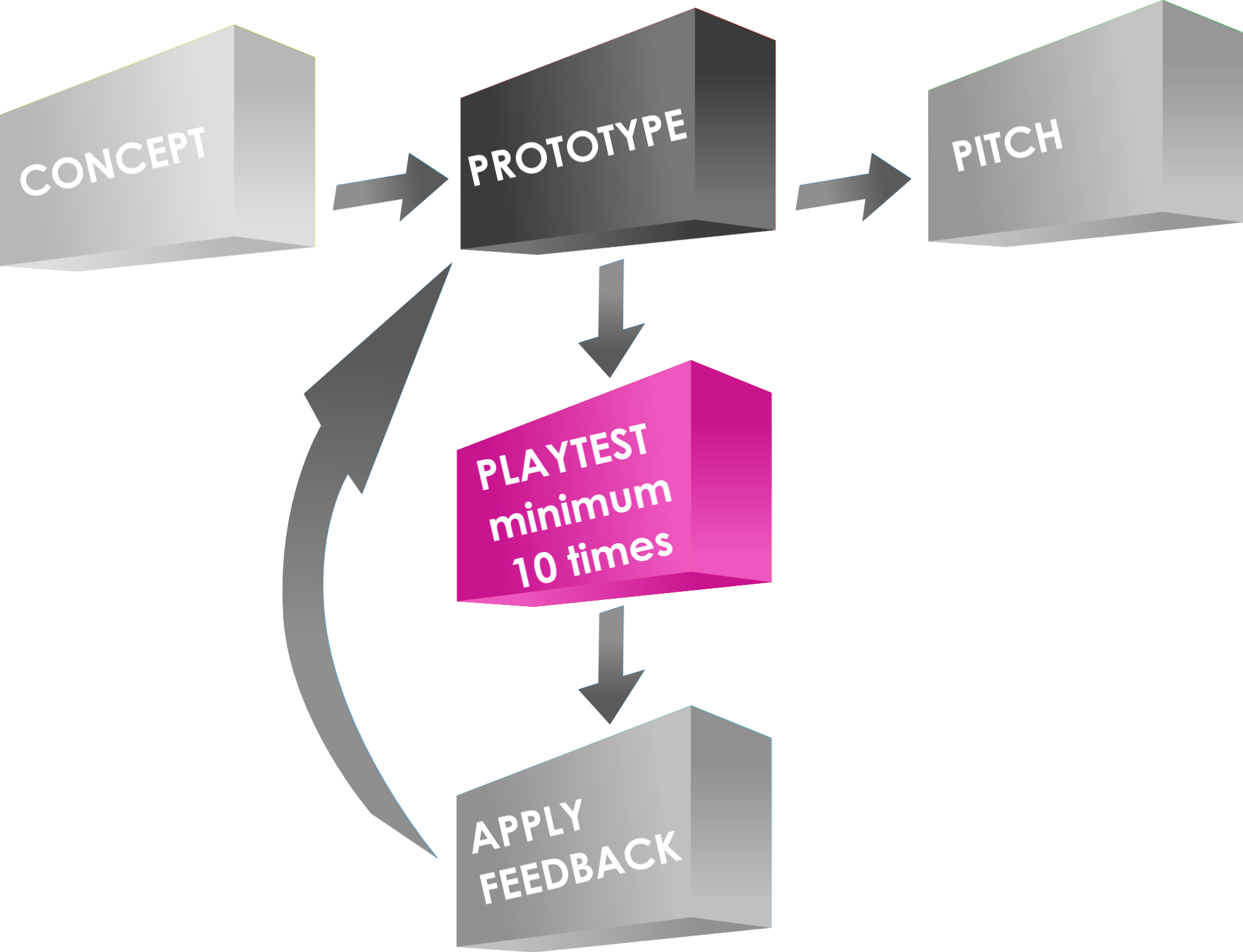
Let’s imagine the playtesting process as if we’re carving a sculpture into stone. (In fact, one could reasonably treat the entire game design process in a similar way). For this article let’s assume you’ve already chosen the stone you want to carve (this is equivalent to creating your CONCEPT and creating the first PROTOTYPE). As Michaelangelo said (notes in parentheses are mine):
Every block of stone (protoype) has a statue (refined/perfected game) inside it and it is the task of the sculptor (designer & playtesters) to discover it.
So today I’m going to cover how the playtesting process takes that raw stone of a prototype and carves it down into something that is beautiful!
Rough Cut that Stone! (Playtest #1)

What exciting sculpture is within, waiting to be found?
So you’ve chosen your concept, decided on your mechanics, and created your first prototype. It’s time to rough cut that stone.
Getting the prototype to the table is an exciting moment! You’re ready to try it out. Don’t let disappointment cloud your excitement. And don’t expect things to work perfectly.
The goal of playtest #1, like rough cutting a stone, is to get rid of the large chunks that need not be there. To put it in gaming terms, find what’s broken. If there are broken mechanics, either eliminate them or chip away at them. The more you chip away, the closer you’ll get to a beautiful game!
Playtest #1 should be a solo playtest. Don’t submit your friends to something that is likely to be a waste of their time. Note: it will not be a waste of your time. Playtest #1 is a HUGE step in the game design process. But do it by yourself.
When sitting down for your first playtest I recommend having some questions prepared in advance. These can be things like whether or not you think mechanic A is broken, or whether mechanic B doesn’t work quite right, or whether the cards are balanced enough. For games with a lot of depth/detail it’s important to ignore the small things during this first playtest and even the first ten playtests. Remember, we are looking at the big picture here. We’re rough cutting the stone. So go ahead and rough cut your game!
Shaping that Stone! (Playtests #2-10)
Here’s a rule of thumb I try to follow when playtesting:
Don’t change things on the fly while playtesting, never change more than one thing at a time, and make sure you have enough plays under your belt to be able to compare your changes to the previous form (10 playtests seems appropriate).
Following this rule means that playtests 2-10 will be run with the same rules/components/etc. Since you’ve already rough cut your game via Playtest #1, feel free to invite your friends over to try it out. By getting 10 playtests under your belt you’ll begin to get a feel for what the beautiful sculpture within the stone actually looks like. Those first 10 playtests should provide a lot of great feedback.
But don’t change anything during those first ten plays unless there are things which obviously don’t work or are broken. These sorts of things should have been cleared up during solo Playtest #1.
During Playtests 2-10 try to pay attention to what people are saying about the game, how they react to certain elements, and most importantly pay attention to any feedback that is mentioned by different players independently. The more people that mention the same thing, the more important that thing is.
Fine Shaping that Stone (Subsequent Playtests in increments of 10)
From here forward you are in the “Fine Shaping” realm of game design. This is a VERY important section of game design. This is were things really begin to look like a final product. The objective here is to take each element of the game and work on making it beautiful. Here’s a list of things to pay attention to during these subsequent playtests:
- What is your goal/objective with this game design?
- How well does each mechanic work?
- Does each mechanic do what I want it to do? (Note: this is different from the previous bullet)
- What portions of the game are players responding positively/negatively to?
- When implementing new things (every 10 playtests) how are players reacting differently from the previous version?
- How well are things balanced? Do players always make the same choices? Is there only one path to victory?
- Pay attention to Downtime, Kingmaking, Runaway Leader, Tension, Endgame Awesomeness.
Those are just some of the things I try to pay attention to when playtesting. But the point of emphasis is not to change things except for every 10 playtests. If you change things sooner than that you’ll likely not have a good enough understanding of your game to really be able to tell if it has gotten better or worse.
That’s also why it’s important not to change two things at once. If you change two things and the game gets worse, how will you know which one caused it? Sure, sometimes it might be obvious, but it’s still an unnecessary risk. Change one thing at a time every 10 playtests so that you get to know your game really well.
Smoothing that Stone
We’re getting to the fun point. You’ve rough cut the game, you’ve shaped it, and you’ve refined it. You’re almost there. Once you’ve done a lot of playtests it’s time to start thinking about finishing it off and making a high level prototype. This is where things get a little different from the sculpting stone analogy.
When sculpting a stone, once you remove a chunk of that stone it’s gone forever. But with game design you can always add material back into the game. I chose the stone sculpting analogy because I am a proponent of keeping the game design simple. Here’s a lesson I’ve learned along the way:
It’s easy to add complexity and detail. It’s very difficult to simplify down to the game you actually want.
By this point in the game design process with numerous playtests under your belt you should only have to be changing small details. You should be at the point where you can see the beauty of your work. There’s just small imperfections in it. So smooth them away with refining.
The “Final” Product

A masterpiece, just like your game design after numerous playtests!
You’ve done all the dirty work. You’ve chipped away, you’ve refined, you’ve smoothed it out. You’re all set to pitch the game (which is something I know nothing about!). Your beautiful product is “complete.”
Okay, the word “Complete” is an absolute misnomer unless you publish the game yourself exactly how it is. Unlike a sculpture, board games can continue to be worked on incessantly. My perspective is to get the game to a point where you are confident in sending it to a publisher, and then send it to a publisher! If they sign your game, they might change it from something like David into something like the Sistine Chapel but it will still be YOUR work of art!
This has been a sort of 10,000 foot view of playtesting. In the future I’ll write another article more focused on an individual playtest session. Thanks for reading!
BGR: Last Will

Yes. It’s like Brewster’s Millions.
Another Board Game Review! This time I’m reviewing Last Will by Czech Games Edition and designer Vladimír Suchý.
In Last Will you have received an inheritance of sorts from your deceased Uncle. But before you can “earn” the inheritance you have to prove yourself worthy of it! How do you do that? By spending an allotment of cash faster than your cousins. You’ll have to buy residences, farms, and mansions. You’ll have to throw extravagant balls. You’ll have to hire outstanding workers. And more! If you can go the furthest into debt, then you win!
This game has players fighting to get rid of their money the fastest. Can you outwit your cousins and spend you allotment first? Or will you be stuck with valuable properties? If you’re ready to spend spend spend, then it’s time to play Last Will (Ben McQuiston’s 2012 Game of the Year! – personal shout out)
Here’s a sneak peek at the game:
Okay… that’s obviously not the game, but it’s the same idea!
Here’s a look at the setup of the game (Image from BoardGameGeek.com):

Look at those awesome Top Hats! This shows a two-player game.
The Upside:
ARTWORK: This is easily some of my favorite board game artwork! Everything is thematically cohesive. It looks amazing. The colors are brilliant. And they spared no expense! I also like that they avoided game-dependent text on the cards, despite the fact that I have to reference the back page of the rulebook for the iconography about two dozen times per game. Really outstanding artwork!
THEME: The theme for this is fresh, unique, and interesting. Having a game where you have to get rid of all your money is so different than the majority of games out there. But all of the mechanics in the game fit the theme really well.
DOWNTIME: One of the things that can take a good game and turn it sour is an abundance of downtime. In Last Will there is very little downtime. This is because in the main action phase all the players can perform their actions at the same time. That’s pretty solid game design!
The Downside:
FIRST PLAY: The first time you attempt Last Will will likely be rough. New players typically have no idea what to do. Why should they buy a building? How does depreciation work? What do companions do? There are a lot of areas where they can get confused. If you’ve only played this game once and were confused, I highly recommend giving it another shot.
ICONOGRAPHY (SYMBOLOGY??): There are a lot of icons (symbols?) in this game. Like I mentioned above, I have to reference the table on the back of the rules multiple times throughout the game. This can be overwhelming to non-gamers or light-gamers.
AP-PRONE: Yes, there are an abundance of decisions to make in this game. And they are tough decisions. I don’t recommend playing this with your AP friends unless you plan on talking with your non-AP friends a bunch during the game. Or you’re incessantly patient.
Designer Perspective – What I Would Change:
As a designer I can really appreciate how well this game is balanced. The design process must have been a beast for this game. There are so many interweaving things within the design. The gameplay works really well. The artwork is outstanding. And the theme is great. The only thing I would be tempted to change is the iconography. It looks nice, but I think the icons could be a little more clear on what they represent. They just are not very intuitive.
Beer Pairing:

This seems like a gentlemen’s (lady’s) game and I prefer to play while enjoying a gentlemen’s beer. And to me a fine example of a gentlemen’s beer is a Scotch Ale. I’m keeping it close to home with this beer pairing and I’m recommending Lake Louie’s Warped Speed Scotch Ale. It’s an excellent beer that goes well with this excellent game! A secondary local option would be Ale Asylum’s Sticky McDoogle! That’s also a great Scotch Ale that is as enjoyable as this game. Either way, you can’t go wrong!
OVERALL RATING:
I’ve played Last Will a half dozen times. I’ve enjoyed each play. There is a great amount of variability. The theme and artwork are awesome. And there is a lot of awesome strategy that keeps me wanting more. I yearn to be better at this game. I’ve won at least once and I’m hoping to win again soon, but just playing this one is a lot of fun! Just get past that first play and this game really becomes outstanding. I’ll rate it 8 out of 10 according to the BoardGameGeek rating system:

Very good game. I like to play it. Probably I’ll suggest it and will never turn down a game.
Scoville Print And Play Now Available!

Let the awesomeness be printed and played!
For those interested I have posted Version 0.1 of Print and Play files for Scoville, including the Rules, onto Board Game Geek. You can follow this link to obtain them:
BoardGameGeek: Unpublished Prototype: Scoville Rules & PnP
If you decide to print it out and play it I’d be happy to answer any questions. Just leave a comment below! I’d also be VERY interested in hearing your feedback from your plays of the game. So let’s stay in touch and make this game as best as it can be!
You can also hit me up on Twitter (@EdPMarriott) if you have any questions.
Thanks!
Prototype Art: Cubes in Inkscape
Inkscape Logo of Squidy Awesomeness
There are a lot of you out there who are working on board game prototypes. Often those prototypes will utilize the ever popular cube. And that usually results in the cube being placed onto graphics such as cards or tiles or the board itself and then later on, in the rulebook. So today I wanted to give you a quick tutorial to show you how I make a cube for board game graphics using Inkscape.
You can create your own set of awesome looking Scalable Vector Graphics versions of cubes using the free Inkscape software. If you don’t have the software, you can download it from their website: inkscape.org.
Let’s Get Cubing!
Once you’ve downloaded and opened Inkscape you’ll see a plain canvas outlined in front of you. I like to leave it turned on, but you can turn off the “edges” if you visit the document properties under “File.”
What we are going to do first is click on the “Create 3D Boxes” icon on the left. Here is a picture showing what this should look like:
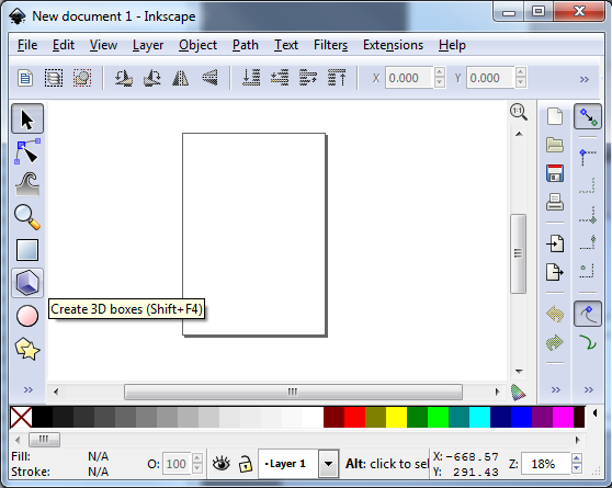
There… on the left… the icon that game designers love!
Click on the icon. Then click and drag within the framed region to create a generic box. It should look something like this:
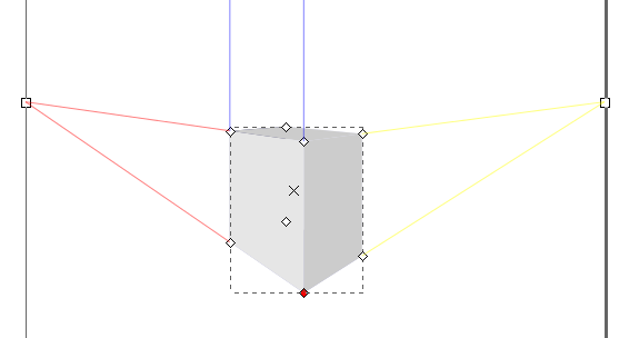
Great! You’re doing it!
You can see we’ve created a generic gray box. Now it’s time to make it look like a cube of awesomeness that you would be proud to include in your board game graphics!
So the next thing you should do is “shape” the box to look like a cube. This can be done by clicking and dragging the little diamonds on the corners of the generic box. Go ahead and try it out. Once you’ve dragged then to the positions of your liking then you might end up with something like this:
Our cube of awesomeness is started to be awesome!
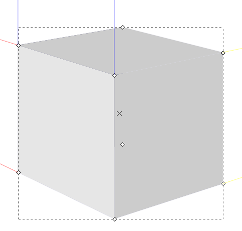
Assuming you’re pleased with the shape of you cube it’s then time to make it look good. Normally you can just click on an object using the “Select and Transform” icon (it’s the black arrow on the left). Once you’ve selected the “Select and Transform” icon, click on the cube. Then you can change the color by selecting any color from the color row at the bottom of Inkscape. But that’s not the way I do it. Why? Because you end up with a flat monotone cube of ugliness rather than a sweet cube of awesomeness. Here’s what it might look like:
Our awesome turned ugly. Let’s fix that!
Don’t be afraid! We can transform that cube from ugly to awesome in just a few easy steps! First, we’ll want to use the “Edit paths by node” tool, which is right below the “Select and Transform” icon. This one looks like a quarter of a circle, with three nodes, and a black arrow. By clicking on this icon you can then go and choose a specific face of the cube. Once you’ve selected a face of the cube you can then change its color without changing the other faces. In this next picture I have changed two of the faces and have selected the top face:
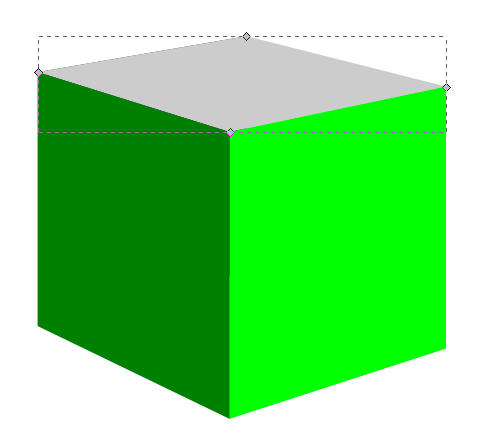
Looks like we’re back on track!
So I had selected the right face and made it a light green. Then I selected the left face and made it a dark green. Now with the top face selected I can choose its color, in this case an even lighter green. Now you should have something like this:
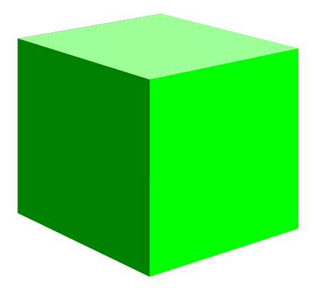
Not too shabby!
Alright!
Just a side note, if you have trouble selected the individual faces, make sure you’ve chosen the “Edit Paths by Node” tool rather than the “Select and Transform” tool.
So we’ve got a green cube with differently colored faces. What’s next? I found that sometimes the hidden faces will show through along the edges. So we can change their colors too. This is a little tricky though, so follow closely.
Go ahead and click on the left face. Then what you want to do is press the “left” arrow on your keyboard to move the face over. Don’t use your mouse to drag it since it will be almost impossible to easily put it back in the right spot. It should look something like this:
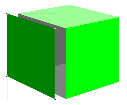
The hidden “ugly” faces show themselves!
With two of the three ugly faces exposed you can click on each one and change them to a color that matches your cube color. In this case I just choose a dark green for these two hidden faces. Then slide the moved left face back into place using your “right” arrow key. You can then move the right face or the top face to expose the third hidden side and change its color.
Now you’ve got your beautiful cube. You can call it quits right there if you want a nice simple cube. Just select the cube, click “File > Export Bitmap” and you can save it as a nice little .png file. And I also recommend saving the .svg file so that you don’t have to recreate the cube every time. But if you want to spruce it up a bit then keep reading!
Adding Awesomeness!
Sometimes cubes can look better with a border. There’s a very easy way to create one. With the cube selected click on “Filters > ABCs > Black Outline” to get something like this:

Oh boy! Things are looking good!
Pretty dec, right! (Note: dec is short for “decent,” all the cool kids know that!) Just be careful because the smaller your cube the larger the border will appear relative to the cube.
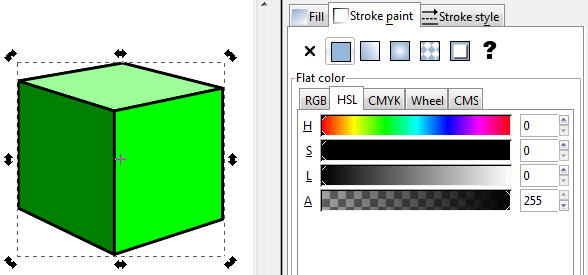
If you don’t want a black outline there are other options, but it’s slightly more complicated. With the cube selected you’ll want to click on “Object > Fill and Stroke.” That will open a panel on the right. “Fill” will color the main area of the object. “Stroke” will add a border to the object. We want to use Stroke. Taking our border-less cube and applying a simple black stroke will result in a cube like this (Note, on the Stroke Style tab you will want to choose the “Round Join” option):
Not quite as awesome as I’d hoped!
I am not a fan of the lines along each edge. It just doesn’t look that clean to me. So here’s my trick: duplicate the cube and apply a stroke to the copy in the back. To duplicate the cube make sure it is selected and then right click. On the pop up menu click “Duplicate.” This will create a duplicate directly on top of the original. Adding a stroke to the copy in back will show allow only the outside edges of the stroked cube to show past the unstroked cube. Then you can create cubes that look like this:
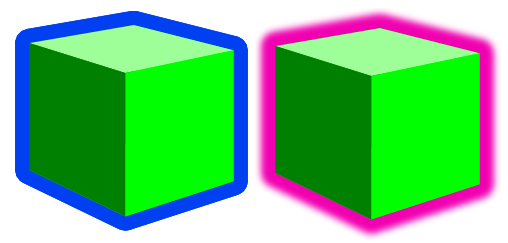
Awesomeness complete, even though these two examples look pretty ugly!
On the left is a duplicate cube with a blue stroke applied to the back copy. On the right is a duplicate cube with a blurred pink stroke applied to the back cube. One final note is that if you choose the duplicate cube option you will want to group the two together so that when moving them around you won’t have to constantly be lining them up.
Lesson Complete!
Now you know how to use Inkscape to create nice looking cubes for your board game graphics! If you are a starving artist and you have little computer skills then I have a special bonus for you. I am supplying a .svg file for all of you with a slew of cubes that you can use freely without crediting me, without paying me, and without worrying about getting sued. Feel free to use this file and the cubes wherever you want, however you want, and in whatever way you want so long as you use them for the greater good! Here is an image of the .svg file:
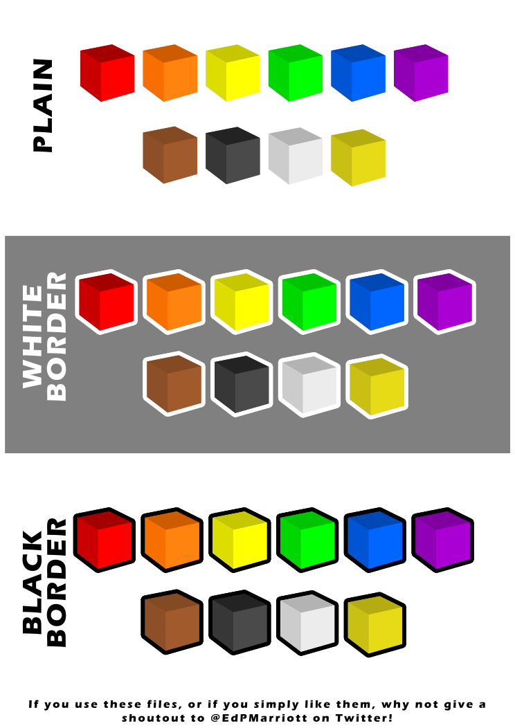
Go on… use this artwork freely! Make your prototypes look awesome!
To download it just click here: Google Drive > FreeUseCubesbyEdPMarriott.svg
Note, if you have trouble downloading the file from Google Drive you might want to allow third party cookies. You can read more here: http://productforums.google.com/forum/#!topic/docs/_pXrQmwkrGU . If you have further problems, please let me know!
And let me know how they work for you. Now get Cubing!
