Trading Post Part 2: Early Prototyping
Trading Post Logo… for now.
I have a new game design I’m working on and today I am posting the second of 4 articles about it. Including last week, today, and the next two Thursdays, I’ll be writing about the game from it’s creation to the present state. Here’s the four articles in this series:
- 5-16-13: Origins of Trading Post
- TODAY 5-23-13: Prototyping Early Versions
- 5-30-13: Hiatus and Re-design
- 6-6-13: Path to GenCon
So today let’s again jump back in time a few years and take a look at my early prototyping attempts, from when I didn’t know anything about prototyping games!
The Board:
One of the first things I attempted to make when I thought I had the design “together” enough was a board. I figured black and white was a great place to start. So I drew a few sketches about the layout and then opened The Gimp.
For those of you who don’t know what The Gimp is, here’s where you can go to learn more: http://www.gimp.org/
It is an open source image editing software. While it used to be my weapon of choice for image editing and graphic design, I now use Inkscape since it is a vector graphics software (and still free).
So in The Gimp I got a 21″ x 21″ file open and began by creating the main hex grid. Last week I wrote about a grid of squares with truncated corners where cubes could fit. Well, that was gone by the time I decided to make a prototype. So here we are already discussing a hex grid map with square tiles. In the earliest designs all the tiles were going to be 1″ squares. So the board reflected that. You’ll understand why I went with squares a little more in the discussion about components below.
The hex shaped grid for player territories was a beast to design. I actually had to do math to get the grid to be a hex in The Gimp. This would have been relatively easy in Inkscape. But it wasn’t very fun in The Gimp.
After wrestling with the hex grid territory region I added a few other smallish things to the board. This included the title, resource areas, a time track, and a spot for cards. After spending a completely ridiculous amount of time on a board for a prototype that hadn’t even been played, here’s what I ended up with:
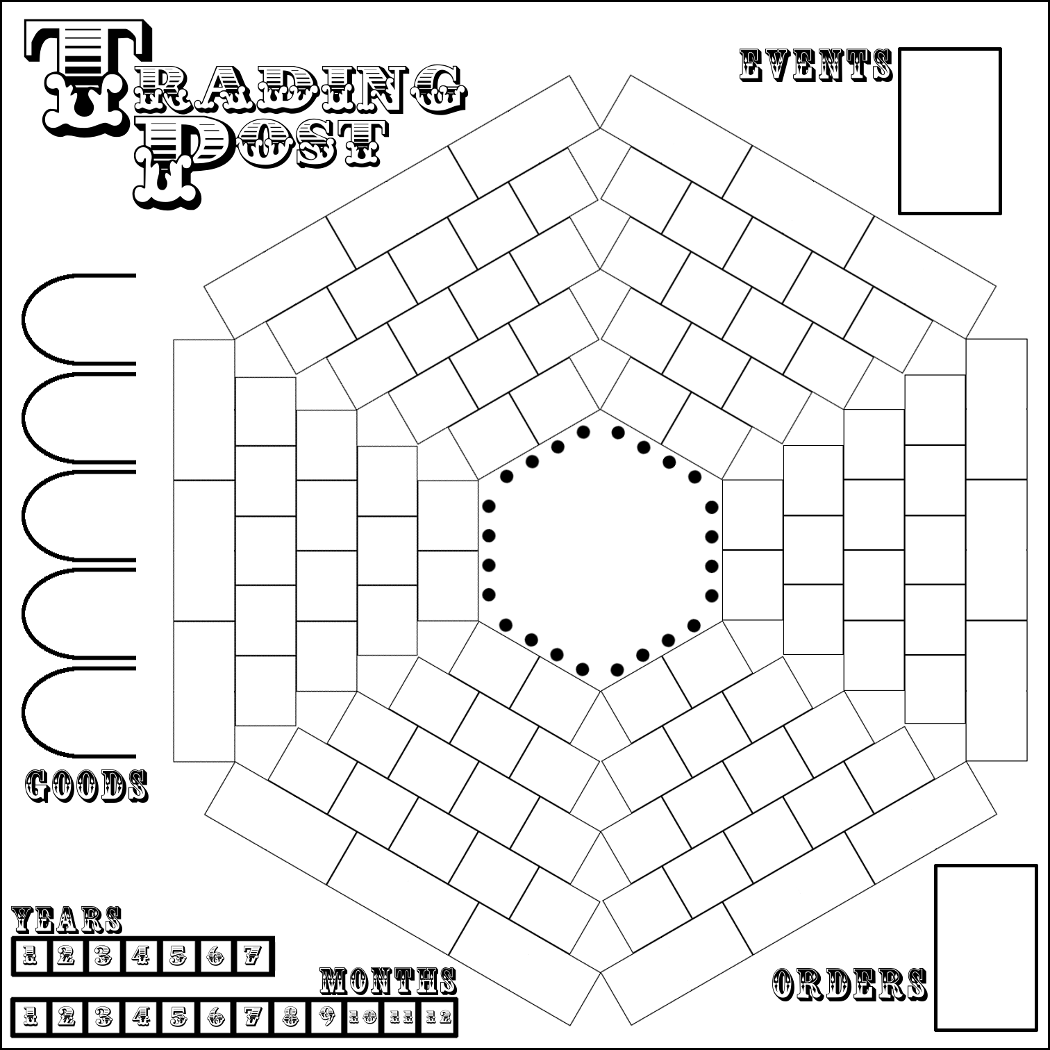
Well, it’s better than nothing, right?
As you can see it values function over form. Ugly though it be, it would still get the job done. So I printed it on 9 different sheets of paper and tried to get all the edges lined up. Maybe my struggles with creating a full size game board when working on Trading Post are what subconsciously led me to not having a full size board for Scoville.
The Territory Tiles:
The main concept of the design involves exploration of your territory. Players start with their pawns in the center and eventually should try to explore all of their territory. So I had to make tiles to put on the sections of your territory as you would discover them.
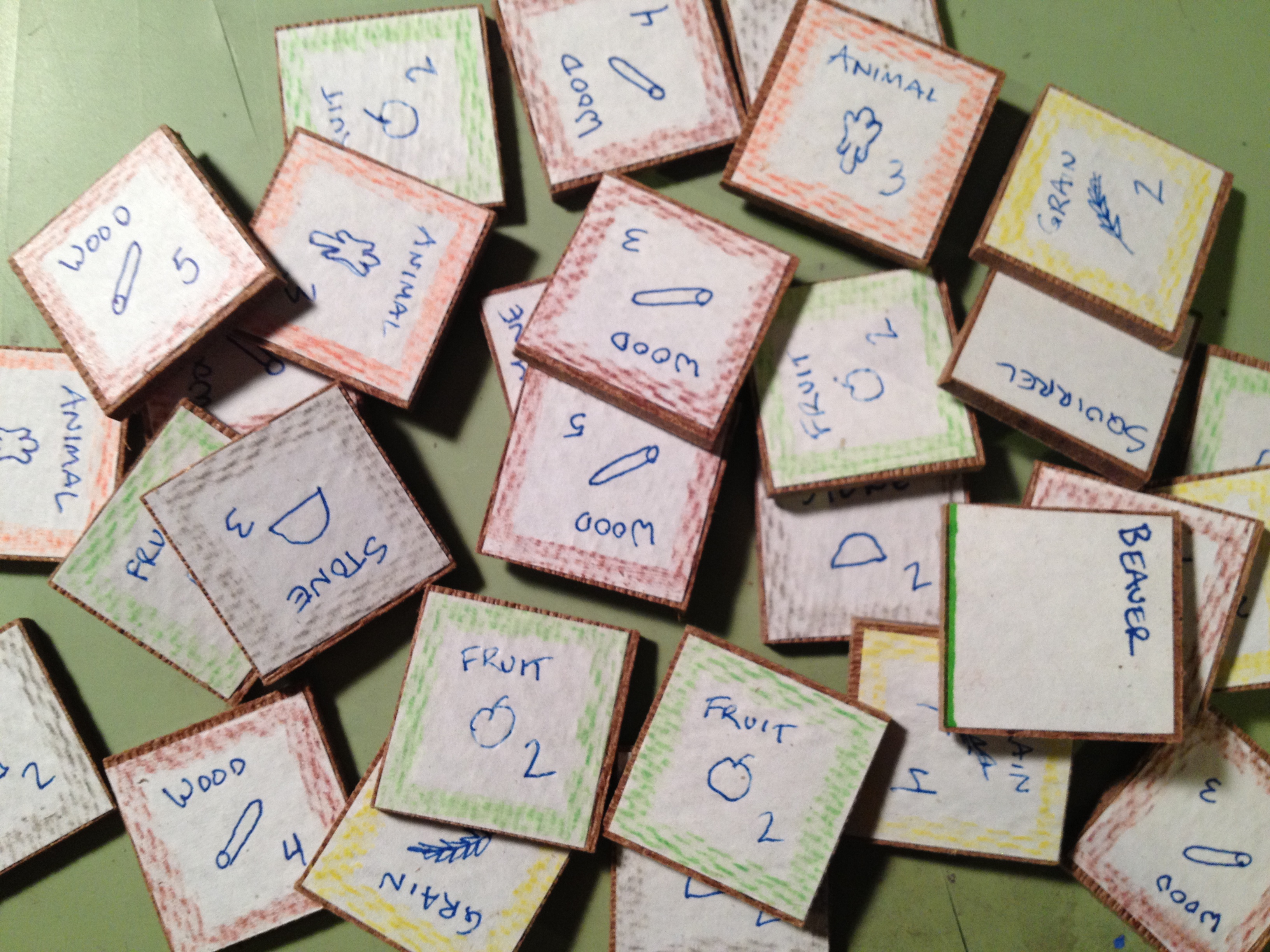
Wood tiles with hand drawn icons and colored pencil edges. Wow.
These tiles would represent different resources that could be available, AND the amount of that resource that the piece of land would produce… for the rest of the game. This included things like Wood, Stone, Fruit, Grain, and more.
Here is a lesson I learned when prototyping the territory tiles: Just buy chipboard components from someone like Printplaygames.com. For the cost you can get just about everything you would need to get your game to the prototype phase.
Did I make such a wise decision? Not even close. I actually bought a wood board and went to a friend’s house to use their table saw to cut 1″ square tiles. Then I cut out square pieces of paper. The paper got glued to the tiles. Then I drew little icons on each one and colored the edges to match the icon. Here’s a recommendation: Don’t do it like that!
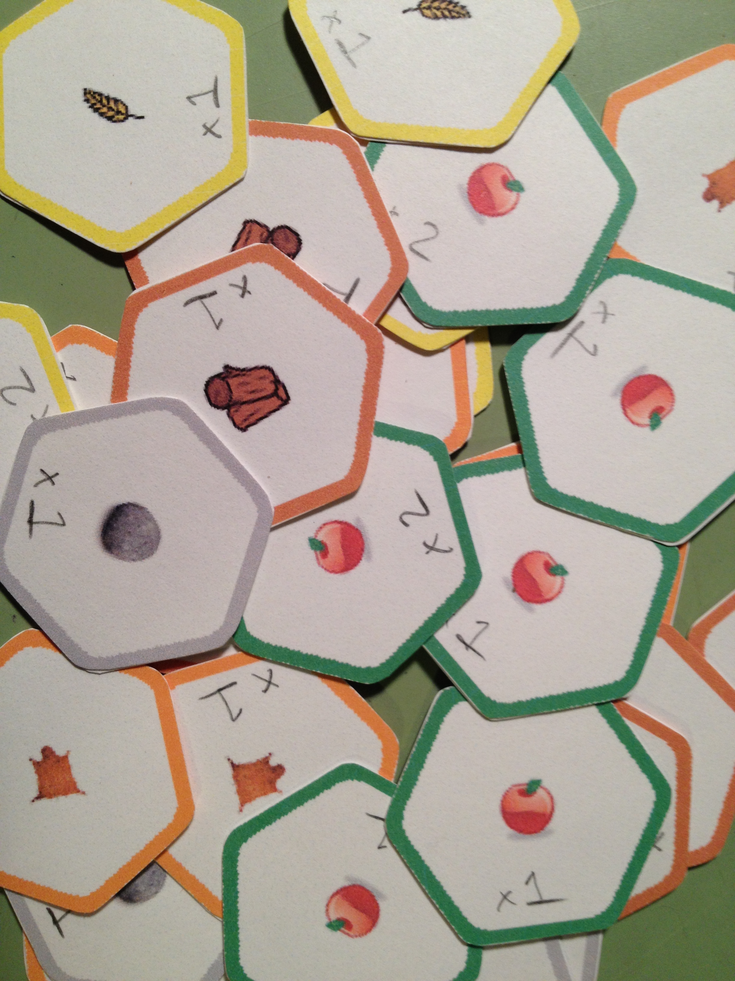
Hex punched, corners rounded, glued back to back. Aye!
Eventually I got to the point where a hex-based grid seemed like a better idea and I began to work toward a hex-based prototype. I used a computer aided drafting software called SolidWorks to render a hex grid that I could print out for the hex-based prototype. I don’t recommend using CAD software for board game design unless you’re making minis. The main problem is that the CAD software typically doesn’t allow you to save images in high quality. The downside of the change to a hex-based system was that all the effort I put into the wooden square tiles was now wasted. (I can say that it was wasted because it was never even used in a playtest).
The hex-based system didn’t change how the game was played. It just made things fit a little better and look neater & tidier on the board. It was at this point in my board game design career that I decided to purchase a hex-punch. I bought a Creative Memories Double Hex Punch off eBay for about $8. It turns out that that’s a crazy awesome price! Despite the price I recommend buying a variety of punches, especially circles. I just searched and found a few of the Creative Memories hex punches on eBay for about $37. Another free designer tip:
Punches can be your best friend!
Here is a link for punches from Fiskars. I would recommend starting on eBay, though.
Ugh. Looking back on all of this makes me wish I had been familiar with Inkscape at the time I was working on this design. All of the art and tiles could have been made with Inkscape so much more easily than what I was doing.
Well I now had my territory tiles made. Now it was time to add the other unnecessary ingredients in this poor game design…
The Event & Order Cards:
After reading the article about what makes a game good (Note: here’s the article I mentioned in last week’s Trading Post article, thanks to Neil Roberts who found the link – What Makes a Game Good?) I knew that I wanted to especially avoid monotony in the game design. I already had a random draw for territory exploration. But how else could I increase variability and replayability?
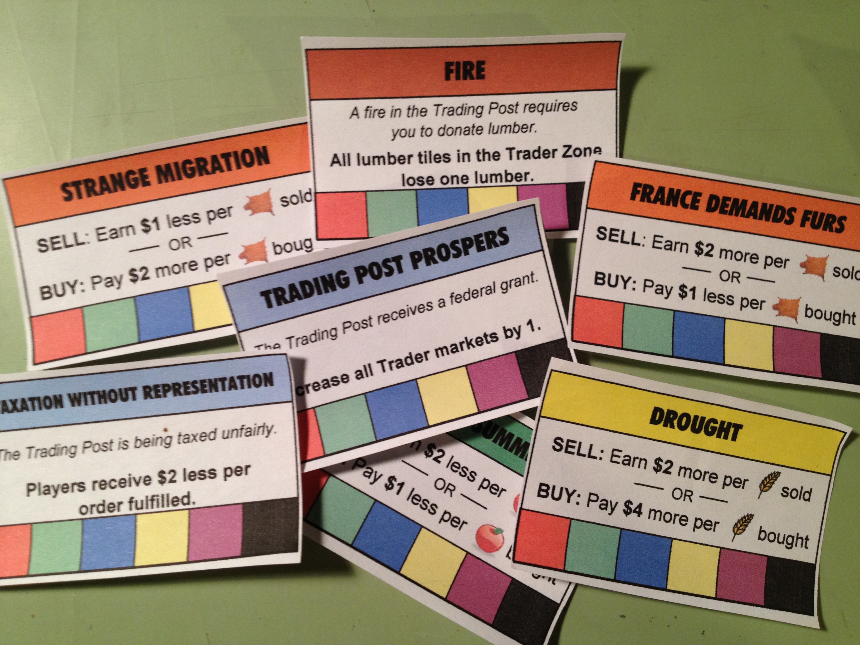
My poor attempt at adding replayability.
I came up with the idea that each “year” in the game would have something different going on. I called these “Event” cards. They typically affected how the market worked for different goods. But they also could positively or negatively affect all players. A few of the event cards are shown here on the right.
These were masterfully made in Excel. The bottom row of the event cards is a spot for players to put a cube of their player color when the card affected them to show that it had done so. Cards could only affect a player once. The top box on the cards is also color coded. The DROUGHT card in the image affects GRAIN and thus matches the yellow color of the grain. Pretty awesome, huh?
But this wasn’t enough! Another free designer tip:
Don’t add complications until the game needs it!
At the time I was designing Trading Post I hadn’t learned that lesson. So I added ORDER cards in a seemingly theme-less way to make each game different. I guess I was really worried that people would be bored with Trading Post after one or two plays.
Thematically the ORDER cards represented things the Trading Post needed during that year. That at least made sense. These things included blankets, hats, pies, buildings, flagpoles, and on and on. I struggled to make a list long enough of the sorts of things that a Trading Post might need. But eventually I got them all together and started making more “awesomeness” in Excel. Here’s a glimpse of the result:
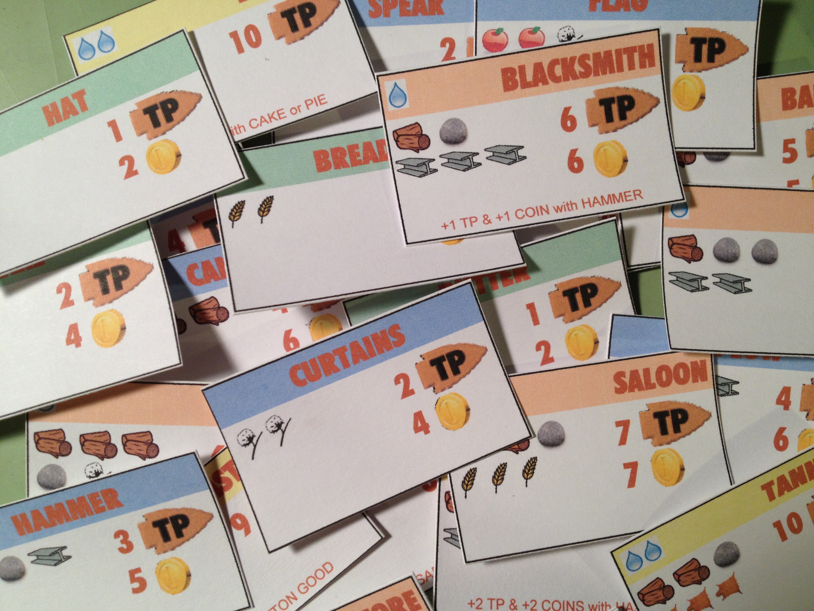
Trading Post Order Cards. Excel is NOT a graphic design tool!
So made a stack of about 50 order cards that would come out randomly, four per year. These would be available on a first come-first serve basis. The cost is shown on the left. In the image above, for example, the curtains would cost 2 cotton. The reward is on the right. In the same curtains example the reward was 2 Trading Points and 4 coins. I even added further complication by having some order cards provide a bonus if the owner already had fulfilled a prerequisite. In the image above an example is the BLACKSMITH. If you had fulfilled the HAMMER order card for the Trading Post and then fulfill the Blacksmith card you would earn an extra point and an extra coin. I suppose I added this to the design to produce a more guided decision tree to players.
In most of these images the way the prototype components were made was by printing on normal paper and glue-sticking them to 60lb. paper. The problem with this method is warping. And it was a big problem with the original Trading Post components. This is one reason that I have moved on to gluing stuff to matte board or chip board.
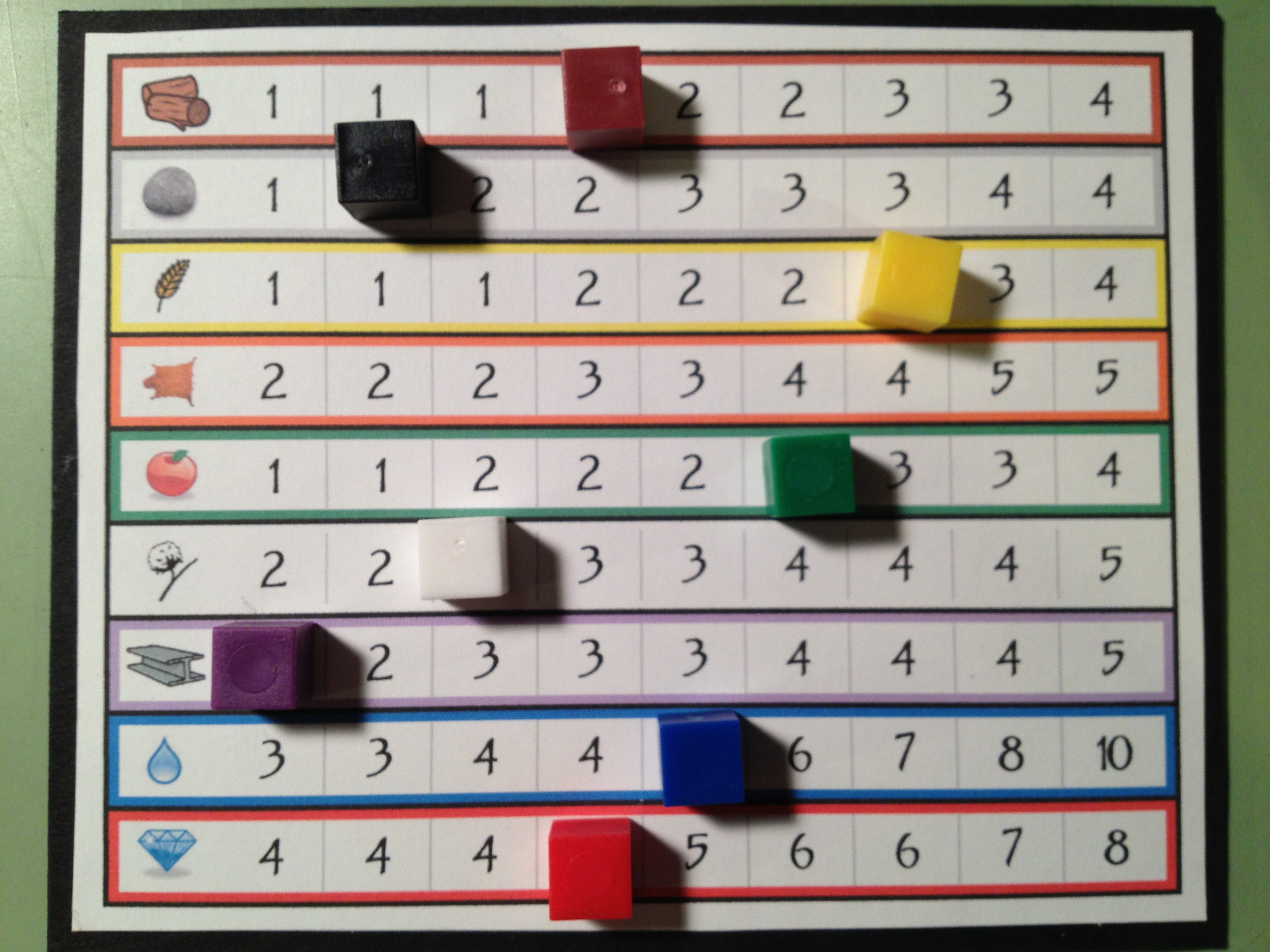
The market.
By this point in the design I had the board, the territory tiles, the event cards, and the orders. A market board was also built for the game to allow people to trade for different goods. This would be the driving economic factor of the game, but would also allow players to obtain goods that their randomly seeded territory did not produce. With all those components in place it was time to focus on what was in front of me… the player mat!
The Player Mats:
Since I knew that I wanted a main concept of the game to revolve around exploration I decided that upgrading your ability as an explorer would be critical. Thematically that meant going from a “trader” to a “trader with a horse” and eventually to a “trader with a wagon.” From early on in the design I limited the explorable zone for a “trader” to the first two rows out from the Trading Post. The idea behind this that fit the theme was that a man or woman could only walk, explore, and carry enough food for an expedition two rows out from the Trading post. By upgrading and purchasing a horse you’d be able to move faster and thus could explore more territory on the same rations. So when you purchased a horse you would be able to explore rows three and four away from the Trading Post. Finally, if you wanted to explore the outer most regions you would need to build a wagon.
So there is a side objective of all players in the game to be collecting the components they needed to be able to build their wagon. In the design I set it up so that you had to procure certain items. Once you had all these items you had a de-facto wagon. The wagon would allow you to explore the fifth row from the Trading Post.
I designed the player mats to show how far you could move and how much you could carry based on your status. And I included a Wagon Construction Area showing your progress toward a wagon. Here’s a look at the first and second versions of the player mats:

The top shows the original version. The bottom shows the cleaner, more user-friendly second version.
The cool thing, or at least what I thought was cool, was that in the second version you would actually be building your wagon by placing the pieces on top of the illustration.
One other thing to point out about how the game worked is illustrated in the second version of the player mats. There is a row for INCOME and a separate row for MONEY. Thematically the INCOME row represented any money earned during your turn. This would be like getting a paycheck. The way it worked was that after your turn, your income would be added to your money and then the income track would be set to zero. This means that any money earned on your turn isn’t available until the next turn.
I would say that through this whole prototyping process, which occurred in mid-2011, my favorite components were the player mats.
Overall Prototyping Experience:
The best possible tip I could provide to designers regarding prototyping would be this:
Just make something functional and test it. Only put in the effort to make it look good once you know it’s working.
Next week you’ll see that I don’t heed my own advice. But I’m inhibited by my desire to make things look good. And now that I know how to use Inkscape it takes much less effort to produce something that looks good.
Looking back at all the things I did for Trading Post I’ve realized that I wasted a lot of time. I built spreadsheets. I wasted hours using The Gimp to make that board. I added needless complexity, which then required me to make more components.
The game was only attempted to be playtested in its previous form twice. The effort to playtest ratio for this game is just ridiculous. So next week I’m covering my hiatus from the game, how I’ve advanced as a designer during that hiatus, and now how I’m going about redesigning the game. With that in mind I’ll leave you with one final image, which is a printout of a spreadsheet that I made so I could take notes on. This illustration sums up all the things that I am trying to avoid with the redesign!
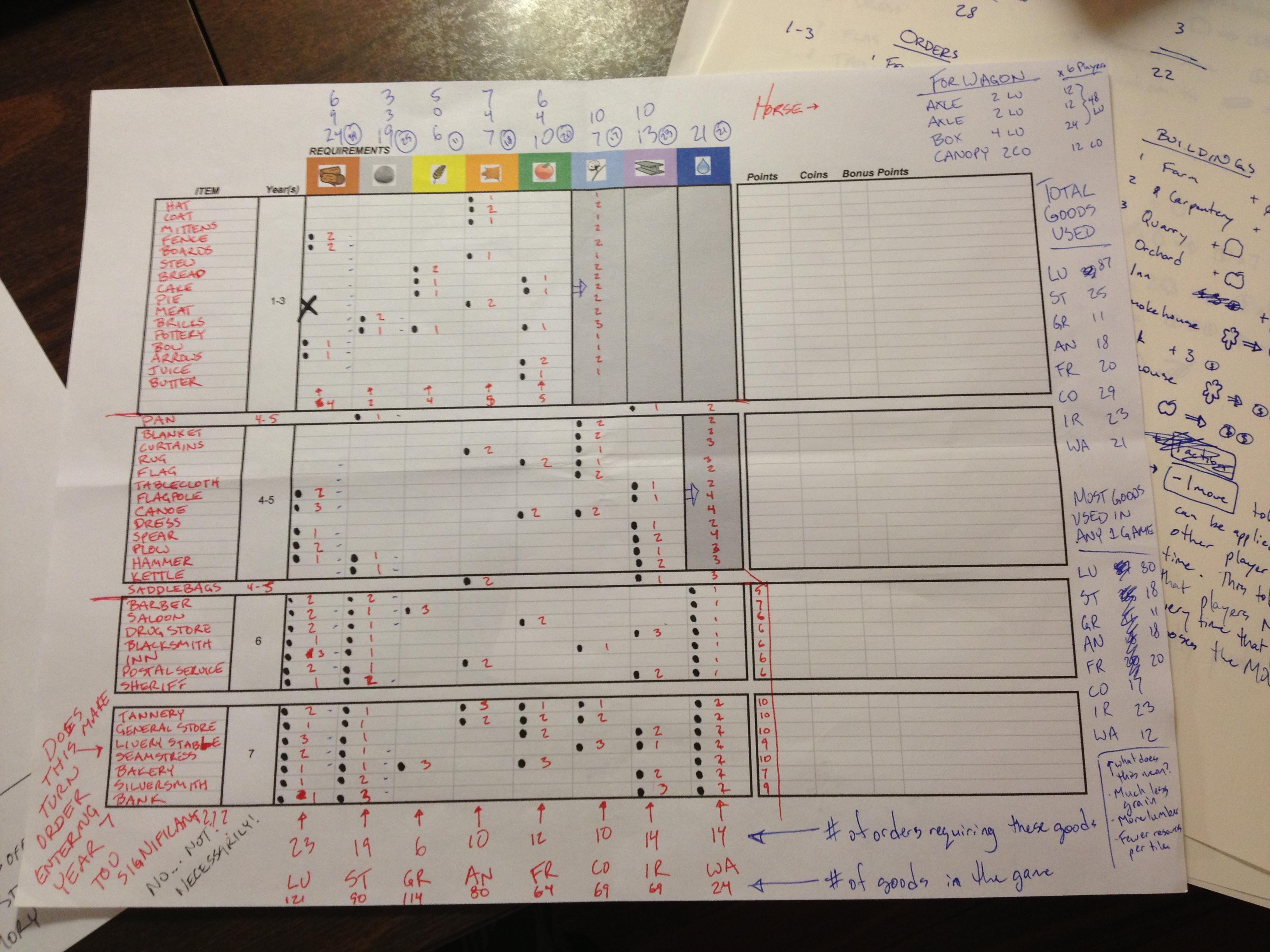
Wow. Just wow. Next week you’ll see dramatic improvements!
Thanks for reading. I’m happy to answer any questions you have about Trading Post and the things I’ve posted so far. Just share your comments below!
Posted on May 23, 2013, in Game Design, Lessons Learned, My Games, Prototyping, The Boards, Trading Post and tagged board game design, board game prototype, game design, game designer tips, graphic design, prototyping, Trading Post. Bookmark the permalink. 4 Comments.

Pingback: Boards and Barley - Early Prototyping of Trading Post | Board and Caffeinated
Pingback: Trading Post Part 3: Hiatus and Redesign | Boards and Barley
Pingback: Trading Post: Path to GenCon | Boards and Barley
Pingback: Bonus Trading Post Post | Boards and Barley