The Benefits of Pretty Prototypes
Today I’m presenting you my rebuttal for an article posted on Example of Play on May 30th. Here’s the link:
It’s an interesting article and I am currently at the prototype phase with Trading Post. So now’s as good a time as ever to post my rebuttal. I’m a big fan of the visual aesthetic of quality prototypes versus handwritten game designs on 8.5×11 sheets of paper. It’s worth the effort to me to make a quality prototype. Let’s get started…
The BEST possible prototype is an amazing looking prototype.

Prototype Cards for Trading Post and Scoville
Maybe. It’s all about perspective and approach.
When designing a board game you will have to create something physical to test the game. There are many approaches to this but here are the two genres that your prototype will likely fit into:
- Use pencil/pen/colored pencils/markers.
- Use art creation software and a printer.
These aren’t the only options, of course, but they are the basis for today’s rebuttal of that article.
It Can Be Worth the Effort to Make Nice Prototypes.
So there you are, sitting at Protospiel or an UnPub event. You’ve got your prototype on the table. It’s got a few poker chips for money. You’ve got an 8.5×11 piece of paper that has folds and creases. It’s covered with a few chicken scratches of notes, but still it serves as the game board. And you’ve got sleeved cards covered in Sharpie. Your table is empty. You glance at the exceedingly full table next to you to see what’s going on. On that table is a glowing, beautifully rendered, full art prototype on thick matte board with quality printed cards and an aesthetic that draws you in.
Uh oh.
Think of it like this. If you were an attender of Protospiel or UnPub and were looking for games to play, would you be more drawn to the nice fancy artwork where you can tell the designer put a lot of effort into his or her product? Or would you be more drawn to the 8.5×11 with Sharpie notes and no art?
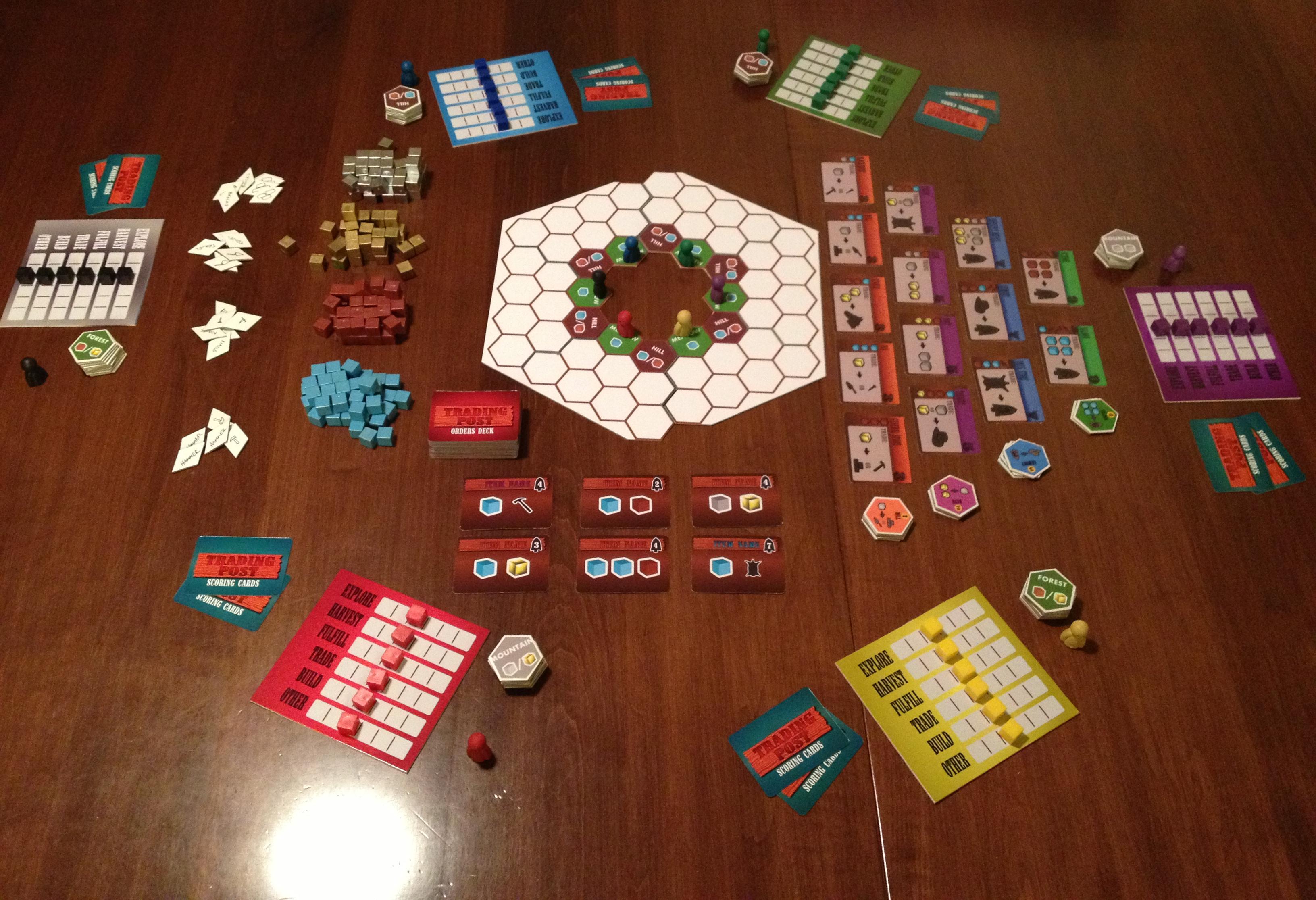
One of the reasons I think Scoville had some of the buzz that it did after Protospiel-Milwaukee was due to the quality of the prototype. Several people commented on the thick, quality feel of the Orders and Recipes in the game. Others asked how I made the components. The point is that I put in a little extra effort to make things seem more like a real game rather than a prototype.
What Should Be the Focus of Your Playtester?
Let’s examine the same scenario as above. So someone sits down at your table, with your 8.5×11 covered in Sharpie. You think you’ve got a decent game here. So you teach them how to play and after a few rounds, when you believe things should really be taking off, you notice a look of confusion on their face.
Let’s get into their head a little bit. As that player you are trying to enter into whichever world the designer has built for you. Part of playing games is about stepping into a different world for a while. In this case you don’t know what world you’re entering because there is no theme and no artwork. This 8.5×11 with Sharpie thing has you in a mental police chase to try and figure out how things work in this game.
Your mind has lost it’s focus. You are staring at a white sheet of paper while trying to put yourself in some other world. Where will your focus be? I imagine it would be difficult to make the game your focus.
Let’s think of another example. It’s 1910 in Manhattan and you need a cab. You’re waiting in the rain watching for a cab to roll by. Whoops, one just drove by, but it looked just like a normal car. Aye. Wait, what’s this? A Yellow Cab? That sure was easy to spot. So you hop aboard the yellow cab and they take you on your way. And not surprisingly, you leave a nice little tip for the driver because he was so easy to spot.
Board game prototypes are the same. As I saw at Protospiel-Milwaukee and as evidenced by the plethora of games on Kickstarter alone, there are a lot of people designing games. Your game should have appropriate enough artwork to be able to draw in players, build buzz, get your name out there, and perhaps earn a publisher’s eye. I wouldn’t expect to get anywhere with my designs if they looked very poorly made.
Are You Willing To Change Things?
One of the problems with building a high quality prototype is that it can be difficult or cumbersome to make changes. With Scoville I just about wore out my rotary cutter. Every time I made some changes I’d have to print out new components and cut them and mount them to matte board.
One way around this issue is that when you make your original prototype, go ahead and make some blank components. That way you’ve got pieces that you can write on as placeholders until you’re ready to make a complete new version.
The article that I linked above discussed a card that the designers were unwilling to change for a long time. The point they made was that if you are unwilling to change it, it’s not a prototype. In their case they had an elegant card with full artwork.
I totally agree with their sentiment. And in the situation where you are unwilling to change a component then you might as well put full art on it.
Don’t Get Too Attached!
Another point of the article was that the designer expended a lot of effort to make a nice quad-fold board and then began to consider player tableaus rather than the nicely crafted board.
While I enjoy the quality feel of the components in my prototypes, I don’t let myself get attached to them. So what if I spent three hours designing a deck of cards and paid $10 to have the deck made at The Game Crafter. If the game is terrible with those cards then I have to be willing to get rid of them.
So that brings us to our balancing act of the show. There is a balance between the effort you put into making a quality prototype and the usefulness of that prototype. If you are solo testing there is absolutely nothing wrong with the 8.5×11 with Sharpie approach. If you are having friends over to try out a new game design there is nothing wrong with that approach either. If you are attending a convention and you are seeking valuable feedback, then please don’t go with the 8.5×11 approach. Put in some effort and make it look nice. Then after the convention when you apply that feedback, be willing to throw away your original quality prototype.
Why Awesome Prototypes are Better
If you’ve put in some effort and realize that you’ve made a quality prototype that you aren’t ashamed to show off then here are a few points to consider:
- You can believe that players will feel immersed in your game, and feedback will represent that.
- You will have built a prototype that you would be happy to send off if a publisher requests it.
- People are conventions will be more willing to playtest your game than the ugly 8.5×11 game at the next table.
- You will be honored as a great human being and a plaque with your image will be mounted at the Board Game Prototypers Hall of Fame!
Okay, maybe not that last one.
The bottom line is that, depending where you are in the design process, it may be time to make a nice, high quality prototype.
To Sum:
Spend a little effort and make things look nice so that you are the one that draws a crowd!
High Quality Prototype of an Untested game!
Posted on June 27, 2013, in Game Design, Prototyping, The Boards and tagged board game design, board games, game design, prototyping prototype, quality prototype. Bookmark the permalink. 6 Comments.

I completely agree with just about everything you say here, but I think maybe you missed Sam’s underlying point.
Where he says “don’t make a fancy prototype because you’ll be unwilling to change it,” you say “make a fancy looking prototype and don’t be unwilling to change it.”
The salient point here is “don’t be unwilling to change it, no matter how much effort you put in.” And I completely agree that players will have a much harder time actually playing the game if they have trouble with the interface, so it’s actually very important to have user friendly components.
I don’t think they need to be professionally made or final production quality, but do put the effort in to find some clip art or use some colors to differentiate different types of components. It will help players play the game, so that you can see how they like the game itself.
For decks of cards I use cardstock in opaque sleeves (no cards needed for backing, they shuffle wonderfully). For tiles it’s easy to print on cardstock and glue to chipboard, or more cardstock.
As an example, my Ground Floor prototype floors were just 2 pieces of cardstock stuck together. Whenever I made an update, I just affixed the newly printed cardstock on top. By the end, the floor tiles were fairly thick, built up of layer upon layer of cardstock!
As another example, I used colored paper for cards in Eminent Domain – a different color for each Role card. This made it MUCH easier for players to recognize which cards they had in hand, they didn’t have to spend brain cycles trying to keep track of that (as they would have if all the cards were white).
– Seth
Thanks for your comments, Seth! Yes, the overall points are that you should be willing to change it no matter how much effort you put into it and that having a pretty prototype can be beneficial for getting more players to test it and for better feedback.
I laughed thinking of your Ground Floor components getting thicker and thicker. Hopefully you didn’t have to change things too much.
– Ed
I agree that the nice-looking prototype is king–once you are past the solo-testing phase. This little warning comes from personal experience. More than once (ugh), I’ve gotten a little too carried away with graphic design (and even ordering fancy bits) only to discover the game doesn’t really work! I’m getting better at not doing this. And it’s still worth it to have a great prototype.
When we’re testing our games, we often get a “wow, I thought I was playing a finished game that you bought somewhere!” reaction to our prototypes. Sometimes I worry that people will form opinions even if the rules are still a work in progress, but I think you make a good point about bringing people into the right headspace to immerse themselves in the experience. And yeah, there’s a place for sharpies/printer paper, and big conventions are not it!
Pingback: 2013 in Review | Boards and Barley
Pingback: News Bits: 7/1/2013 | iSlaytheDragon