Category Archives: The Boards
Trading Post Part 2: Early Prototyping
Trading Post Logo… for now.
I have a new game design I’m working on and today I am posting the second of 4 articles about it. Including last week, today, and the next two Thursdays, I’ll be writing about the game from it’s creation to the present state. Here’s the four articles in this series:
- 5-16-13: Origins of Trading Post
- TODAY 5-23-13: Prototyping Early Versions
- 5-30-13: Hiatus and Re-design
- 6-6-13: Path to GenCon
So today let’s again jump back in time a few years and take a look at my early prototyping attempts, from when I didn’t know anything about prototyping games!
The Board:
One of the first things I attempted to make when I thought I had the design “together” enough was a board. I figured black and white was a great place to start. So I drew a few sketches about the layout and then opened The Gimp.
For those of you who don’t know what The Gimp is, here’s where you can go to learn more: http://www.gimp.org/
It is an open source image editing software. While it used to be my weapon of choice for image editing and graphic design, I now use Inkscape since it is a vector graphics software (and still free).
So in The Gimp I got a 21″ x 21″ file open and began by creating the main hex grid. Last week I wrote about a grid of squares with truncated corners where cubes could fit. Well, that was gone by the time I decided to make a prototype. So here we are already discussing a hex grid map with square tiles. In the earliest designs all the tiles were going to be 1″ squares. So the board reflected that. You’ll understand why I went with squares a little more in the discussion about components below.
The hex shaped grid for player territories was a beast to design. I actually had to do math to get the grid to be a hex in The Gimp. This would have been relatively easy in Inkscape. But it wasn’t very fun in The Gimp.
After wrestling with the hex grid territory region I added a few other smallish things to the board. This included the title, resource areas, a time track, and a spot for cards. After spending a completely ridiculous amount of time on a board for a prototype that hadn’t even been played, here’s what I ended up with:
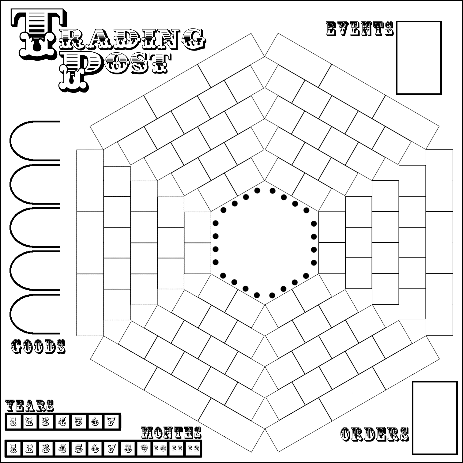
Well, it’s better than nothing, right?
As you can see it values function over form. Ugly though it be, it would still get the job done. So I printed it on 9 different sheets of paper and tried to get all the edges lined up. Maybe my struggles with creating a full size game board when working on Trading Post are what subconsciously led me to not having a full size board for Scoville.
The Territory Tiles:
The main concept of the design involves exploration of your territory. Players start with their pawns in the center and eventually should try to explore all of their territory. So I had to make tiles to put on the sections of your territory as you would discover them.
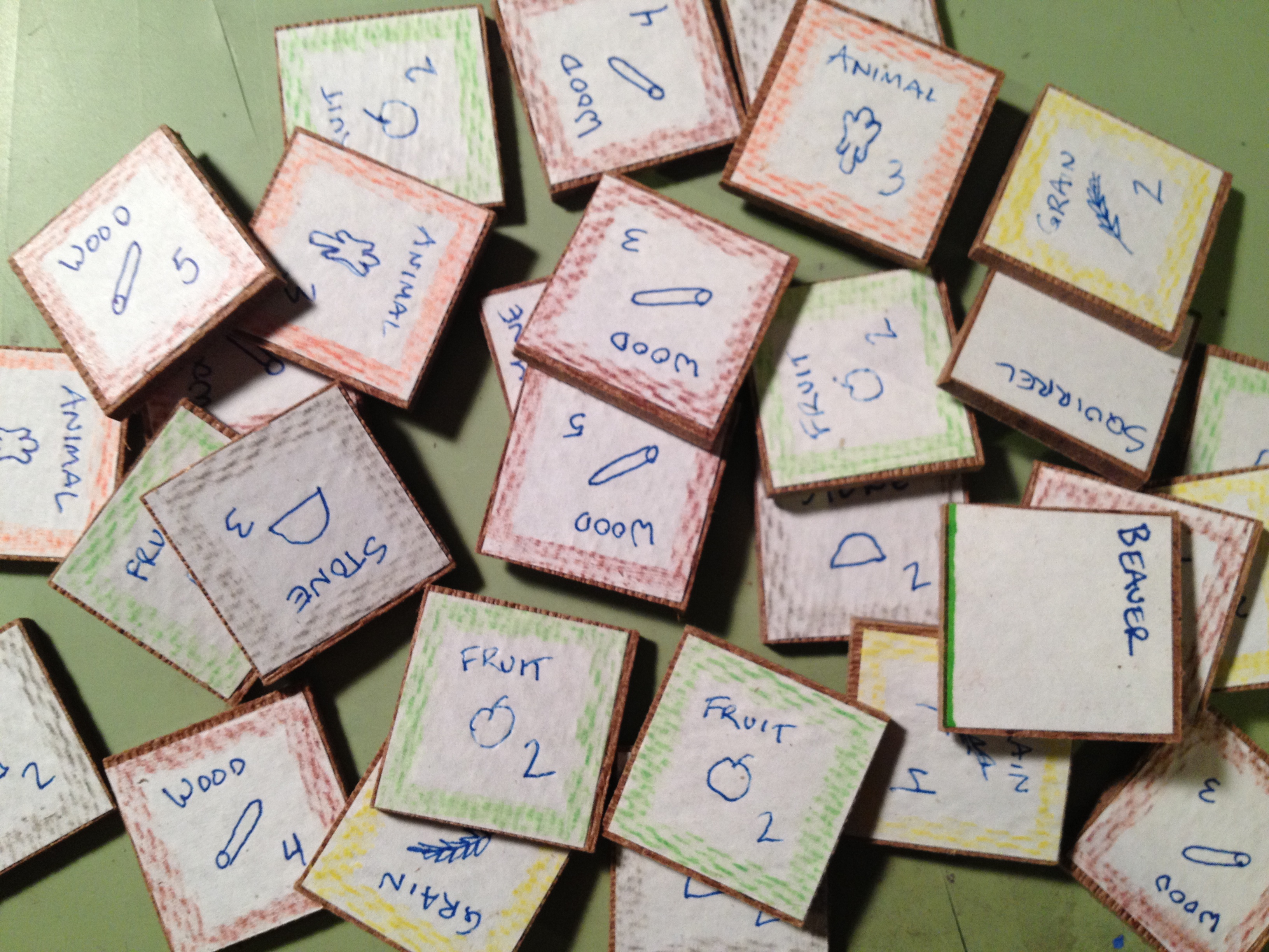
Wood tiles with hand drawn icons and colored pencil edges. Wow.
These tiles would represent different resources that could be available, AND the amount of that resource that the piece of land would produce… for the rest of the game. This included things like Wood, Stone, Fruit, Grain, and more.
Here is a lesson I learned when prototyping the territory tiles: Just buy chipboard components from someone like Printplaygames.com. For the cost you can get just about everything you would need to get your game to the prototype phase.
Did I make such a wise decision? Not even close. I actually bought a wood board and went to a friend’s house to use their table saw to cut 1″ square tiles. Then I cut out square pieces of paper. The paper got glued to the tiles. Then I drew little icons on each one and colored the edges to match the icon. Here’s a recommendation: Don’t do it like that!
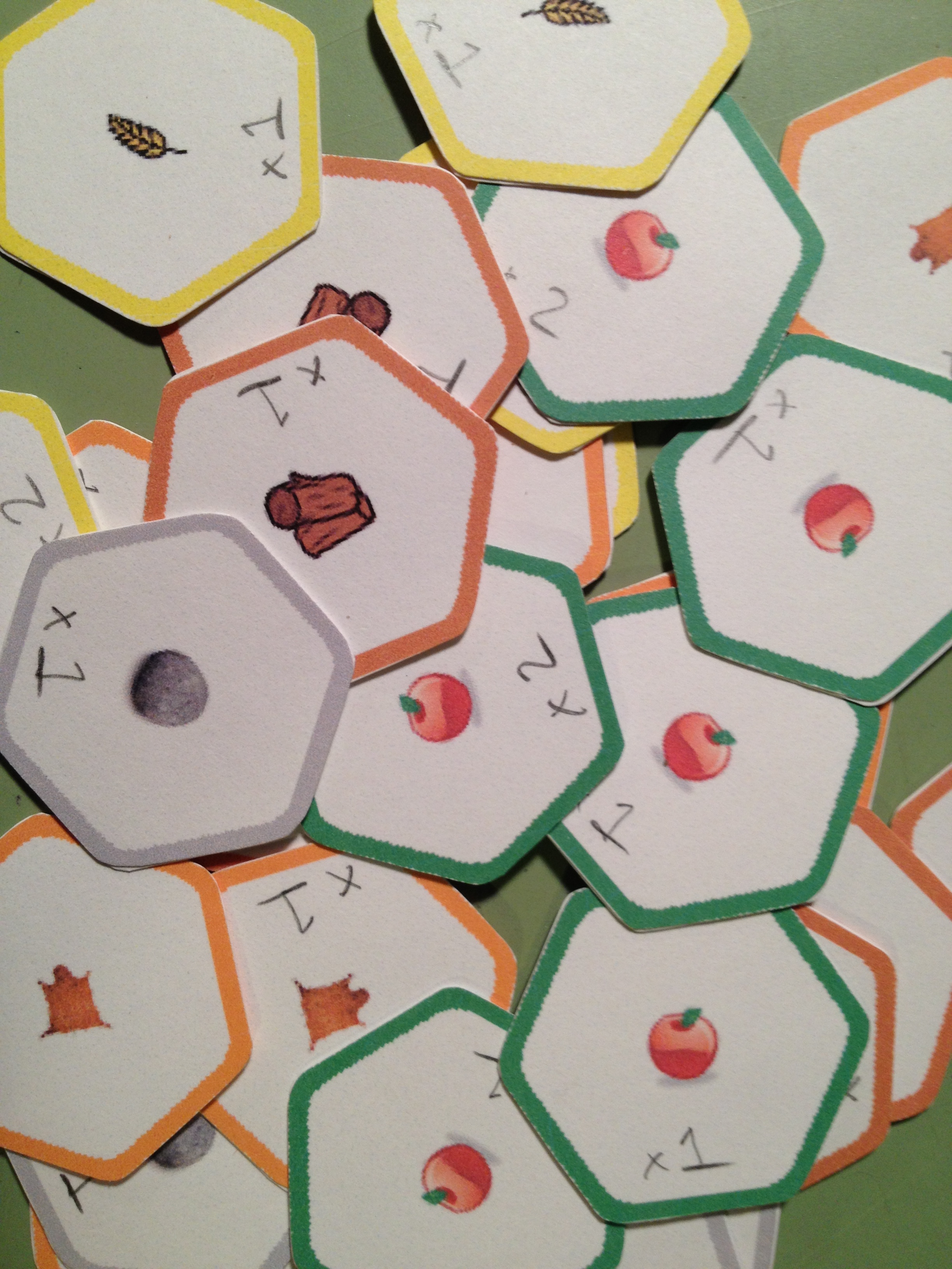
Hex punched, corners rounded, glued back to back. Aye!
Eventually I got to the point where a hex-based grid seemed like a better idea and I began to work toward a hex-based prototype. I used a computer aided drafting software called SolidWorks to render a hex grid that I could print out for the hex-based prototype. I don’t recommend using CAD software for board game design unless you’re making minis. The main problem is that the CAD software typically doesn’t allow you to save images in high quality. The downside of the change to a hex-based system was that all the effort I put into the wooden square tiles was now wasted. (I can say that it was wasted because it was never even used in a playtest).
The hex-based system didn’t change how the game was played. It just made things fit a little better and look neater & tidier on the board. It was at this point in my board game design career that I decided to purchase a hex-punch. I bought a Creative Memories Double Hex Punch off eBay for about $8. It turns out that that’s a crazy awesome price! Despite the price I recommend buying a variety of punches, especially circles. I just searched and found a few of the Creative Memories hex punches on eBay for about $37. Another free designer tip:
Punches can be your best friend!
Here is a link for punches from Fiskars. I would recommend starting on eBay, though.
Ugh. Looking back on all of this makes me wish I had been familiar with Inkscape at the time I was working on this design. All of the art and tiles could have been made with Inkscape so much more easily than what I was doing.
Well I now had my territory tiles made. Now it was time to add the other unnecessary ingredients in this poor game design…
The Event & Order Cards:
After reading the article about what makes a game good (Note: here’s the article I mentioned in last week’s Trading Post article, thanks to Neil Roberts who found the link – What Makes a Game Good?) I knew that I wanted to especially avoid monotony in the game design. I already had a random draw for territory exploration. But how else could I increase variability and replayability?
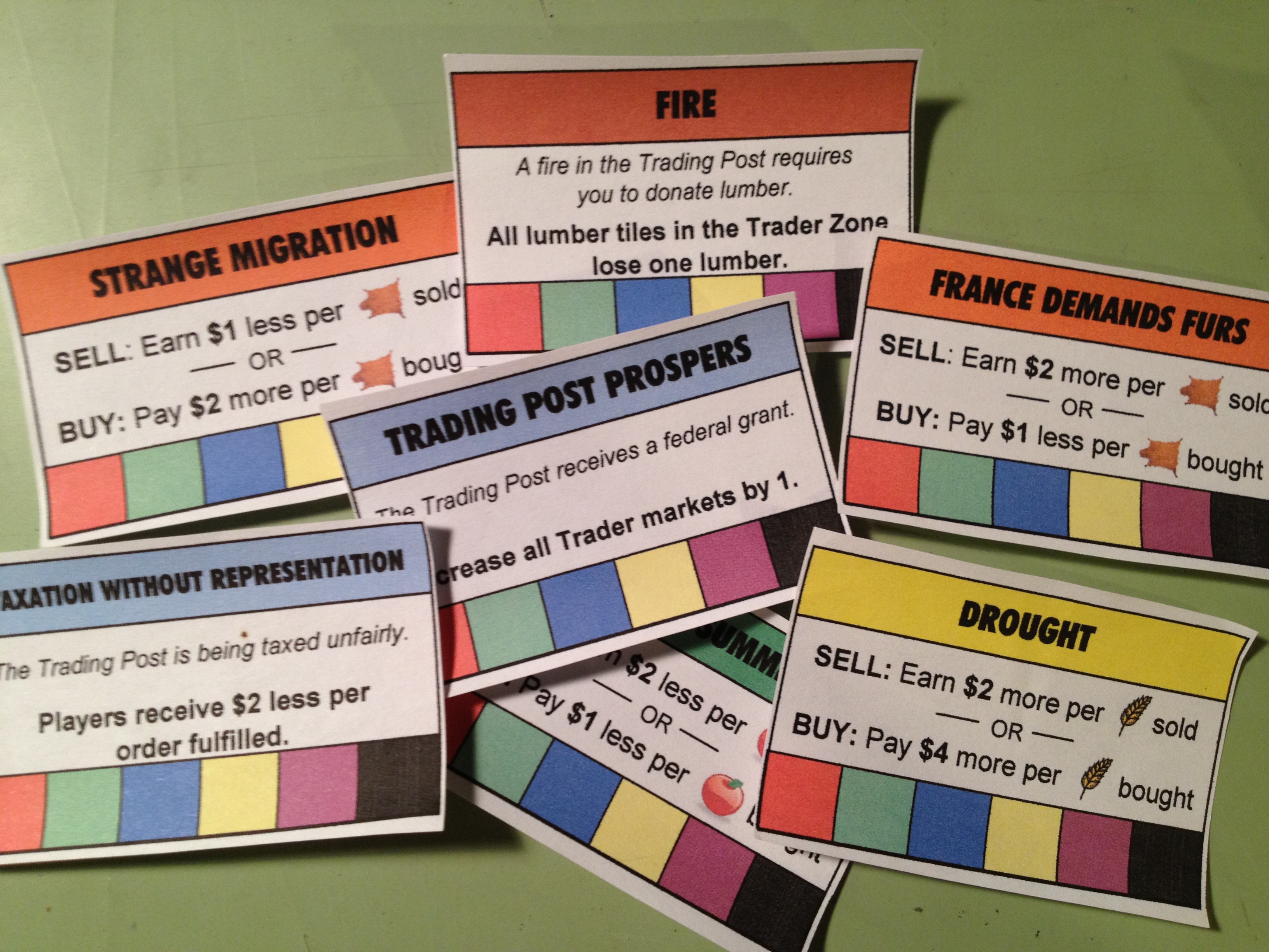
My poor attempt at adding replayability.
I came up with the idea that each “year” in the game would have something different going on. I called these “Event” cards. They typically affected how the market worked for different goods. But they also could positively or negatively affect all players. A few of the event cards are shown here on the right.
These were masterfully made in Excel. The bottom row of the event cards is a spot for players to put a cube of their player color when the card affected them to show that it had done so. Cards could only affect a player once. The top box on the cards is also color coded. The DROUGHT card in the image affects GRAIN and thus matches the yellow color of the grain. Pretty awesome, huh?
But this wasn’t enough! Another free designer tip:
Don’t add complications until the game needs it!
At the time I was designing Trading Post I hadn’t learned that lesson. So I added ORDER cards in a seemingly theme-less way to make each game different. I guess I was really worried that people would be bored with Trading Post after one or two plays.
Thematically the ORDER cards represented things the Trading Post needed during that year. That at least made sense. These things included blankets, hats, pies, buildings, flagpoles, and on and on. I struggled to make a list long enough of the sorts of things that a Trading Post might need. But eventually I got them all together and started making more “awesomeness” in Excel. Here’s a glimpse of the result:
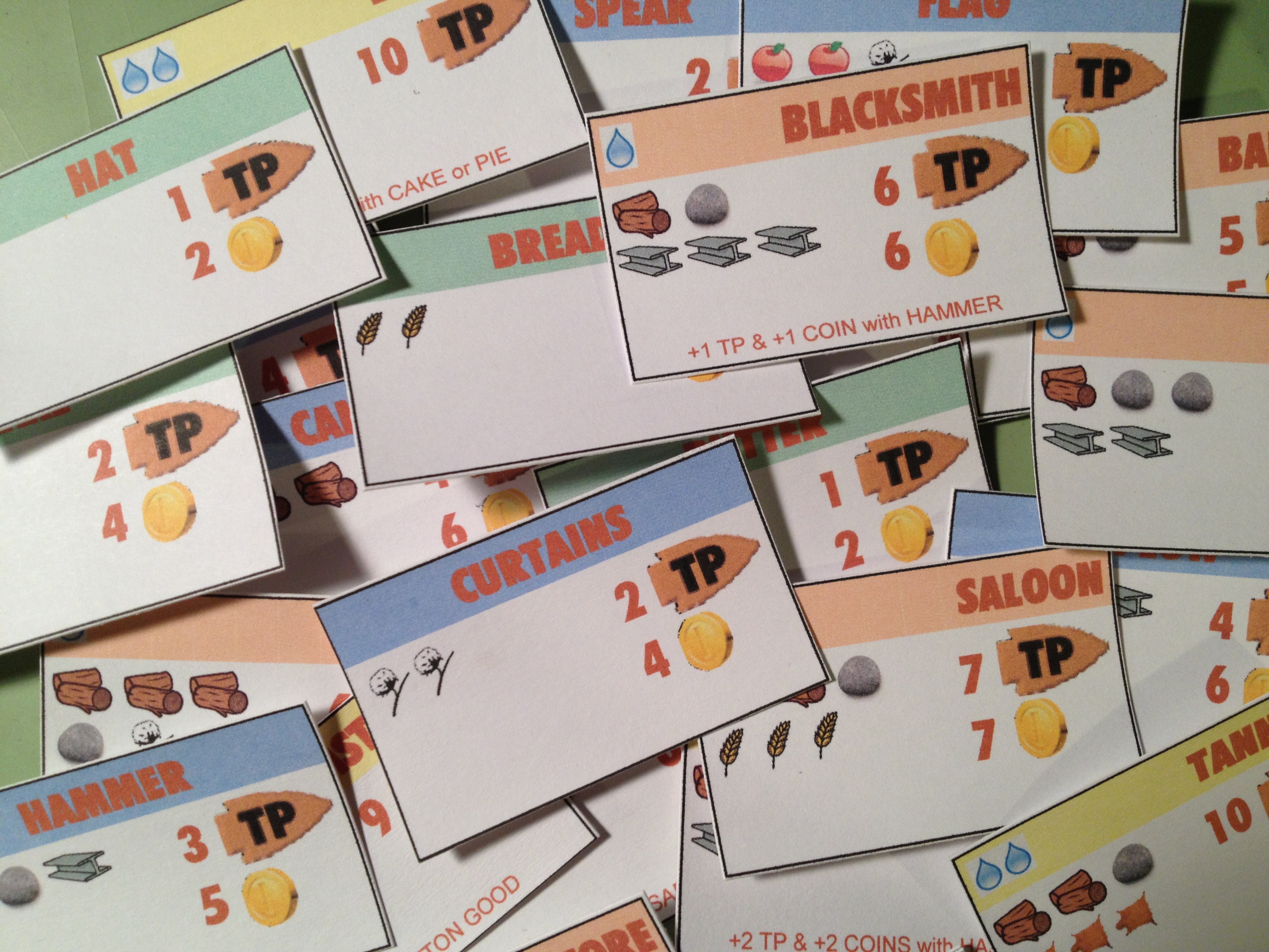
Trading Post Order Cards. Excel is NOT a graphic design tool!
So made a stack of about 50 order cards that would come out randomly, four per year. These would be available on a first come-first serve basis. The cost is shown on the left. In the image above, for example, the curtains would cost 2 cotton. The reward is on the right. In the same curtains example the reward was 2 Trading Points and 4 coins. I even added further complication by having some order cards provide a bonus if the owner already had fulfilled a prerequisite. In the image above an example is the BLACKSMITH. If you had fulfilled the HAMMER order card for the Trading Post and then fulfill the Blacksmith card you would earn an extra point and an extra coin. I suppose I added this to the design to produce a more guided decision tree to players.
In most of these images the way the prototype components were made was by printing on normal paper and glue-sticking them to 60lb. paper. The problem with this method is warping. And it was a big problem with the original Trading Post components. This is one reason that I have moved on to gluing stuff to matte board or chip board.
The market.
By this point in the design I had the board, the territory tiles, the event cards, and the orders. A market board was also built for the game to allow people to trade for different goods. This would be the driving economic factor of the game, but would also allow players to obtain goods that their randomly seeded territory did not produce. With all those components in place it was time to focus on what was in front of me… the player mat!
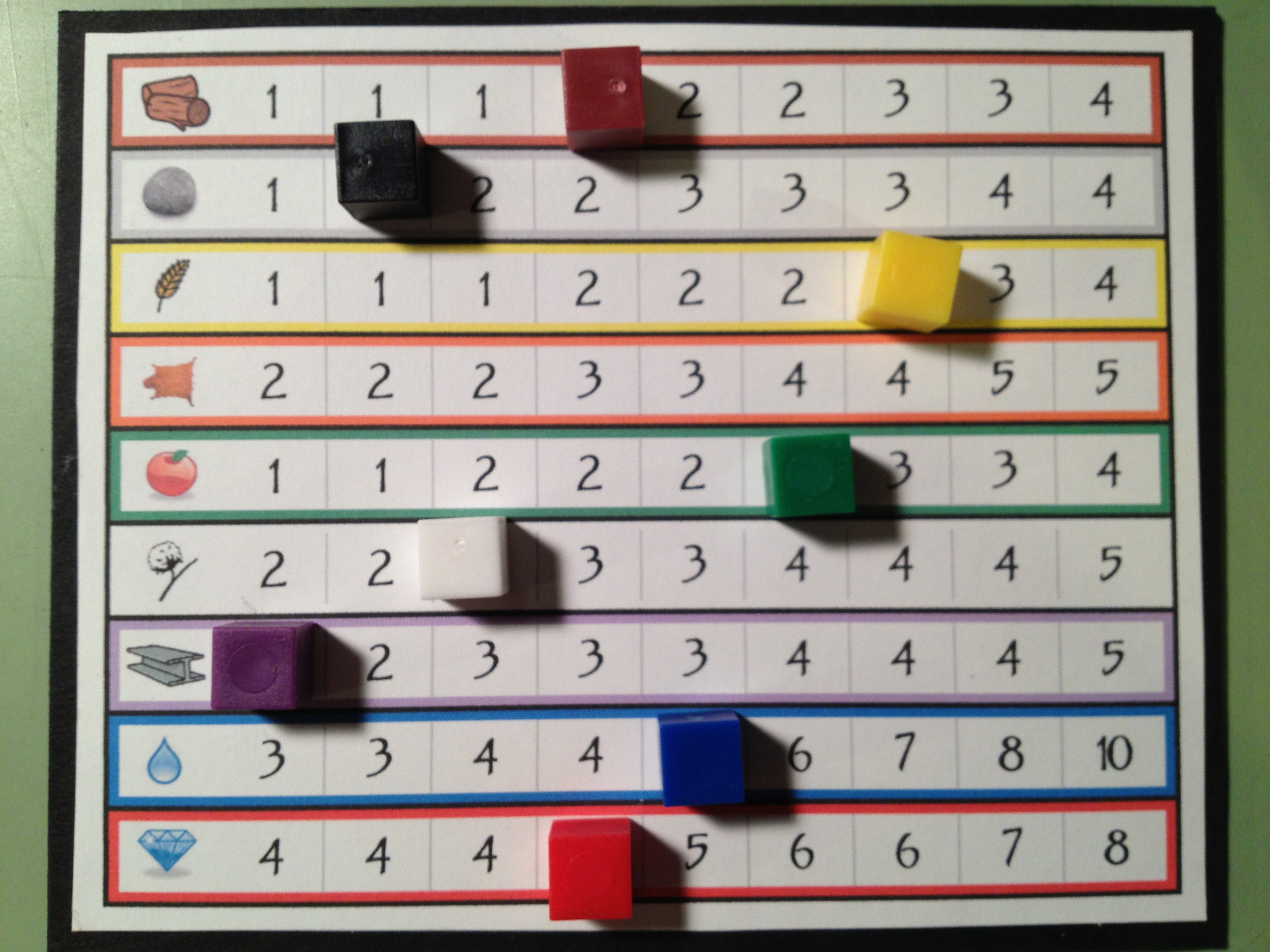
The Player Mats:
Since I knew that I wanted a main concept of the game to revolve around exploration I decided that upgrading your ability as an explorer would be critical. Thematically that meant going from a “trader” to a “trader with a horse” and eventually to a “trader with a wagon.” From early on in the design I limited the explorable zone for a “trader” to the first two rows out from the Trading Post. The idea behind this that fit the theme was that a man or woman could only walk, explore, and carry enough food for an expedition two rows out from the Trading post. By upgrading and purchasing a horse you’d be able to move faster and thus could explore more territory on the same rations. So when you purchased a horse you would be able to explore rows three and four away from the Trading Post. Finally, if you wanted to explore the outer most regions you would need to build a wagon.
So there is a side objective of all players in the game to be collecting the components they needed to be able to build their wagon. In the design I set it up so that you had to procure certain items. Once you had all these items you had a de-facto wagon. The wagon would allow you to explore the fifth row from the Trading Post.
I designed the player mats to show how far you could move and how much you could carry based on your status. And I included a Wagon Construction Area showing your progress toward a wagon. Here’s a look at the first and second versions of the player mats:

The top shows the original version. The bottom shows the cleaner, more user-friendly second version.
The cool thing, or at least what I thought was cool, was that in the second version you would actually be building your wagon by placing the pieces on top of the illustration.
One other thing to point out about how the game worked is illustrated in the second version of the player mats. There is a row for INCOME and a separate row for MONEY. Thematically the INCOME row represented any money earned during your turn. This would be like getting a paycheck. The way it worked was that after your turn, your income would be added to your money and then the income track would be set to zero. This means that any money earned on your turn isn’t available until the next turn.
I would say that through this whole prototyping process, which occurred in mid-2011, my favorite components were the player mats.
Overall Prototyping Experience:
The best possible tip I could provide to designers regarding prototyping would be this:
Just make something functional and test it. Only put in the effort to make it look good once you know it’s working.
Next week you’ll see that I don’t heed my own advice. But I’m inhibited by my desire to make things look good. And now that I know how to use Inkscape it takes much less effort to produce something that looks good.
Looking back at all the things I did for Trading Post I’ve realized that I wasted a lot of time. I built spreadsheets. I wasted hours using The Gimp to make that board. I added needless complexity, which then required me to make more components.
The game was only attempted to be playtested in its previous form twice. The effort to playtest ratio for this game is just ridiculous. So next week I’m covering my hiatus from the game, how I’ve advanced as a designer during that hiatus, and now how I’m going about redesigning the game. With that in mind I’ll leave you with one final image, which is a printout of a spreadsheet that I made so I could take notes on. This illustration sums up all the things that I am trying to avoid with the redesign!
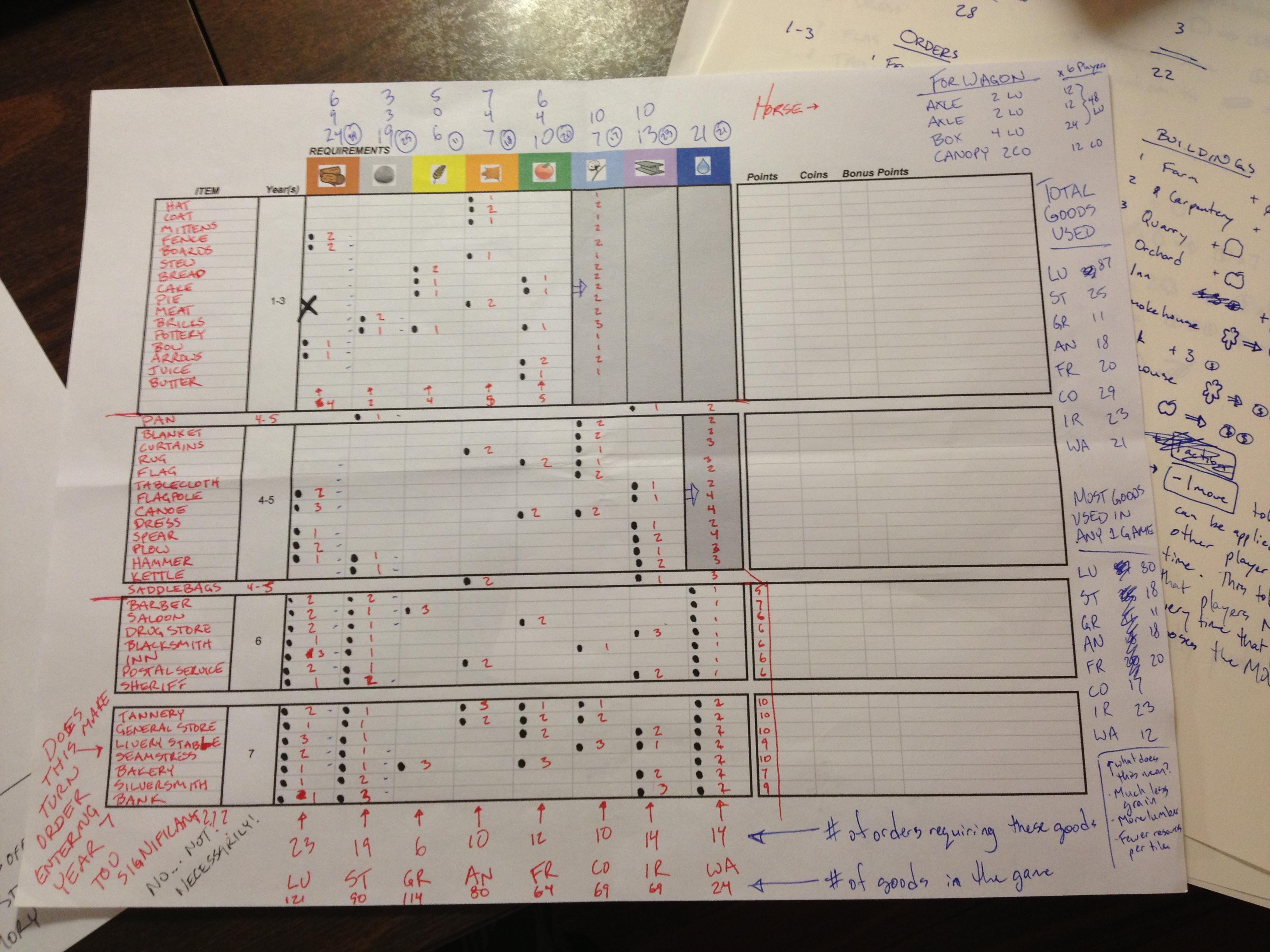
Wow. Just wow. Next week you’ll see dramatic improvements!
Thanks for reading. I’m happy to answer any questions you have about Trading Post and the things I’ve posted so far. Just share your comments below!
BGR: Guildhall
I’ve had the privilege of playing Guildhall four times now so I figured I’m overdue to review it. So since it’s Friday and I post game reviews on Friday I figured better late than never. Let’s see what I think of the game!

He’s smiling because of bacon!
Guildhall by Alderac Entertainment Group is a card game where players try to fill the halls of their guilds (imagine that). To fill a guild you have to have five different colored cards of the same character. There are Farmers, Weavers, Dancers, Historians, Traders, and Assassins. Each character type provides you with some different ability. For example, when you play a dancer you get to draw a number of cards equal to the number of dancers in your guild and you get an extra action. Players have two actions per turn.
This game is played to a certain number of points. Points can be earned in two ways. The Farmer cards allow you to earn points if you have a certain number of Farmers already in your guild. The other option to earn points is by completing a guild hall and turning it in for a card with a point value on it. The winner is the first player to 20 points.
Here’s a look at Guildhall on the table (Image via Trent Hamm via BoardGameGeek.com):

This is Guildhall. A big game in a small package!
The Upside:
- OPTIONS: So there’s only six different types of cards, how many options can there be? Well, each card does something slightly different based on how many of that card you have in the guild. So 6 cards with 3 categories means 18 options every turn. But it’s even better because you can combo things, which is awesome!
- INTERACTION: This game has a great amount of interaction. You are constantly messing with other players guilds and they are doing the same to you. You are constantly hoping that they won’t mess up the guild that you’ll be able to complete on your next turn. This game definitely has a nice back-stabby layer to it!
- WEIGHT: This game is just a big deck of cards and a few coin chits. But beneath the surface is a pretty deep and tense strategy game. Players can’t plan too far ahead but it’s important to make good plays with at least your next turn in mind. This game is heavier than one would expect. And that’s a good thing!
The Downside:
- QUALITY: I’m sort of a stickler for good quality. In this case it’s not the physical quality that bothers me but rather the visual quality. My problem with it is that in the copy I’ve played there are different shades of the background colors. For example, the green Farmer will be a different green than the more limey green Trader. It just bothers me. This does not affect gameplay though.
- LACK OF CONTROL: Often in the game it feels like you don’t have much control over what’s going to happen to you. If you jump out to an early lead, beware, because they’ll probably all come after you. And there’s nothing you can do about it. That bothers me, but only a little.
- THE BOX/INSERT: The box for Guildhall is ridiculously large. Like I mentioned above, this game is just a deck of cards and coin chits. The box is just oversized for the amount of components you receive. This does not affect gameplay though.
Designer Perspective – What I Would Change:
The only thing I don’t really like about the game is that once you’ve filled a guildhall you basically just turn it into points. And if you’re wise you’ll likely grab the highest valued point card available. As a designer I’d like to see the ability to use the completed guild halls in a more interesting way. My suggestion would be that the face up cards that represent points would require sets of completed guildhalls (like Farmers and Dancers). This could make it more strategic if all the players are really trying to complete the same guild.
Beer Pairing:

This game feels like a light beer but plays like a heavy beer. There’s one beer in particular that fits the bill for me and that’s Guinness, which drinks like a light beer but feels like a heavy beer. (I guess that’s the opposite… oh well) So I’m pairing Guildhall with a classic brew, Guinness Draught. This beer is a very enjoyable beverage that is deeper than one might originally guess. Just like Guildhall.
OVERALL RATING:
I didn’t care much for this game when I first played it. That’s due to my lack of understanding of how the cards could really interact with each other. (Maybe I shouldn’t review games after only one play!) But now that I’ve played four times I can really see how well this was designed. Not only is there player to player interaction, but card to card interaction. My favorite combo is to “weaver a dancer” and then play a dancer to get the extra card and action. I’ll rate this game an 8 out of 10 according to the Board Game Geek ratings scale.

Very good game. I like to play it. Probably I’ll suggest it and will never turn down a game.
Trading Post Part 1: Origin
Trading Post Logo… for now.
I have a new game design I’m working on and today I am posting the first of 4 articles about it. Today, and the next three Thursdays, I’ll be writing about the game from it’s creation to the present state. Here’s the four articles I’ll be writing:
- TODAY 5-16-13: Origins of Trading Post
- 5-23-13: Prototyping Early Versions
- 5-30-13: Hiatus and Re-design
- 6-6-13: Path to GenCon
So let’s jump back to 2010 when I was first diving into game design and take a look at how Trading Post became a thing…
Concept: Theme
Here you are, explorer extraordinaire! You have been selected from an elite group of explorers to develop a new Trading Post. You role, should you choose to accept it, is to utilize the resources found on your section of their territory, and contribute the most to the Trading Post. Contributions include constructing new buildings for the Trading Post, successfully exploring all of your allotted territory, and completing trades that are beneficial for the Trading Post.
Concept: The Map
Normally when I start a new game design I start with a theme. Trading Post is an unusual case in that it started with both a theme and a map mechanic to be used in that theme. For some reason I thought that a square grid with spots on the corners for putting cubes would be a good idea. And it would seemingly work very well with the Trading Post concept.
Here’s a look at one player’s section of territory in very alpha artwork, if you can refer to lines as artwork:
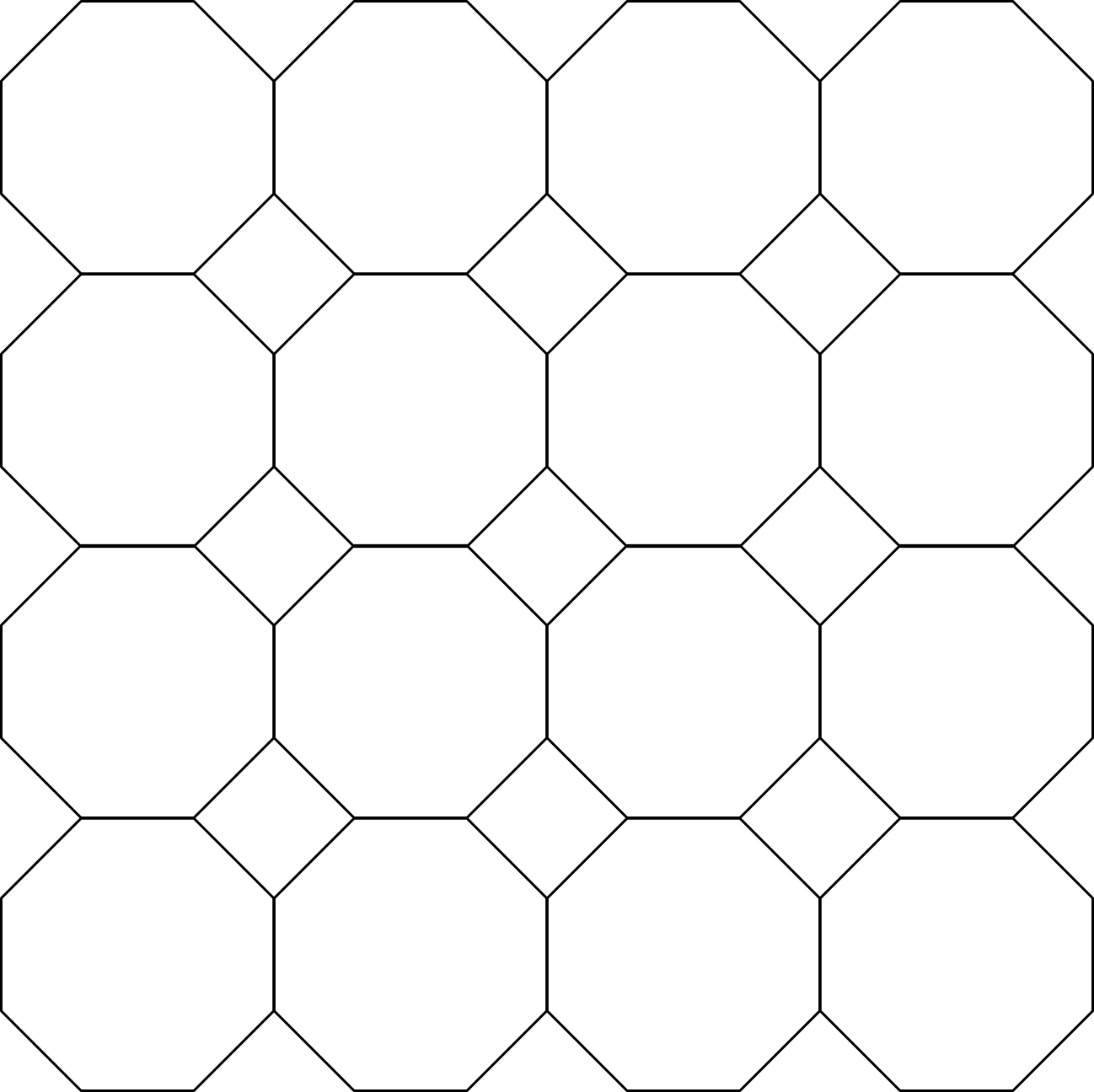
Octagons represent land/buildings. Diamonds represent resources.
The idea of the map is that you can explore the land and add buildings to the octagons. Then each building can produce something that you can place into the diamonds. The resources would be represented by cubes, which would fit very nicely into the diamonds. The really sweet part of this map design is that you have to try and move your goods into the diamonds that adjoin to your territorial neighbors so that you can trade with them without having to use the Trading post as a middle man.
Concept: Game Play
With a theme and map mechanic in place it was time to figure out how the game would actually be played. I had found a really nice article online about what makes a game good. It included things like Tension, Replayability/Variability, No Runaway Winner, No Kingmaker, No Player Elimination and more. If anyone know of the article can you share the link? I can’t ever find it. So after working through some of those things in my head I came up with a ladder type design where you would become more capable of doing more things on your turn.
The idea of this was that you would start as just a person in the Trading Post. You would thus be able to move one spot per action, and you could only explore up to two rows into your territory. Since exploring all of your land is part of the game it would be important to build up the capability. So the first step would be to purchase a horse via trade with the Trading Post.
Once you traded for a horse you would be able to move two spots per action. You would also be able to explore the next row. In the game design the tiles that would be available in this “Horse Region” were better than those available in the “Person Region” (first two rows). This would allow you to do more stuff, make better trades, and work toward the wagon.
The Wagon was the last “upgrade” you could do. To build the wagon you would have to make a series of trades to procure the necessary components: wheels, axles, canopy, box. Once you’ve upgraded to the wagon you can then move three spaces per action and explore the furthermost regions of your territory. This is vital as the most valuable resources are only available in the “Wagon Region.”
Concept: Time and Action Points
During the game each action would cost a certain amount of time. The game would be played over 7 years with each action costing a certain number of months. So moving would cost 1 month. That’s why it would be important to upgrade to a horse or wagon as early as possible to be able to move more spots with the same action. Basically with the game being 7 years of 12 months each player would have 84 action points to work with.
Because I made “time” part of the game I was able to also have the seasons play a role. Each year had a new “Event” card come up that affected something for the year. This could be seasonally dependent as well.
So I came up with a series of event cards to add several things to the game design:
- Replayability: Each game would be different since the draw of event cards is random.
- Variability: Specific scenarios of event cards could be established to promote specific game play.
- More details: Having event cards made the game deeper, in my opinion.
I found early on that having a time mechanic like this made things difficult to design. Since players weren’t always taking the same number of actions on a turn I had to incorporate a “last player gets a turn” mechanic similar to that in Glen More. By doing this I would never have to worry about how player order worked.
The other downside of having 84 actions points (84 months) in the game was that every single turn players would have to advance their “months” token and potentially their “years” token if they entered a new year. Fiddly.
Concept: Overall
I thought I really had something with this game design. I was gung ho about putting together a prototype and making this into the most awesomest game ever. With 8 different resources, 84 action points per player, upgrades to a horse and then wagon, land development, trading, exploration, etc. I knew this would be awesome. Perhaps I was being a little too optimistic.
In my mind I thought this game had a lot of potential. I put a lot of time into it early on only to realize that it was ridiculously complicated. Next week I’ll cover my initial prototyping efforts and the lessons I learned during that phase. In two weeks I’ll share with you the current re-designed version, which is night-and-day better, potentially even being a playable and fun game. And three weeks from now I’ll discuss my path forward with the game as we approach GenCon.
If you have any questions or comments about the game over the next three weeks, just let me know!
Scoville Print and Play Version 2

Version 2 awesomeness now available!
I am pleased to announce that Version 2 of the Scoville Print and Play files are available for download at BoardGameGeek.com. Here is the link:
There are no major rules revisions to the game. The only clarification to the rules is that when selling peppers you must sell peppers from your own supply. Peppers in the fields are not for sale.
There are a few changes to the Print & Play files. The most notable change is that Gold has been dropped in favor of Silver. I’d like to thank Adam “A-Game” Buckingham for the suggestion. This was done for two reasons:
- Black + White blends to gray, not gold. So from a color perspective this is much less confusing.
- There is a much lower chance of confusing yellow with silver. These two colors are now more distinct.
The PnP files also have a few other revisions. These include:
- Artwork for the Bonus Point Tiles for secondary peppers (green/orange/purple) has been adjusted to decrease confusion.
- The Field has been slightly increased in size to better fit with the pepper tiles.
- The pepper tile artwork has been changed to help with color blindness and for clarity.
Here’s a peek at the revised pepper tiles:
 By adding the pepper image to each tile it will help with color blindness. Each pepper is a different shape. And by changing the artwork to include the green border it should help to clarify where the player pawns will actually be walking. I showed this image to my wife and she said she thinks the game would be better with these rather than the cubes. This was actually a suggestion of Brett Myers (@brettspiel) during Protospiel-Milwaukee, so I must give credit where credit is due!
As usual, if you have any questions about the PnP files or the rules, or the game in general, please feel free to leave a comment here on Boards & Barley or on the BGG download page. Or feel free to email me. And I’d love to hear what you think about the game!
Board Game Review: Myrmes
DISCLAIMER: I am reviewing Myrmes after one play (2-player). Why do I review games after one or two plays? Because It’s the first two plays that will determine whether or not I want to play it again! If I don’t like a game after those first two plays then I’m definitely moving on since there are so many other good games out there. Now on to today’s review…

The Ants go marching two by two, Hurrah! Hurrah!
Time for another Friday Board Game Review! Today’s game is one with an interesting theme: Building an Ant Colony!
In Myrmes you are in control of an ant colony. It is up to you to manage your workers, soldiers, and nurses to improve your colony as best as you can. Throughout the game you are faced with thematic decisions. Should you sacrifice a worker above ground to provide food for your colony? Should you leave a nurse behind and score points by completing an objective? Should you make more babies??? These are all serious questions, people! And when you play Myrmes you’ll have to make these sorts of thematic decisions! Over and over again!
Here’s a look at the board and components (image via BoardGameGeek.com):

It looks pretty intense! But is it any fun?
So after one play what did I think? Let’s find out…
The Upside:
- COMPONENTS: This game has a bunch of components and they are almost all of very nice quality. The best, of course, are the little plastic ants even though they sort of look like spiders.
- ARTWORK: I think some of the artwork on this game is outstanding! I really like the player mats with the ant colony. The artwork there looks really nice and it feels like you are underground in an ant colony.
- THEME: I thought things fit the theme very well. It felt like you had to decide how to run a real ant colony.
The Downside:
- COMPONENTS: While quantity doth not make great a game, quality can ruin one! The hexes that are placed onto the board look and feel nice, but they are not the same size as the hex grid on the board. Therefore they don’t fit properly.
- ARTWORK: While the player mat artwork is really nice, the overall continuity of artwork in this game is non-existent. The player mats are so different from the board, which has about four different art styles (the score track leaves, the distressed seasons, the background, etc.). It just doesn’t seem to be the same style throughout all the components.
- THEME: By fitting the theme of an ant colony I asked myself, “What’s fun about an ant colony?” Aren’t I supposed to be playing a game and having fun? Are ants fun? The most fun I ever had with ants was burning them with a magnifying glass.
So that was interesting. For the first time I listed the same categories as both upsides and downsides to the game. I suppose that goes very well with my mixed feelings about this game.
Designer Perspective – What I Would Change:
While I can understand the desire to make a game that so thematically fits with the idea of running an ant colony I just wonder why they actually designed this game. There was very little interaction and I often felt like I was just doing things to do them. As a designer I would have tried to inject more tension in the game. I think this would be best accomplished by having all players be part of the SAME ant colony. Either they could each have their own role (i.e., one player could be a worker, another a soldier, a third a nurse, and so on) or they could control one part of the colony. Then the idea of the game could be to contribute the most to the colony. You could compete over the use of the colony’s resources. Doing it that way sounds like a much more fun game!
Beer Pairing:

Back to work! So play Myrmes!
This is a difficult game to pair with a beer. But since the game felt more like work than fun I suppose I should pair it with a working man’s beer. So I’m pairing Myrmes with Working Man’s Lunch by Fullsteam Brewery. I’ve never had the beer so this pairing is based on name alone.
OVERALL RATING:
I didn’t really enjoy Myrmes. It was very ‘meh’ feeling to me. It felt more like work than like fun. The decisions weren’t very intense. There was nothing that stopped me from doing what I wanted. The interaction seemed minimal, though that could have been due to it being a two player game. And overall I can’t rate this higher than a 6 out of 10 according to the BoardGameGeek.com rating system.

Ok game, some fun or challenge at least, will play sporadically if in the right mood.
