Blog Archives
Design Me: Action Point Allowance
It’s been a couple of weeks off on Friday’s for me, meaning I haven’t posted a review or Design Me article since life gets in the way sometimes. But I’m back! And today we’ve got an interesting Design Me Challenge. Here’s the result that I liked best from Boardgamizer:
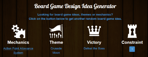
Action Point Allowance to crusade the moon and beat a bad guy! I can do this!
Moon Rattler
In the game Moon Rattler you are in command of one of several military space fleets sent from Earth to destroy the moon. Little did we humans know that the moon is actually a giant rattlesnake. It has laid some eggs and it’s getting really feisty. We humans need to prevent those babies from hatching. It’s time to save the world!
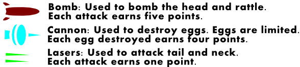
Moon Rattler is an action point allowance game where players are moving around a rondel throughout the game trying to defeat the moon rattler. The player who accumulates the most points during the game will be the winner. Points are obtained by contributing to the destruction of the moon rattler, which can be accomplished in several ways, shown here:
 But these weapons cannot be used freely. Each player will have to charge their weapons or obtain bombs using their action points. Let’s dig in a little deeper.
Components
- Main board
- 6 Space ship meeples
- 6 player mats
- Numerous cubes in each player’s color
- Point tokens
- 18 Wooden egg tokens (3 per player per game)
- Health cubes
How To Play
Players will be flying their ship around the circle in clockwise fashion. At each location they will have 4 action points to use. In any turn the player may save two of their unused points for a later turn of their choosing. So on any given turn a player will have 4-6 action points available.
At each location the player may charge or obtain the item listed. This means that if they spend action points, then they would place a cube onto their player mat in the appropriate location. Charging their weapons or clock or obtaining a bomb require different amounts of action points. Here’s a tentative list:
- CHARGE LASER: 1 AP = 1 cube
- CHARGE CANNON: 2 AP = 1 cube
- CHARGE BOMB: 3 AP = 1 cube
- CHARGE CLOAK = 2 AP = 1 cube
Here is a look at the player mats, showing the maximum goods a ship can possess:
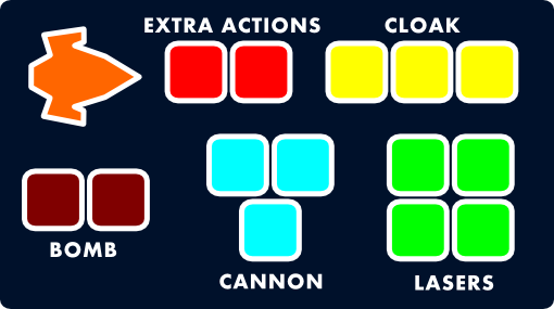
Moon Rattler player mat for orange player
Therefore a ship can hold 2 bombs, a charge of 3 for their cannon, a charge of 3 for their cloak, and a charge of 4 for their lasers.
Here’s the catch: Players have to balance obtaining/charging weapons with moving and actually using those weapons. Let’s take a look at the board so you have an idea of what’s going on here:
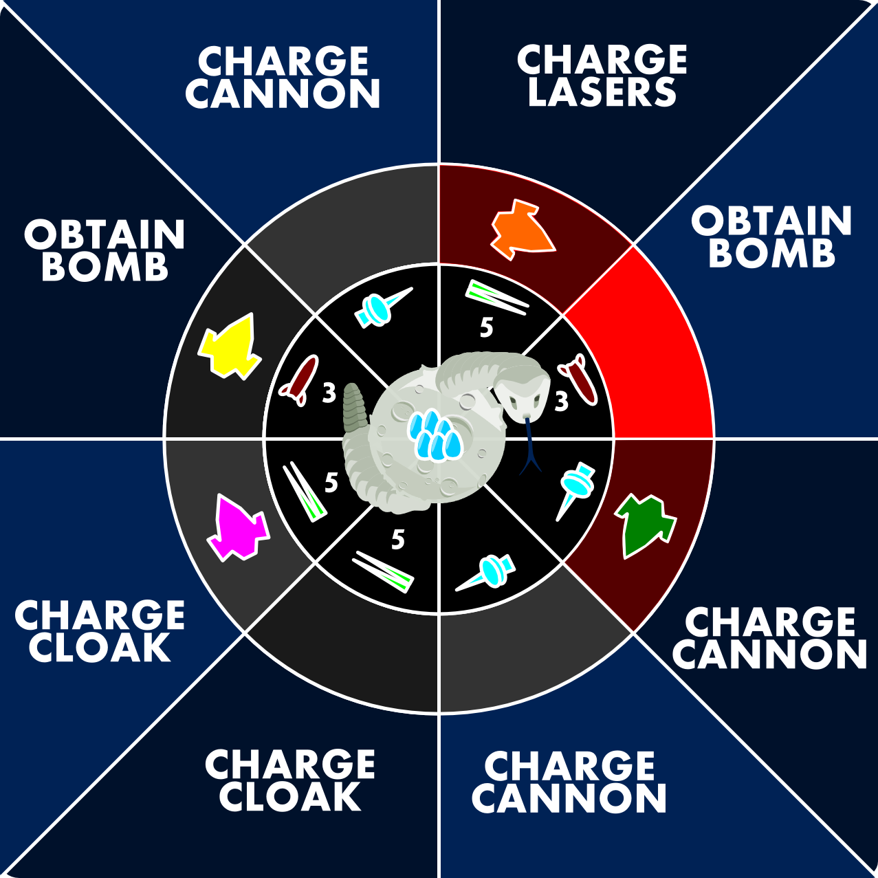
Moon Rattler Rondel Board
Let’s pretend we are the orange player. First of all, we are in a red region. The three red regions near the Moon Rattler’s head are the regions where the rattler can strike you. In the dark red regions you lose 1 AP if you are not cloaked. In the bright red region you lose 2 AP if you are not cloaked. Using the cloaking device does not cost AP, but the cubes must be discarded from your player mat.
So the orange player is in a region with CHARGE LASERS. The region also shows that only lasers can be used to attack in that region. So the orange player is basically deciding if the want to charge or attack with their lasers.
The green player is in the same situation in the image above with the exception that they are either charging their cannon or using their cannon to attack the eggs. They are also in a red region, so hopefully they had a cloaking cube to discard.
Here’s the other thing. Players may stay in a region as long as they like. Their ships will fly only when they use AP to move around the rondel. A player may use any number of AP to move 1 spot per AP around the rondel.
On a turn a player will use AP in any order. So let’s imagine we are the orange player again. We might have a bomb on board. So we could spend 1 AP to move into the bright red region at the head. Then we could use 1 AP to drop a bomb (and earn 5 points), then we could spend 2 AP to move off the head and onto the CHARGE CANNON region. That would be a great turn if we did not have any more cloaking cubes.
At the start of the game, an appropriate number of health cubes should be placed on the octants of the board. For example, the head region should begin with 3. Each time these regions are attacked, the attacking player will remove one of the cubes per attack. These regions can still be attacked but are only worth 1 point each. The game will end when all cubes have been removed.
My Thoughts: I think this could be an interesting concept. I like the balance of using AP to charge versus to attack. With the rondel in the game it makes it important where you are located. I think I may mock this one up and give it a try.
Your Designer Perspective:
What do you think about the design for Moon Rattler? What would you have come up with for the design based on the Boardgamizer criteria? Any thoughts about my design?
Thanks for reading! And don’t forget to exercise your brain by doing design exercises like this! Have a great weekend.
Thrifting Victory!

I’m not sure how many of you take the time to visit your local thrift store establishments, but every so often I find I enter the doors of the local GoodWill or St. Vincent dePaul’s. Why do I go to those places? I go there to hunt. I go to stalk the ever elusive find. I go to find board games for cheap!
And I’m not alone. A good friend found the game Tsuro for $1.20. We’ve played it at least 7 times. What a find! Each week there is a thread on BoardGameGeek where people list their thrift store finds. I love perusing the list to see what treasure people found. I have never been one to have a good find. Until now.
Farkle Party
My wife and I stopped at GoodWill to look for cheap Halloween costumes for the kids. While she was looking through those racks I headed over to the game section with secret hopes of finding Agricola or something else awesome for cheap. Well, I found Farkle Party, which has six dice cups and 36 dice. For $3.99 I figured it wasn’t a terrible deal for the dice. My plan was to use the dice for game designs in my queue.
The tin was taped shut and I didn’t want to be that weird guy in the store that untapes things to check them before buying. So I bought it. At our next shopping stop I waited in the car while my wife went in. I figured it was as good a time as ever to open the tin and examine my new dice! However, there were no dice! Instead it was full of this:
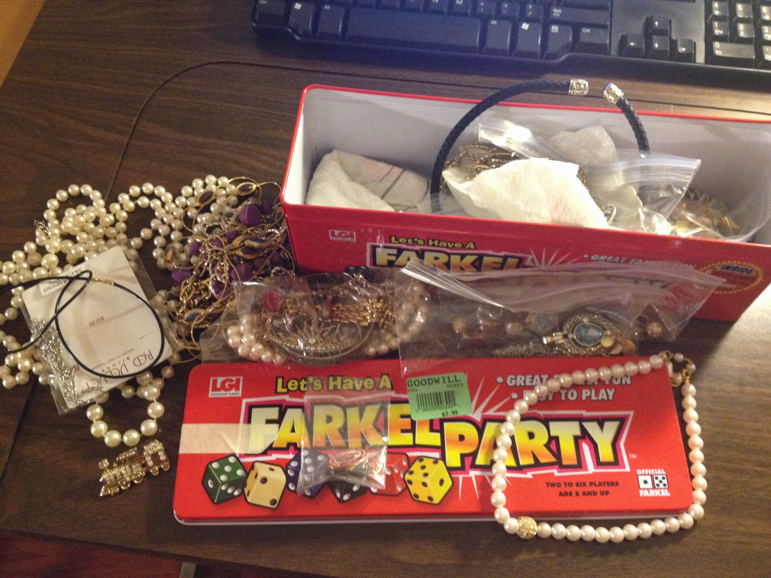
No Dice!
Jewelry! At first I was really disappointed because I wanted the dice. But then I realized that there might be something of value in it. So I looked through it a little bit and picked out a few things that I thought might have value.
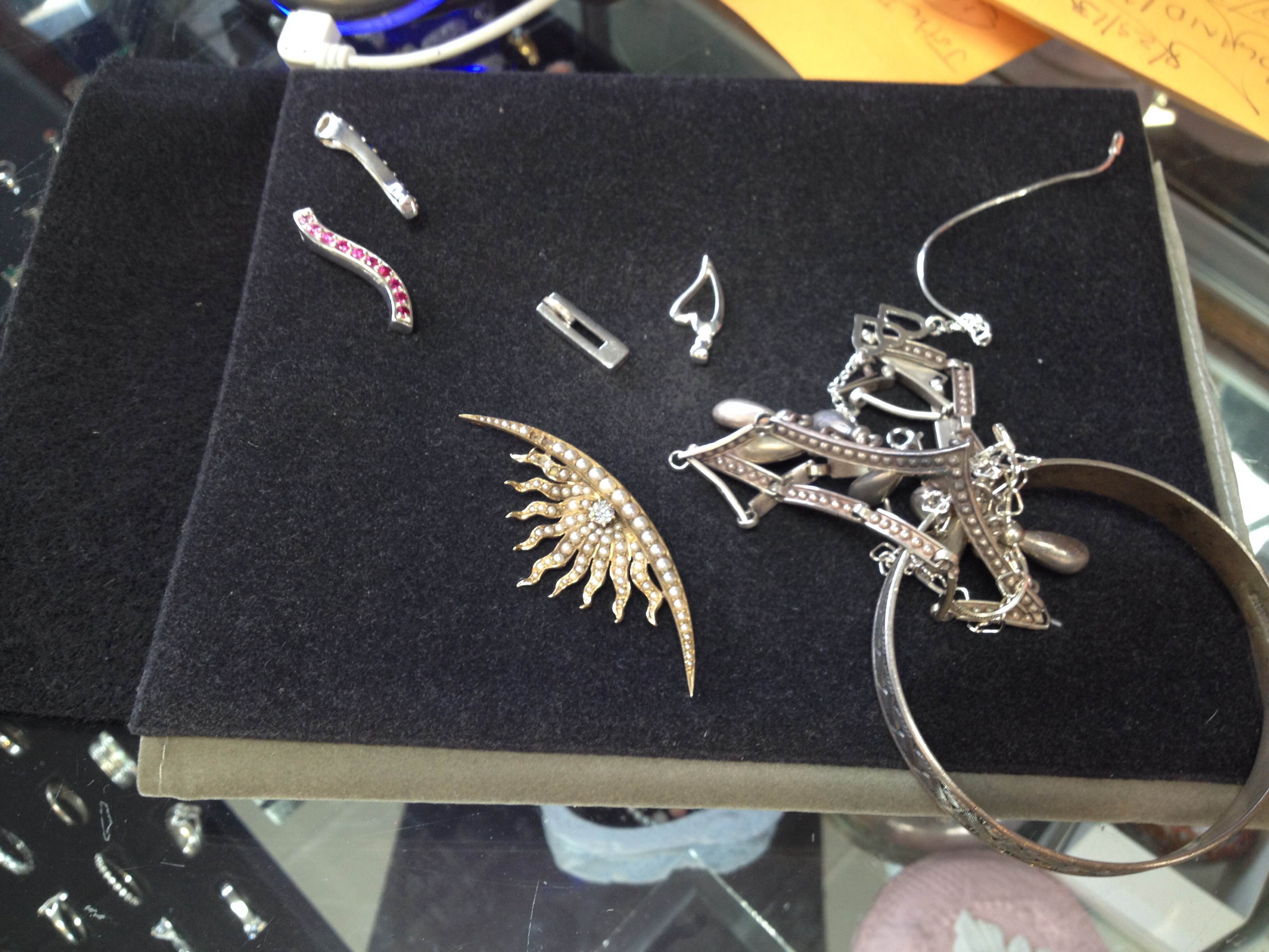
The items I sold.
Yesterday I took those items into a local jeweler to get them appraised and see if they would be interested in buying them. Here’s the results:
- Sterling silver items and miscellaneous items: $35
- Diamond on a brooch: $90
- Gold on a brooch: $142
So my $3.99 purchase earned me $267! Now that’s a thrifting victory if I’ve ever heard of one! Have you had any thrifting victories?
Prototype Art: Icons in Inkscape
Inkscape logo of squidy awesomeness!
One of the things that can take your game design from playable to pitchable is iconography. Icons can really help put a nice polish on a game. There are a few benefits that icons can provide for your game design:
- Ease of viewing/understanding
- Beautification
- Language Independence
Those are a few and I’m sure there are more. So today I wanted to present a tutorial similar to my “Cubes in Inkscape” tutorial to help game designers with the creation of icons for their games.
This article will be focused on the software called Inkscape. It is a free Scalable Vector Graphics (SVG) software. Don’t worry too much about what that means, just know that it’s awesome. If you don’t have the software I recommend downloading it and using it for your game design art. Note: if you have Photoshop/Illustrator then I would recommend staying with that and skipping the rest of the article.
Also, if you love icons but just can’t figure out how to make your own, then head over to Game-Icons.net where they have over 1,000 free icons for your use. So let’s get started.
Let’s Get Iconizing!
So “Iconizing” isn’t really a word. But that’s beside the point. The objective for today is to teach you how to make icons that you can use with confidence in your board game designs. We are going to be making a barley icon. But you’ll hopefully be able to use what you learn here today to make any icons you might need for your game design.
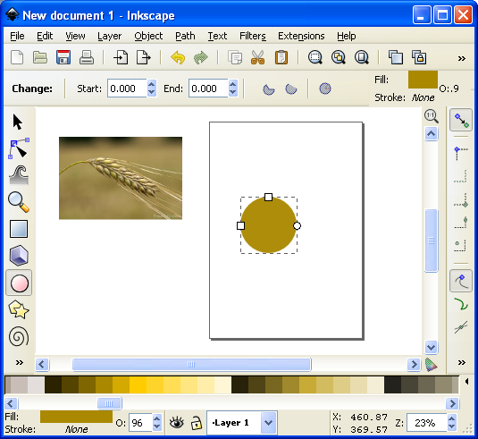
Once you’ve downloaded and opened Inkscape you’ll see a plain canvas outlined in front of you. I like to leave it turned on, but you can turn off the “edges” if you visit the document properties under “File.” Here’s what it should look like:

We will be working with the “Create Circles, Ellipses, and Arcs” command for this article.
You’ll often want a web browser open as well. It is often beneficial to do a web search for the item you are looking to iconize. So here’s a snapshot of a web search page for barley:

Using a web search can give you ideas of how to iconize the item.

Barley, you’re about to be iconized!
After I’ve done a web search I like to copy and paste a picture or two into Inkscape as a starting point. In this case I’ll be using the photo on the right as my guide for creating a barley icon. So copy that picture into Inkscape if you want to follow along.
One thing to remember when creating icons is that we want them to be very clear and understandable. Sometimes icons represent things, like resources. Other times they represent actions, like “move an extra space.” We before we create the icon we need to know what we are going for. In the barley example we will simply use the icon to represent a barley resource.
So now that the picture is in Inkscape we can start our tutorial. I like to use a picture so that I can create the correct shape of something in Inkscape by overlaying that shape on the right part of the picture and making the edges line up. I won’t show that today since this image will be for reference only, but it is a useful thing to do. I may write about that in the future.
The icon of a barley begins with one circle…
Go ahead and click on the “Circles, Ellipses, and Arcs” command and click and drag a circle on the page anywhere you like. If you want to change the color, scroll along the color bar at the bottom. If you want to make sure it is a true circle, hold CTRL when dragging. If you hold CTRL and drag at a different angle then it will jump to an ellipse rather than a circle. Once you’ve dragged out the circle and chosen a color you might have something like this:
This circle will be one grain of barley.
The next thing we want to do is turn our circle into a Path. There are two ways to do this. The first is to go to the PATH toolbar at the top and click “Object to Path.” The second way to do this is to select the item and press SHIFT + CRTL + C.
 Then we want to use this command from the left toolbar. It is the “Edit Paths by Node” tool and is pretty awesome for what we want to accomplish today. Click on it and then click on our circle. Then your circle should look like this (note that I have zoomed in on the circle):

The dots around the circle are the nodes that we will edit.
What we do next is edit our circle by moving the nodes around. Across the top we have different options for editing the nodes. The tools that I utilize most often are these:
- Insert new nodes into selected segment
- Make selected nodes corner
- Make selected nodes smooth
I recommend playing around with each of those commands so that you become familiar with how node editing works.
So let’s take our circle and turn it into a barley grain. First click on the upper node. Then click on “Make selected nodes corner.” Then you can grab the little circles on the lines extending from the node and move them to wherever you like. Here’s what you might end up with:

By editing the nodes we can make the circle look like a barley grain.
Now go ahead and manipulate the other nodes. I “Cornered” the bottom node and angled up the right side. I moved the bottom node to the right. I moved the top node up and to the left. And I brought in both side nodes. Here’s my result thus far:

Okay. That’s pretty passable for a barley grain. Now we want to make more of them. But instead of following that whole process over and over we are simply going to duplicate this grain. You can duplicate the grain in two ways. The easiest is to simply push CTRL + D. That will make a new copy over the top of the previous version. Then if you click the arrow tool at the top of the left toolbar you can move the new barley grain. Do this about 5 times, line them up, and then you might have something like this (I’ve zoomed out a little):

We are getting there! Who’s excited??
Okay. It is starting to look alright. Let’s go ahead and duplicate the entire thing and mirror it using the “Flip selected objects horizontally” tool. Then you can rotate the whole selection with the arrow tool. You have to click on the selection so that the arrows on the corner of the selection turn into curved arrows. Then click and hold one of the curved arrows and drag to the angle you want. Note that when dragging, if you hold CTRL it will rotate at discrete angles. This can be really useful. After all of that we should have something like this:

Feel free to enjoy a nice brew while we are iconizing barley!
Now we’ve got most of the hard work done. You may desire to shrink a few of the barley grains near the top end. If you do, you can simply click on one with the arrow tool, then click and drag one of the corner arrows around the object you are shrinking. Note that when you drag the corner arrows, if you hold CTRL it will maintain the aspect ratio of the object. If you hold CTRL + SHIFT it will maintain the aspect ratio and resize it while also maintaining its position in reference to its reference point (shown by the plus sign, which can be moved). For the sake of the tutorial today we are not going to shrink any of the barley grains.
So far so good. But now we need the stalk. So we are going to use the “Draw Freehand Lines” tool from the left. With the tool chosen you should then set the tool to “Triangle In” at the top toolbar where it says “SHAPE.” Then starting at the bottom of the stalk click once. Then move the cursor to where you want the stalk to end and double click. A triangle line should be made that looks something like this:

We’re almost done!
You can change the color again by using the color bar along the bottom. And you can manipulate the shape by editing the nodes.
Alright. So I jumped ahead a little bit and did some of the things I’ve already mentioned. I changed the color of the stalk. I make it thicker by adding a “Stroke” to it (See below about adding a “Stroke”). I didn’t like how tall it was so I deleted two of the grains from each side at the top. I shrank two from each side and rotated them slightly. By simplifying all of this I was able to create a better icon for the barley:

It looks more “Icon-y this way.
So there you go. You’ve got yourself the tools to edit nodes, manipulate shapes, and make cool icons. Those are the basics and they can get you off the ground running. But if you want to add some awesomeness, then keep reading!
Adding the Awesomeness!
If you aren’t quite content with your icons there are a few things you can do to spruce them up. The first is to add a border around them. Remember above when I mentioned about adding a “Stroke”? Let’s start with that and see what kind of border we can come up with.
First, with the arrow tool selected, click and drag a box around all the components in the icon. They click on the “Group” tool to group them into one picture. Then go ahead and duplicate that new group. You will have two copies of the same icon. We will add a stroke to one and then place it behind the other. With one of the copies chosen, click on “Object > Fill and Stroke.” This will open a sidebar like this:
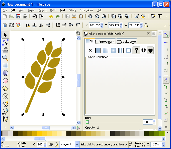
Now we can add awesomeness!
On the “Stroke paint” tab we want to set a solid color stroke. This is the solid blue square icon. For now just keep the black color that it should default to. Then on the “Stroke style” tab let’s go ahead and set the stroke to a value that makes it look nice. In this example the value was 20. You should have a nice big black border around the entire barley. Once you have the border, click on the “Lower Selection to Bottom (end)” command and it will send this copy of the icon behind the other copy, which has no stroke:
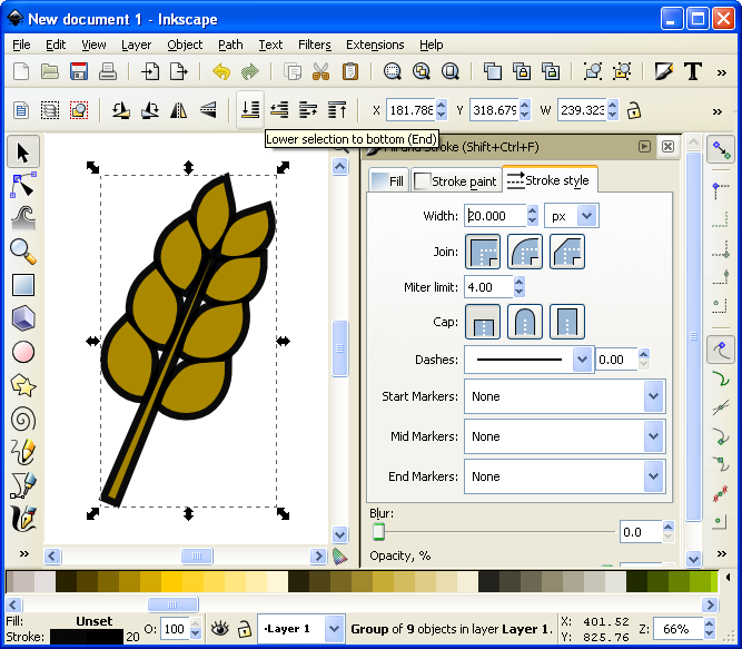
I think it’s really starting to be a nice icon!
Now we’ve got a really nice border. How else might we add awesomeness? We could add gradients to the grains and the stalk!
If you are content with the icon like that, then by all means leave it that way. I think it looks pretty good and icons like that will certainly help with the presentation of your prototype. But if you want to go another level you can add gradients. So let’s see what happens…
First you’ll want to ungroup that top level copy of the barley. We want to add gradients individually to the grains. With it ungrouped go ahead and click on one of the grains. Let’s choose the lower left grain for this example. Then you can click on the “Create and edit gradients” tool on the left toolbar.
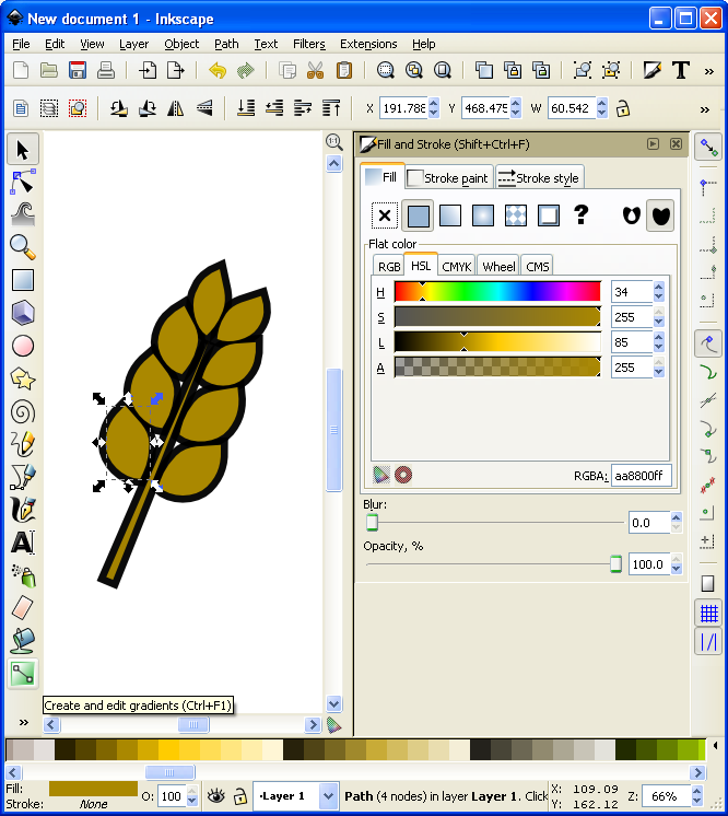
It’s about to get wild!
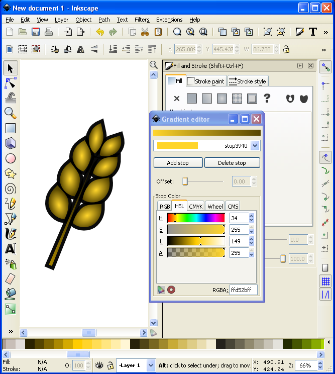
Then click and drag from one side of the selected grain to the other. You will want to play around with the gradient editor to familiarize yourself with the gradient editing options. The easiest are linear gradients. I recommend you start there. Otherwise a radial gradient could look nice. I’ve used one for the grains (each individually) here (Note that you could have applied a radial gradient after editing the first circle and then duplicated that for each grain of barley):
I might actually use this icon!
Alright… we have time for one more layer of awesomeness. What could it be other than a drop shadow??? Thankfully I don’t really have to teach you anything here since Inkscape makes it so easy! With the entire icon (both copies) highlighted go to “Filters > Shadows and Glow > Drop Shadow” and it will open a popup window. If you click on “Live Preview” it will show you what the drop shadow will look like.
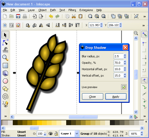
Now that’s what I’m talking about!
And there you have it. A nice and simple icon with three points of awesomeness!
Lesson Complete!
Here is my finished icon of barley, with radial gradients on the grains, a linear gradient on the stalk, a nice “Stroke” border, and a decent drop shadow:
Not too shabby!
That’s all I’ve got for you today. I hope that this article was able to equip you to add some high quality iconography to your game designs to help take them from playable to pitchable and give you confidence in front of the publishers! Please let me know if you have any questions. I would love to help you out. Thanks for reading!
The Game Design Queue

What would you do with an extra hour each day?
Time only offers itself once. So you’d better use it as efficiently as possible. As every designer knows, it’s rare if you are ever working on only one project. I am just the same. I am currently working on four projects, not including Scoville.And I could certainly use a few more hours in the day. So I thought I’d give you a status update for each of the games currently in my “active” queue. My hope is that by writing this I’ll get a better idea of which game(s) on which I should focus my few game design hours per week.
And I’ve decided to set a goal: I want to have a playable and fun game by Christmas.
In the past I have set emotional goals, like “I want to send a game to a publisher by October.” How is that an emotional goal? It’s emotional because it has to do with making me happy versus making a good game. So this new goal is avoidably non-emotional. It’s all about the game. So I am going to attempt to spend the next three months hammering away at the stone to reveal a beautiful sculpture, and hope that it is a decent board game!
Let’s get started with last week’s Design Me game…

Quantum Orcas
I designed it last Friday and by Saturday evening it had already been through four playtests. I’m not sure what your typical Concept to Playtest timeline looks like but this isn’t my typical timeline. There are a few things that the game has going for it to have allowed for four playtests.
- It’s simple to prototype
- It’s simple to teach
- It plays in about 10 minutes
Quantum Orcas (Prototype)
So when I arrived at Protospiel-Milwaukee last Saturday I snagged a few of the free components that The Game Crafter had donated and threw together a copy.
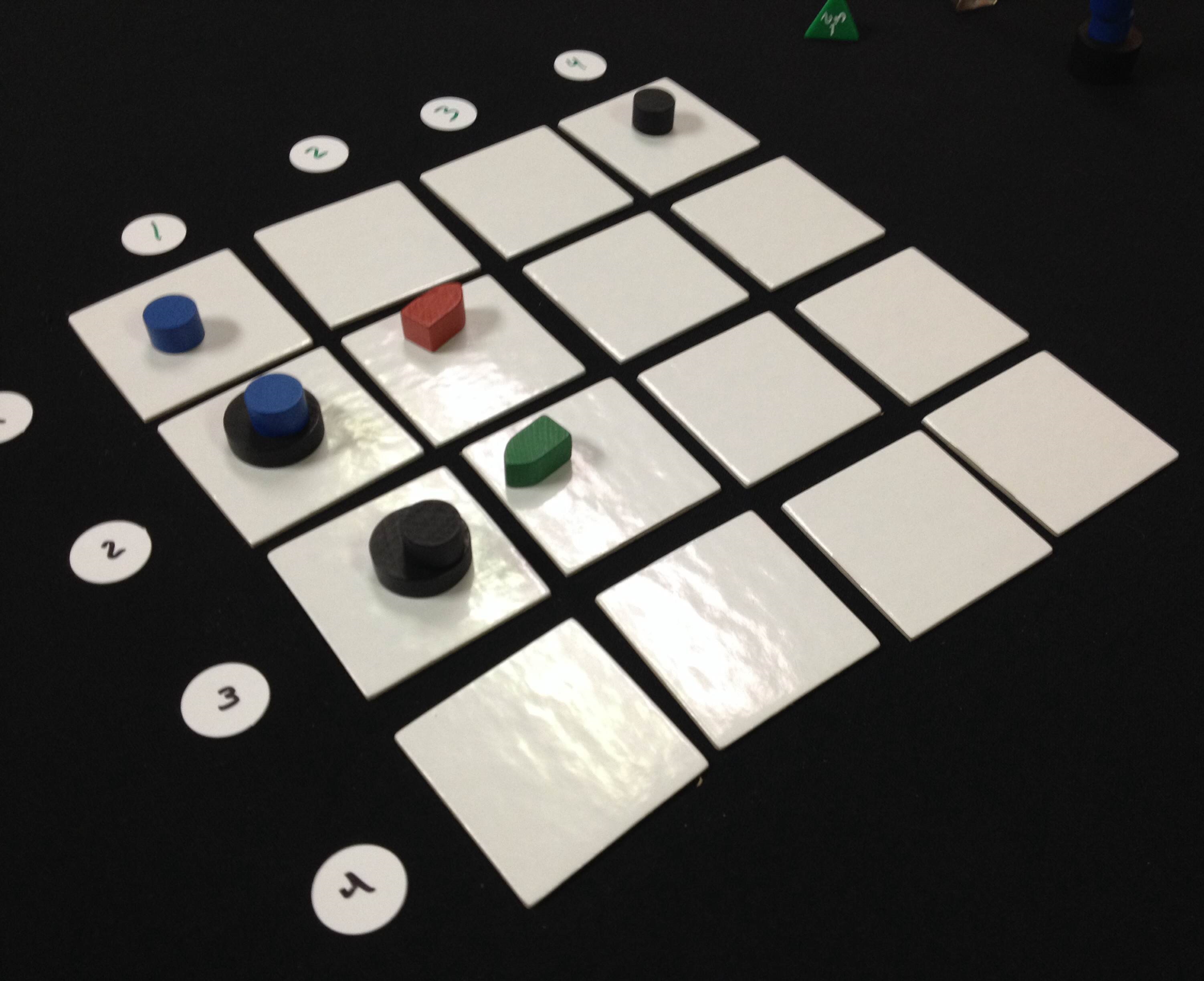
In the game you are a killer whale who can jump across time, which is represented by jumping across the 4×4 grid. The game lasts 8 rounds. Each round two new boats are placed randomly into the grid using two d4s. Then each player chooses one card, which represents a location on the grid, to jump to. If there are boats there, they can eat them. If there are multiple boats, then they’ll have to discard cards to eat them. There are a few other rules, but the player who eats the most boats wins the game.
I think I might be able to design this into a complete game by next week, let alone by Christmas. It could also easily be rethemed. In fact, during Protospiel-Milwaukee I did retheme it based on some components available there. Several people playtested it with the theme of Space Monsters eating asteroids. So maybe I’ll have the game be dual-themed. If you like the killer whale idea you could play on that side of the tiles. If you like the Space Monsters theme you could play on that side.
The bottom line is that this game was fun, plays quickly, and comes in a small box. That’s an awesome combination.
Conclave
![]() I’m not typically an area control/area majority kind of guy. However, Conclave is all about area control. In the game you represent one of the Preferiti, the cardinal’s on the short list to be the next pope. You are also representing a order of Catholicism, which can allow me to do some interesting things with the design.
I’m not typically an area control/area majority kind of guy. However, Conclave is all about area control. In the game you represent one of the Preferiti, the cardinal’s on the short list to be the next pope. You are also representing a order of Catholicism, which can allow me to do some interesting things with the design.
The current state of the game is that it isn’t very fun. While I think there are some interesting mechanics in the game, they just don’t seem to work together to make something that is fun. That’s not good.
But I have some ideas. Since the game revolves around holding the control of different tables, with varying numbers of cardinals sitting at them, then I can add in objectives to the game while keeping it reasonably thematic. The idea would be that the game can be won if a global victory condition is met, otherwise it will be won by a combination of points, which represent how well you manipulated the college of cardinals.
There would be both shared and secret objectives. Once a player completes a shared objective, they place a pawn on it and will earn those points at the end. When a played completes a secret objective it must be revealed. This card will remain in from of them and will be scored at the end.
So I have some good paths forward with Conclave. Now I just have to decide where it actually resides in my priority queue.
Trading Post
![]() Call me Ishmael, for I have discovered a white whale by the name of Trading Post.
Call me Ishmael, for I have discovered a white whale by the name of Trading Post.
Trading Post was my first experience with trying to design a really heavy game. I failed miserably. However, I love the theme and some of the core mechanics so I’d like to do a third complete reboot. Note, however, that the first two reboots were more like retrofitting rather than redesigning.
To redesign the game I want to achieve the following things:
- Make it more historic
- Make it focused on Trading, explicitly about trading furs for European goods.
- Make it fun.
- Make it complex.
So I sat down at the end of August and came up with what I think will be a really great game. The idea of the game is that you are a Trader working for a Trading Post. Your objectives in the game (read: “Ways to score points”) are to go on hunting excursions to collect furs, trade furs for goods, use goods to help build the Trading post. That’s the 10,000 foot view of the game.
There are a few other things going on in the game that I think are unique and interesting. There is a time-dependence for being able to do things in the game. For example, when you send furs to Europe, they have to ride on the boat, which takes time. There is also a concept of chopping wood and floating it down the river towards the Trading Post. So players would have to set themselves up to receive the large amounts of wood when they arrive.
Overall I’m pretty excited to be able to think about this game from a fresh perspective. It’ll be interesting to see how it comes along.
Brooklyn Bridge
This is a very recent game design of mine. As you can imagine, the theme is that of the Brooklyn Bridge. In the game you represent a crew of workers that are helping to build the bridge. It is similar to Stone Age in that you place workers in different areas of the board one location at a time. It is different from Stone Age in that one player cannot remove all their workers and take all their actions at once. Instead, players will remove their workers and take the actions one location at a time.
What that introduces is an interesting dichotomy about placing and removing workers. You might be able to get a good spot in the Materials office, but someone might beat you to building a section of the bridge. You might get lucky and not experience the bends when working in the caisson, or your worker might have to undergo a stage decompression.
This game will be a balance between obtaining goods and earning money. The goal is to contribute the most to the bridge and that will ultimately be the player who earns the most money.
As of today this is still a pretty rough concept. I’ve mocked up some tiles so that I can test a few things. I’m not sure this one (or Trading Post) could really be a full prototype by Christmas, but we shall see.
The Path Forward
So those are the four concepts currently in my active queue. This gives me enough variety and enough challenges to work on while not being overwhelming. But if I try to work on all four then I’m afraid none of them will be ready before Christmas. So I present my first ever poll, for which I am sure to get thousands of votes. Please vote for the game design you would most like to see fully prototyped:
Thanks for reading and voting! I’m hoping to bring you good game design updates over the next three months!
Yarr! Merchants & Marauders be Awesome!

Yesterday was National Talk Like A Pirate Day. So I bet a bunch of you played Pirate themed games last night. I didn’t play any pirate games last night, but I did watch a show about the industrial age and now I have an amazing game design concept which I’ll be keeping quiet about for now. Never-the-less, due to all the Pirate-y goodness I am reviewing a fantastic game called Merchants & Marauders. Let’s get to it!
For those of you who enjoy Pirates and everything involved with that genre and history, then this is the pirate game for you! In the game you take on the role of a captain who is exploring the open seas of the Caribbean. During the game you have the option to be a merchant and pick up goods and deliver them to other ports, or you can be a pirate (marauder) and raid other ships and plunder gold. But the game goes so far beyond just that. There are rumor cards to fulfill (for example: you could get a rumor card that says there is hidden treasure off of Cartagena… if you prove the rumor to be true, then you are rewarded with gold!). There are mission cards to complete for bonuses. There are different types of ships you can own. There is so much to this awesome game! If you feel the desire to plunder some booty, then hop aboard and sail the open seas with me!
Here’s what the game looks like on the table:

Yarr Matey! It be a thing o’ beauty!
So each player is a different captain in control of a ship. On your turn you can choose from several different actions depending on whether you’re in open water or at a port. If you choose to be a merchant then you’ll want to go from port to port picking up and delivering goods for a boatload of booty! If you attack someone, then you are automatically considered a Pirate. This is a more high-risk venture but it can also bring big rewards. But, as they say, “Once a Pirate, Always a Pirate!”
During the game other ships also begin sailing the seas. You have to watch out for these ships. If you are a merchant you’ll have to stay away from Pirate ships, and vice versa. The whole time you are trying to obtain money. The game ends when someone gets to 50 doubloons.
Here’s What I Be Liking:
Artwork: This artwork is absolutely sensational. It is a pleasure for my eyes to look up the game board and player mats. The colors are vibrant. The art style is impressive. And there is nothing to dislike when viewing this game! I am typically influenced by the art on games and this is no different. It’s amazing!
Sailing the Open Seas: This game let’s you sail around as you wish. You are a captain and you have full control of the helm. Nothing guides your strategy in this game and you are free to do as you please. I love having that openness, knowing that I am fully responsible for the actions I take in the game. There are not many games that really immerse you the way this game does!
Many Options: In this game you constantly have many options available to you. You can do numerous things when you are in a port. You can choose to become a pirate by raiding a ship. You can attack your enemy. You can try to complete missions or determine if rumors are true. Overall there are a lot of things you can do! It really feels like you are guiding a vessel around the Caribbean!
Here’s What I Be Disliking:
Downtime: The only complaint I have is that when the other players visit a port it can lead to a lot of downtime where you just don’t do anything. With four players all taking port actions on their turn it can lead to a long time to wait between turns.
Length of the Game: I love Merchants & Marauders. But it takes a long time to play. I group it into the same game length category as Eclipse. It the game didn’t take so long to play it would make the table a lot more often.
Designer Perspective – What I’d Be Changin’:
One thing that seems a little off is that being a Pirate is really hard. I’d like piracy to be a more viable option for players. While the game makes being a pirate have about the right feel, I would rather have the game be a little off theme to make piracy more fun. So I would either make the pirate ships more evasive so that they can plunder and run or present more options for pirates to obtain booty. This isn’t that big of a change and could make it more fun to be a pirate.
The other thing I would change is to add scenarios to the game. I know that the rumor cards give players to work toward, but I would prefer some cooperative scenarios for the game. Imagine all players playing as Pirates and trying to plunder a fleet of merchant ships that are controlled by the game. That would be a lot of fun!
Beer Pairing:

I wish I were out on the open seas soaking up the sun and sucking down a Red Stripe!
While a big jug of rum would be the ideal beverage pairing for this game, I will pick a beer anyway. And I can’t think of a more fitting beer for sailing around the Caribbean than Jamaica’s finest, Red Stripe.
I have to wonder if they didn’t choose the bottle shape so that it felt more like a jug of rum. It’s not a typical shape for beer bottles. But I suppose that’s fitting since Merchants & Marauders isn’t a typical pirate game. It’s better! I haven’t played it in a while, but now after posting this I really want to get it to the table again!
Overall Rating:
I love this game. I love imagining myself sailing the Caribbean with a crew on board who are ready to deliver goods or plunder another ship or suck down some rum. The theme and artwork are so capturing that they really bring me in. Plus, there’s the really cool cardboard treasure chest where you can stash your doubloons. I want to play again and I am rating this game a 9 out of 10 on the Board Game Geek scale:

Excellent game. Always want to play it.
