Blog Archives
Prototype Art: Icons in Inkscape
Inkscape logo of squidy awesomeness!
One of the things that can take your game design from playable to pitchable is iconography. Icons can really help put a nice polish on a game. There are a few benefits that icons can provide for your game design:
- Ease of viewing/understanding
- Beautification
- Language Independence
Those are a few and I’m sure there are more. So today I wanted to present a tutorial similar to my “Cubes in Inkscape” tutorial to help game designers with the creation of icons for their games.
This article will be focused on the software called Inkscape. It is a free Scalable Vector Graphics (SVG) software. Don’t worry too much about what that means, just know that it’s awesome. If you don’t have the software I recommend downloading it and using it for your game design art. Note: if you have Photoshop/Illustrator then I would recommend staying with that and skipping the rest of the article.
Also, if you love icons but just can’t figure out how to make your own, then head over to Game-Icons.net where they have over 1,000 free icons for your use. So let’s get started.
Let’s Get Iconizing!
So “Iconizing” isn’t really a word. But that’s beside the point. The objective for today is to teach you how to make icons that you can use with confidence in your board game designs. We are going to be making a barley icon. But you’ll hopefully be able to use what you learn here today to make any icons you might need for your game design.
Once you’ve downloaded and opened Inkscape you’ll see a plain canvas outlined in front of you. I like to leave it turned on, but you can turn off the “edges” if you visit the document properties under “File.” Here’s what it should look like:

We will be working with the “Create Circles, Ellipses, and Arcs” command for this article.
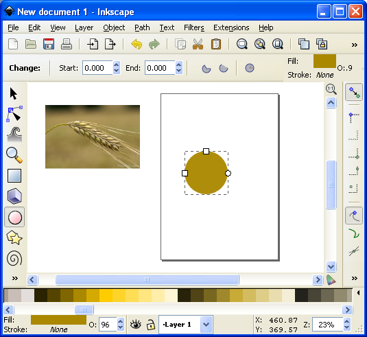
You’ll often want a web browser open as well. It is often beneficial to do a web search for the item you are looking to iconize. So here’s a snapshot of a web search page for barley:

Using a web search can give you ideas of how to iconize the item.

Barley, you’re about to be iconized!
After I’ve done a web search I like to copy and paste a picture or two into Inkscape as a starting point. In this case I’ll be using the photo on the right as my guide for creating a barley icon. So copy that picture into Inkscape if you want to follow along.
One thing to remember when creating icons is that we want them to be very clear and understandable. Sometimes icons represent things, like resources. Other times they represent actions, like “move an extra space.” We before we create the icon we need to know what we are going for. In the barley example we will simply use the icon to represent a barley resource.
So now that the picture is in Inkscape we can start our tutorial. I like to use a picture so that I can create the correct shape of something in Inkscape by overlaying that shape on the right part of the picture and making the edges line up. I won’t show that today since this image will be for reference only, but it is a useful thing to do. I may write about that in the future.
The icon of a barley begins with one circle…
Go ahead and click on the “Circles, Ellipses, and Arcs” command and click and drag a circle on the page anywhere you like. If you want to change the color, scroll along the color bar at the bottom. If you want to make sure it is a true circle, hold CTRL when dragging. If you hold CTRL and drag at a different angle then it will jump to an ellipse rather than a circle. Once you’ve dragged out the circle and chosen a color you might have something like this:
This circle will be one grain of barley.
The next thing we want to do is turn our circle into a Path. There are two ways to do this. The first is to go to the PATH toolbar at the top and click “Object to Path.” The second way to do this is to select the item and press SHIFT + CRTL + C.
 Then we want to use this command from the left toolbar. It is the “Edit Paths by Node” tool and is pretty awesome for what we want to accomplish today. Click on it and then click on our circle. Then your circle should look like this (note that I have zoomed in on the circle):

The dots around the circle are the nodes that we will edit.
What we do next is edit our circle by moving the nodes around. Across the top we have different options for editing the nodes. The tools that I utilize most often are these:
- Insert new nodes into selected segment
- Make selected nodes corner
- Make selected nodes smooth
I recommend playing around with each of those commands so that you become familiar with how node editing works.
So let’s take our circle and turn it into a barley grain. First click on the upper node. Then click on “Make selected nodes corner.” Then you can grab the little circles on the lines extending from the node and move them to wherever you like. Here’s what you might end up with:

By editing the nodes we can make the circle look like a barley grain.
Now go ahead and manipulate the other nodes. I “Cornered” the bottom node and angled up the right side. I moved the bottom node to the right. I moved the top node up and to the left. And I brought in both side nodes. Here’s my result thus far:

Okay. That’s pretty passable for a barley grain. Now we want to make more of them. But instead of following that whole process over and over we are simply going to duplicate this grain. You can duplicate the grain in two ways. The easiest is to simply push CTRL + D. That will make a new copy over the top of the previous version. Then if you click the arrow tool at the top of the left toolbar you can move the new barley grain. Do this about 5 times, line them up, and then you might have something like this (I’ve zoomed out a little):

We are getting there! Who’s excited??
Okay. It is starting to look alright. Let’s go ahead and duplicate the entire thing and mirror it using the “Flip selected objects horizontally” tool. Then you can rotate the whole selection with the arrow tool. You have to click on the selection so that the arrows on the corner of the selection turn into curved arrows. Then click and hold one of the curved arrows and drag to the angle you want. Note that when dragging, if you hold CTRL it will rotate at discrete angles. This can be really useful. After all of that we should have something like this:

Feel free to enjoy a nice brew while we are iconizing barley!
Now we’ve got most of the hard work done. You may desire to shrink a few of the barley grains near the top end. If you do, you can simply click on one with the arrow tool, then click and drag one of the corner arrows around the object you are shrinking. Note that when you drag the corner arrows, if you hold CTRL it will maintain the aspect ratio of the object. If you hold CTRL + SHIFT it will maintain the aspect ratio and resize it while also maintaining its position in reference to its reference point (shown by the plus sign, which can be moved). For the sake of the tutorial today we are not going to shrink any of the barley grains.
So far so good. But now we need the stalk. So we are going to use the “Draw Freehand Lines” tool from the left. With the tool chosen you should then set the tool to “Triangle In” at the top toolbar where it says “SHAPE.” Then starting at the bottom of the stalk click once. Then move the cursor to where you want the stalk to end and double click. A triangle line should be made that looks something like this:

We’re almost done!
You can change the color again by using the color bar along the bottom. And you can manipulate the shape by editing the nodes.
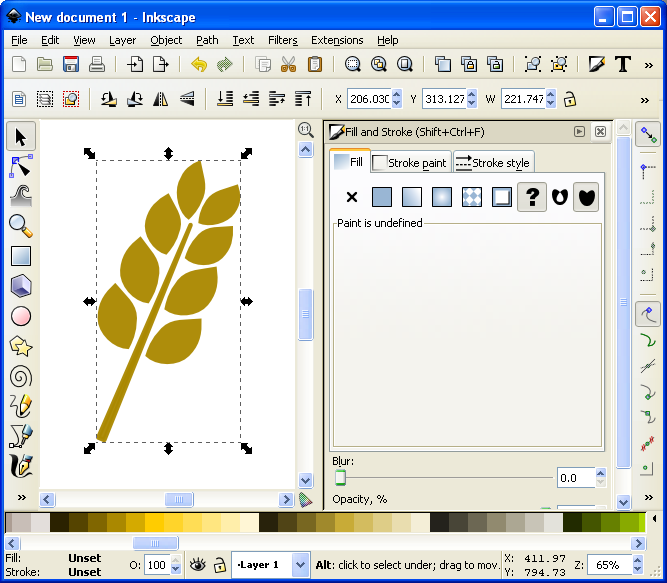
Alright. So I jumped ahead a little bit and did some of the things I’ve already mentioned. I changed the color of the stalk. I make it thicker by adding a “Stroke” to it (See below about adding a “Stroke”). I didn’t like how tall it was so I deleted two of the grains from each side at the top. I shrank two from each side and rotated them slightly. By simplifying all of this I was able to create a better icon for the barley:

It looks more “Icon-y this way.
So there you go. You’ve got yourself the tools to edit nodes, manipulate shapes, and make cool icons. Those are the basics and they can get you off the ground running. But if you want to add some awesomeness, then keep reading!
Adding the Awesomeness!
If you aren’t quite content with your icons there are a few things you can do to spruce them up. The first is to add a border around them. Remember above when I mentioned about adding a “Stroke”? Let’s start with that and see what kind of border we can come up with.
First, with the arrow tool selected, click and drag a box around all the components in the icon. They click on the “Group” tool to group them into one picture. Then go ahead and duplicate that new group. You will have two copies of the same icon. We will add a stroke to one and then place it behind the other. With one of the copies chosen, click on “Object > Fill and Stroke.” This will open a sidebar like this:
Now we can add awesomeness!
On the “Stroke paint” tab we want to set a solid color stroke. This is the solid blue square icon. For now just keep the black color that it should default to. Then on the “Stroke style” tab let’s go ahead and set the stroke to a value that makes it look nice. In this example the value was 20. You should have a nice big black border around the entire barley. Once you have the border, click on the “Lower Selection to Bottom (end)” command and it will send this copy of the icon behind the other copy, which has no stroke:
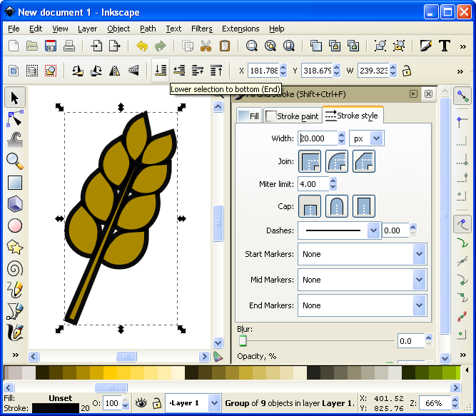
I think it’s really starting to be a nice icon!
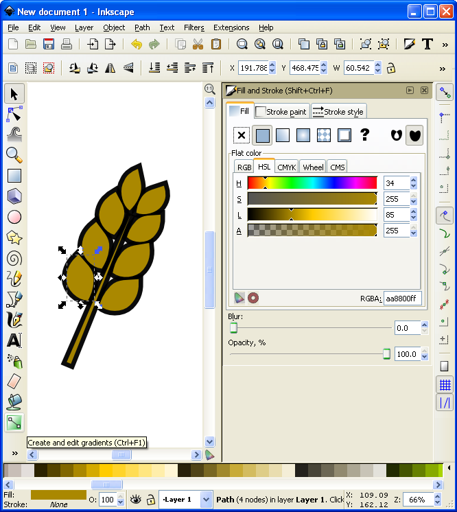
Now we’ve got a really nice border. How else might we add awesomeness? We could add gradients to the grains and the stalk!
If you are content with the icon like that, then by all means leave it that way. I think it looks pretty good and icons like that will certainly help with the presentation of your prototype. But if you want to go another level you can add gradients. So let’s see what happens…
First you’ll want to ungroup that top level copy of the barley. We want to add gradients individually to the grains. With it ungrouped go ahead and click on one of the grains. Let’s choose the lower left grain for this example. Then you can click on the “Create and edit gradients” tool on the left toolbar.
It’s about to get wild!
Then click and drag from one side of the selected grain to the other. You will want to play around with the gradient editor to familiarize yourself with the gradient editing options. The easiest are linear gradients. I recommend you start there. Otherwise a radial gradient could look nice. I’ve used one for the grains (each individually) here (Note that you could have applied a radial gradient after editing the first circle and then duplicated that for each grain of barley):
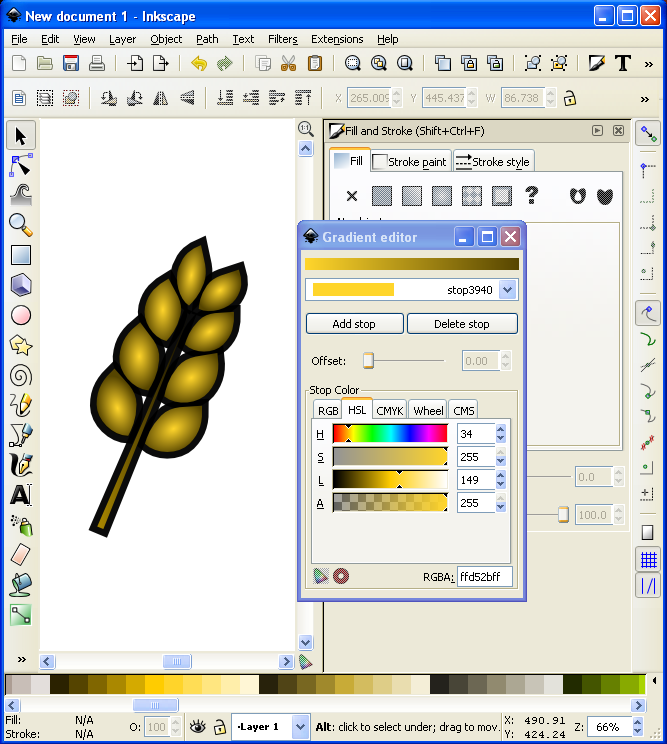
I might actually use this icon!
Alright… we have time for one more layer of awesomeness. What could it be other than a drop shadow??? Thankfully I don’t really have to teach you anything here since Inkscape makes it so easy! With the entire icon (both copies) highlighted go to “Filters > Shadows and Glow > Drop Shadow” and it will open a popup window. If you click on “Live Preview” it will show you what the drop shadow will look like.
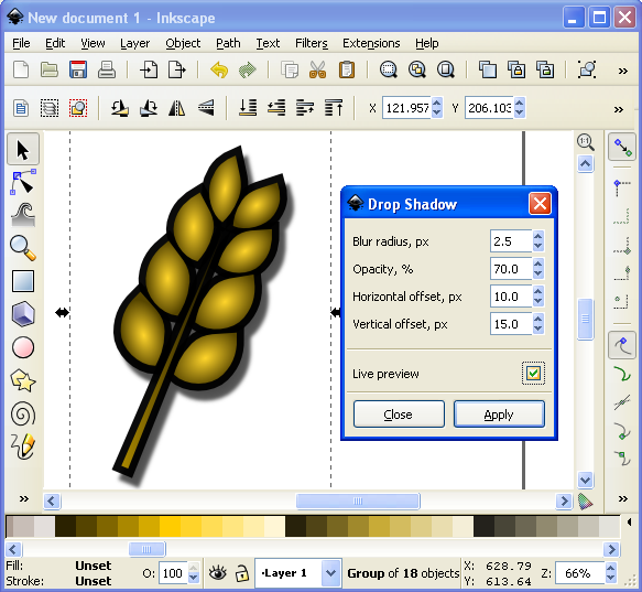
Now that’s what I’m talking about!
And there you have it. A nice and simple icon with three points of awesomeness!
Lesson Complete!
Here is my finished icon of barley, with radial gradients on the grains, a linear gradient on the stalk, a nice “Stroke” border, and a decent drop shadow:
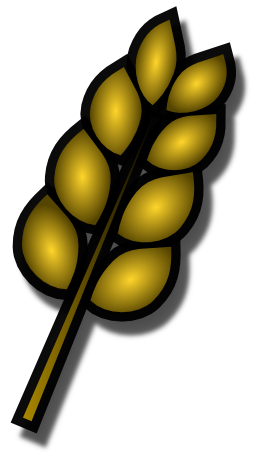
Not too shabby!
That’s all I’ve got for you today. I hope that this article was able to equip you to add some high quality iconography to your game designs to help take them from playable to pitchable and give you confidence in front of the publishers! Please let me know if you have any questions. I would love to help you out. Thanks for reading!
