Blog Archives
Interview with Bellwether Games
![]() Today is Friday so I should be posting a board game review, but instead I will provide something even more awesome.
Today is Friday so I should be posting a board game review, but instead I will provide something even more awesome.
About a month ago Bellwether Games (@BellwetherGames) tweeted that they were looking for aspiring game designers who wanted to be interviewed. Since I am an aspiring game designer I figured I should see if I would be the right person for the interview. They took a look at my website (this website) and replied that I was in fact the right kind of person for the interview.
I might have done a little dance with my hands in the air at that point. Don’t worry, no other humans eyes were injured by watching me dance. I was alone.
So they sent me an email with a few starter questions and I got right to filling them out. After a few back and forths with follow up questions they told me that the interview would be posted at the end of the month. Well, today is the end of the month and right on time the interview has been posted!
Ed Marriott Designer Interview with Bellwether Games.
Let me know what you think!
Scoville Print and Play Version 2

Version 2 awesomeness now available!
I am pleased to announce that Version 2 of the Scoville Print and Play files are available for download at BoardGameGeek.com. Here is the link:
There are no major rules revisions to the game. The only clarification to the rules is that when selling peppers you must sell peppers from your own supply. Peppers in the fields are not for sale.
There are a few changes to the Print & Play files. The most notable change is that Gold has been dropped in favor of Silver. I’d like to thank Adam “A-Game” Buckingham for the suggestion. This was done for two reasons:
- Black + White blends to gray, not gold. So from a color perspective this is much less confusing.
- There is a much lower chance of confusing yellow with silver. These two colors are now more distinct.
The PnP files also have a few other revisions. These include:
- Artwork for the Bonus Point Tiles for secondary peppers (green/orange/purple) has been adjusted to decrease confusion.
- The Field has been slightly increased in size to better fit with the pepper tiles.
- The pepper tile artwork has been changed to help with color blindness and for clarity.
Here’s a peek at the revised pepper tiles:
 By adding the pepper image to each tile it will help with color blindness. Each pepper is a different shape. And by changing the artwork to include the green border it should help to clarify where the player pawns will actually be walking. I showed this image to my wife and she said she thinks the game would be better with these rather than the cubes. This was actually a suggestion of Brett Myers (@brettspiel) during Protospiel-Milwaukee, so I must give credit where credit is due!
As usual, if you have any questions about the PnP files or the rules, or the game in general, please feel free to leave a comment here on Boards & Barley or on the BGG download page. Or feel free to email me. And I’d love to hear what you think about the game!
Two Types of Game Nights
My friend Jeremy and I have been hosting board game nights for quite a while now and I’ve come to a realization lately that there are two different types of game night. There is the type of board game night where you get a bunch of people together and struggle to decide what to play based on number of players, difficulty to learn, setup time, etc. Let’s call this the “Big” game night. Then there is the type of board game night with only a few people where you choose to play the heavier, deeper, more intense games that typically can’t make a showing at the first type of board game night. Let’s call this the “Level 1” game night.
Today I’m going to examine the ups and downs of each type! Note: I’ll write about Board Game Days in a separate article.
Big Game Nights
Big, as in a large number of gamers. Not the size of the game!
I love big game night. But that’s partially because I love any game night! It’s great to get a bunch of guys (note: I’m not sexist… my group is just all guys) together for some board game awesomeness. But it’s not all rainbows and unicorns. There are some downsides to the Big game night, at least compared with the Level 1 game night. Let’s look at the good things first:
- You’re playing games, perhaps enjoying a nice brew, and escaping all the other junk of life.
- You might even be enjoying some nice refreshments.
- With more gamers you often have more games to choose from.
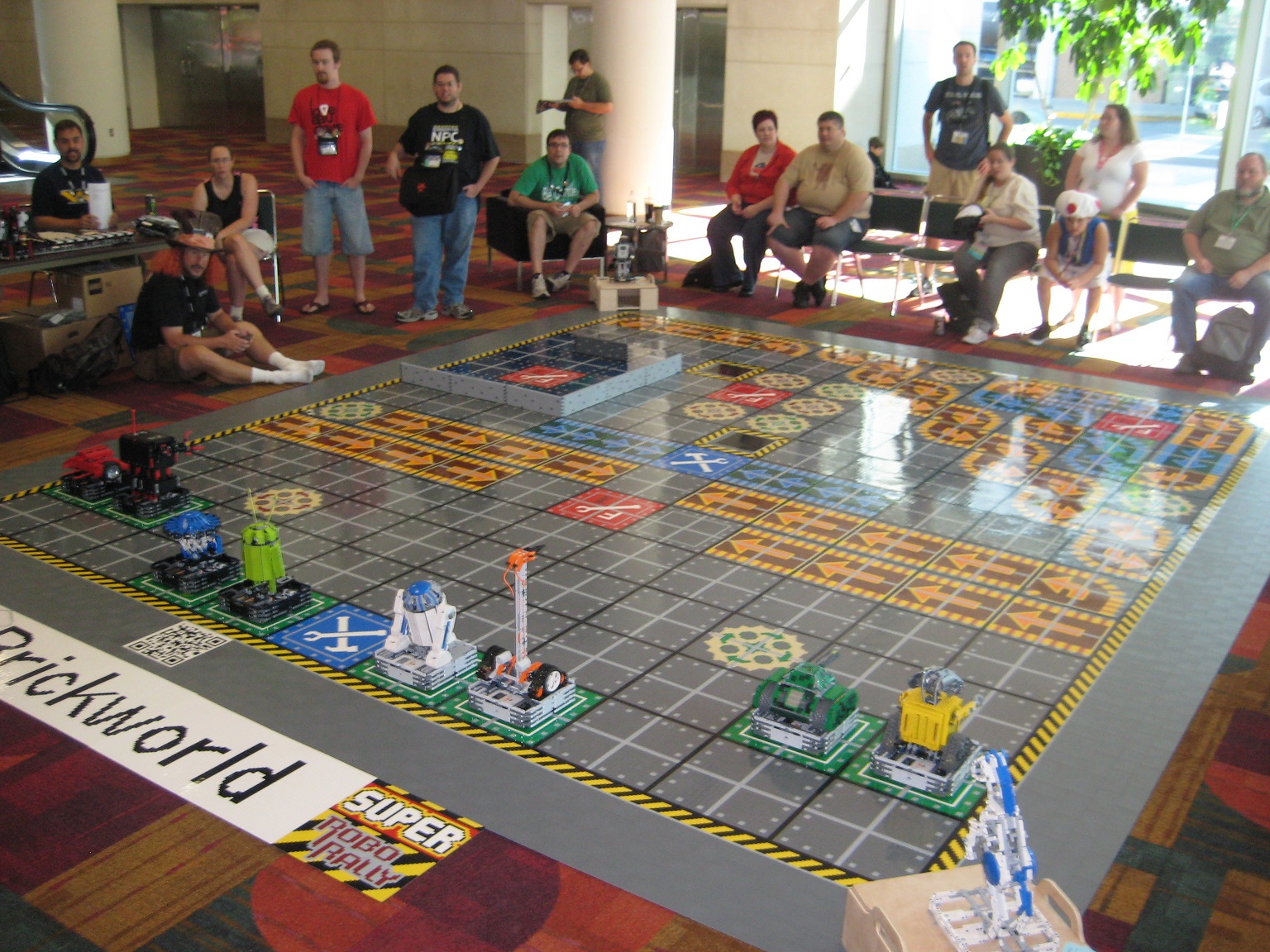
- Robo Rally. Chaos embodied in a board game can be quite entertaining!
There you go… the upside to the Big game night. What downside could there possibly be?
- You might wreck your budget trying to buy games for 8 or 10 players.
- Nuns on the Run, a hide-and-seek nun game, just doesn’t have the right theme!
- Players might get sick of finishing the night with a lap of Bisikle every time (gasp!).
- Indecision enters the gaming arena. Players struggle to agree on what to play.
- It’s often more difficult to break out new games. It always feels like you’re teaching new people old stuff.
- It’s often more difficult to break out heavy games. Big game night is more open to the casual player.

An 8-player recommendation!
When our group was getting to 8 regular attenders I really did a search for 8+ player games. At one point I was ready to pull the trigger on Nuns on the Run. I ultimately went with Robo Rally, which ended up being a great choice. I also looked into Formula D, but never bought it. One of the issues with a larger board game night is that it is hard for everyone to play a game together. One 8-player game that I’ve found to be a lot of fun is VivaJava: The Coffee Game by designer TC Petty III and published by DiceHateMe Games.
The problem is that most games are not 8 player games. That means what was a big group of people is now split in two or three. That’s often less fun. You’ve got cross-table banter. People feel left out of the other table’s conversation, and a disconnect forms. Don’t get me wrong, it’s still a lot of fun… just not as fun as the “Level 1” game night!
Level 1 Game Nights
Several of us in our group use the phrase “Level 1” to refer to each other as awesome, tight, “I got your back” type of friends. On occasion we have an impromptu “Level 1” game night where it’s just a small group of us getting together. I wanted to refer to these game nights as “Intimate” but that just didn’t feel appropriate with all the finger-bending. These nights include the kind of friends you never hesitate to play any game with. These game nights also have an upside and a downside. This time let’s start with the downside:
- Less beer options to choose from.
- Fewer refreshments.

3 hour games are acceptable at Level 1 Game Nights!
While those two can be tough to swallow, the Level 1 game night can make up for that in the quality of the games that hit the table. Here’s the upside:
- Heavier games make the table. Enter Uwe Rosenberg and Stefan Feld!
- New games can be played since there is usually a high willingness to learn together.
- Playtesting of prototypes happens more freely.
- You’ve learned what to expect from the other players.
- Inside jokes, Jerks!
- You never have to split into multiple games.
There’s a lot to enjoy with a Level 1 game night! But the bottom line here is that any game night can be fun. Go into them with the right expectations and you’ll have a good time. And remember, playing to win and playing to have fun are not necessarily the same. So get to your local game night and have a great time!
Prototype Art: Cubes in Inkscape
Inkscape Logo of Squidy Awesomeness
There are a lot of you out there who are working on board game prototypes. Often those prototypes will utilize the ever popular cube. And that usually results in the cube being placed onto graphics such as cards or tiles or the board itself and then later on, in the rulebook. So today I wanted to give you a quick tutorial to show you how I make a cube for board game graphics using Inkscape.
You can create your own set of awesome looking Scalable Vector Graphics versions of cubes using the free Inkscape software. If you don’t have the software, you can download it from their website: inkscape.org.
Let’s Get Cubing!
Once you’ve downloaded and opened Inkscape you’ll see a plain canvas outlined in front of you. I like to leave it turned on, but you can turn off the “edges” if you visit the document properties under “File.”
What we are going to do first is click on the “Create 3D Boxes” icon on the left. Here is a picture showing what this should look like:
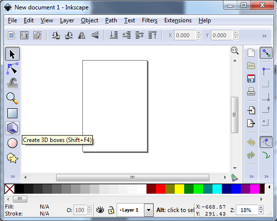
There… on the left… the icon that game designers love!
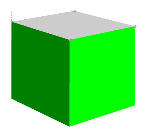
Click on the icon. Then click and drag within the framed region to create a generic box. It should look something like this:
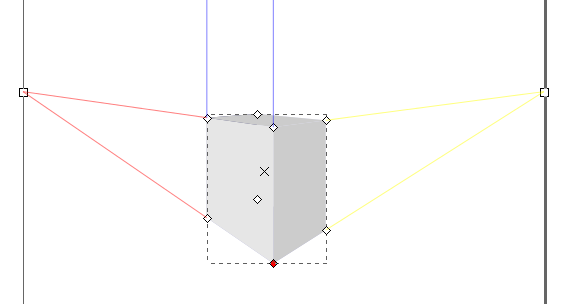
Great! You’re doing it!
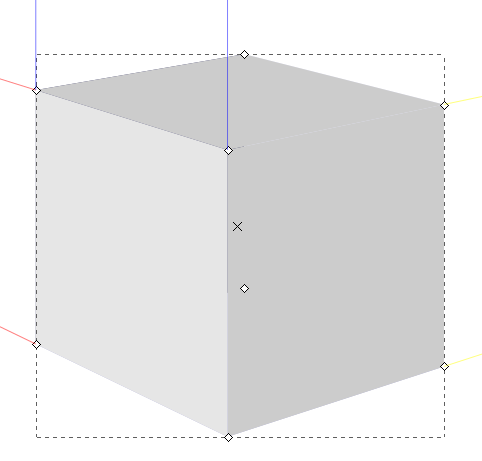
You can see we’ve created a generic gray box. Now it’s time to make it look like a cube of awesomeness that you would be proud to include in your board game graphics!
So the next thing you should do is “shape” the box to look like a cube. This can be done by clicking and dragging the little diamonds on the corners of the generic box. Go ahead and try it out. Once you’ve dragged then to the positions of your liking then you might end up with something like this:
Our cube of awesomeness is started to be awesome!
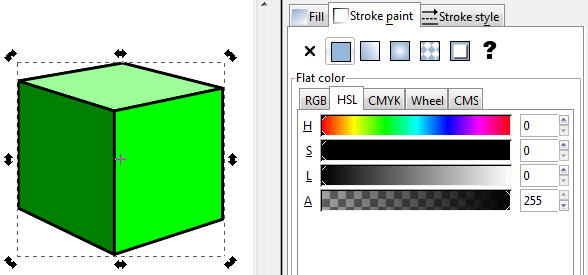
Assuming you’re pleased with the shape of you cube it’s then time to make it look good. Normally you can just click on an object using the “Select and Transform” icon (it’s the black arrow on the left). Once you’ve selected the “Select and Transform” icon, click on the cube. Then you can change the color by selecting any color from the color row at the bottom of Inkscape. But that’s not the way I do it. Why? Because you end up with a flat monotone cube of ugliness rather than a sweet cube of awesomeness. Here’s what it might look like:
Our awesome turned ugly. Let’s fix that!
Don’t be afraid! We can transform that cube from ugly to awesome in just a few easy steps! First, we’ll want to use the “Edit paths by node” tool, which is right below the “Select and Transform” icon. This one looks like a quarter of a circle, with three nodes, and a black arrow. By clicking on this icon you can then go and choose a specific face of the cube. Once you’ve selected a face of the cube you can then change its color without changing the other faces. In this next picture I have changed two of the faces and have selected the top face:
Looks like we’re back on track!
So I had selected the right face and made it a light green. Then I selected the left face and made it a dark green. Now with the top face selected I can choose its color, in this case an even lighter green. Now you should have something like this:
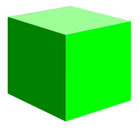
Not too shabby!
Alright!
Just a side note, if you have trouble selected the individual faces, make sure you’ve chosen the “Edit Paths by Node” tool rather than the “Select and Transform” tool.
So we’ve got a green cube with differently colored faces. What’s next? I found that sometimes the hidden faces will show through along the edges. So we can change their colors too. This is a little tricky though, so follow closely.
Go ahead and click on the left face. Then what you want to do is press the “left” arrow on your keyboard to move the face over. Don’t use your mouse to drag it since it will be almost impossible to easily put it back in the right spot. It should look something like this:
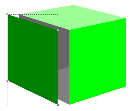
The hidden “ugly” faces show themselves!
With two of the three ugly faces exposed you can click on each one and change them to a color that matches your cube color. In this case I just choose a dark green for these two hidden faces. Then slide the moved left face back into place using your “right” arrow key. You can then move the right face or the top face to expose the third hidden side and change its color.
Now you’ve got your beautiful cube. You can call it quits right there if you want a nice simple cube. Just select the cube, click “File > Export Bitmap” and you can save it as a nice little .png file. And I also recommend saving the .svg file so that you don’t have to recreate the cube every time. But if you want to spruce it up a bit then keep reading!
Adding Awesomeness!
Sometimes cubes can look better with a border. There’s a very easy way to create one. With the cube selected click on “Filters > ABCs > Black Outline” to get something like this:

Oh boy! Things are looking good!
Pretty dec, right! (Note: dec is short for “decent,” all the cool kids know that!) Just be careful because the smaller your cube the larger the border will appear relative to the cube.
If you don’t want a black outline there are other options, but it’s slightly more complicated. With the cube selected you’ll want to click on “Object > Fill and Stroke.” That will open a panel on the right. “Fill” will color the main area of the object. “Stroke” will add a border to the object. We want to use Stroke. Taking our border-less cube and applying a simple black stroke will result in a cube like this (Note, on the Stroke Style tab you will want to choose the “Round Join” option):
Not quite as awesome as I’d hoped!
I am not a fan of the lines along each edge. It just doesn’t look that clean to me. So here’s my trick: duplicate the cube and apply a stroke to the copy in the back. To duplicate the cube make sure it is selected and then right click. On the pop up menu click “Duplicate.” This will create a duplicate directly on top of the original. Adding a stroke to the copy in back will show allow only the outside edges of the stroked cube to show past the unstroked cube. Then you can create cubes that look like this:
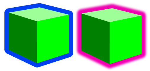
Awesomeness complete, even though these two examples look pretty ugly!
On the left is a duplicate cube with a blue stroke applied to the back copy. On the right is a duplicate cube with a blurred pink stroke applied to the back cube. One final note is that if you choose the duplicate cube option you will want to group the two together so that when moving them around you won’t have to constantly be lining them up.
Lesson Complete!
Now you know how to use Inkscape to create nice looking cubes for your board game graphics! If you are a starving artist and you have little computer skills then I have a special bonus for you. I am supplying a .svg file for all of you with a slew of cubes that you can use freely without crediting me, without paying me, and without worrying about getting sued. Feel free to use this file and the cubes wherever you want, however you want, and in whatever way you want so long as you use them for the greater good! Here is an image of the .svg file:
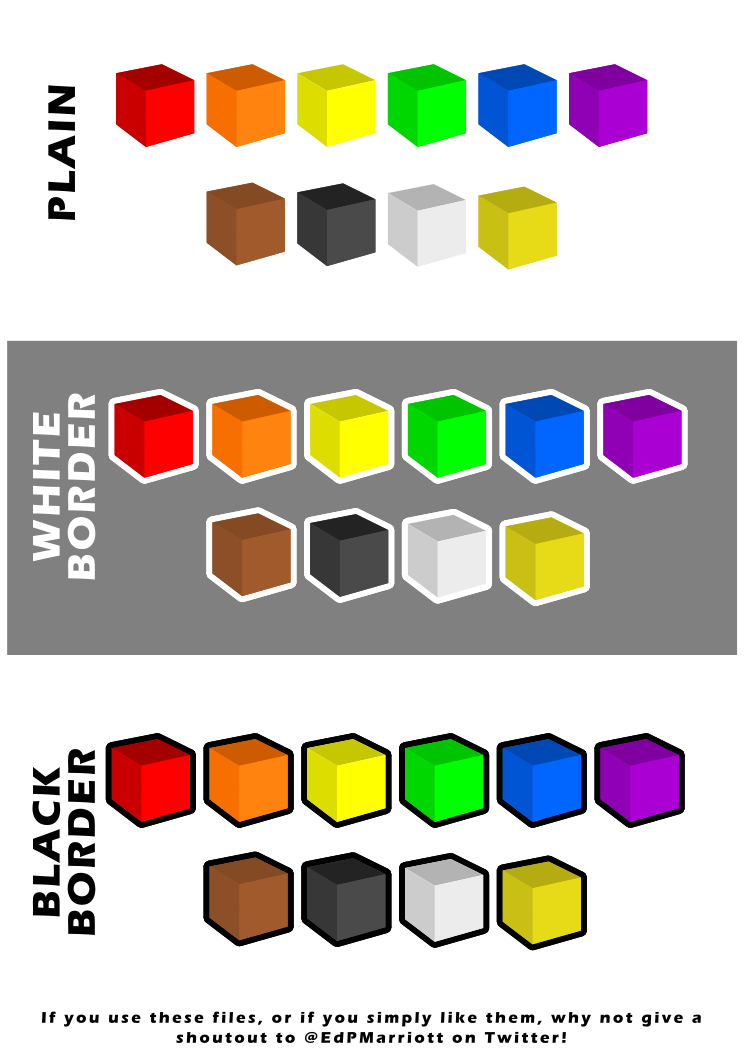
Go on… use this artwork freely! Make your prototypes look awesome!
To download it just click here: Google Drive > FreeUseCubesbyEdPMarriott.svg
Note, if you have trouble downloading the file from Google Drive you might want to allow third party cookies. You can read more here: http://productforums.google.com/forum/#!topic/docs/_pXrQmwkrGU . If you have further problems, please let me know!
And let me know how they work for you. Now get Cubing!
Brewery Spotlight: Karben4
Try the Silk Scorpion or the Undercover for some barley awesomeness!
If you live in the Madison, WI area and you like beer and food you should probably go check out the newest brewery in town: Karben4!
Located where the Ale Asylum used to be, on Kinsman Boulevard near the airport, they have six brews available to compliment their delicious menu items.
They don’t have a full website up yet, but you can visit the domain and learn the hours: karben4.com. Or you can learn a lot more on their Facebook page: facebook.com/Karben4. Or you can follow them on Twitter: @Karben4. And they’ve been in the local online news outfits as well. Here’s a sampling:
- Beer Baron takes over former Ale Asylum (77Square)
- New Brew at Karben4 (Madison Magazine)
- Beer Here: Silk Scorpion Black IPA from Karben4 Brewing (Isthmus Daily Page)
When I visited I tried the Undercover Session Ale and the Lady Luck Irish Red. I thought both were very enjoyable. But my favorite was the Nightcall, which is a smoked Porter. I had only previously had one smoked beer and that was a very smoky brew. The Nightcall, however, had a much more enjoyable level of smoke flavor, which was present but not overwhelming. So I sampled and enjoyed three of their six beers!
But perhaps the highlight of our evening at Karben4 was the summer sausage sandwich. I would try to explain the amount of awesomeness this sandwich brings to the table but I’ll share a picture from Karben4’s Facebook page instead. Don’t drool too much! (Disclaimer: I did not personally eat any of the sandwich, but I have a really good sense of smell and this smelled of awesomeness. My friends both thoroughly enjoyed it!)
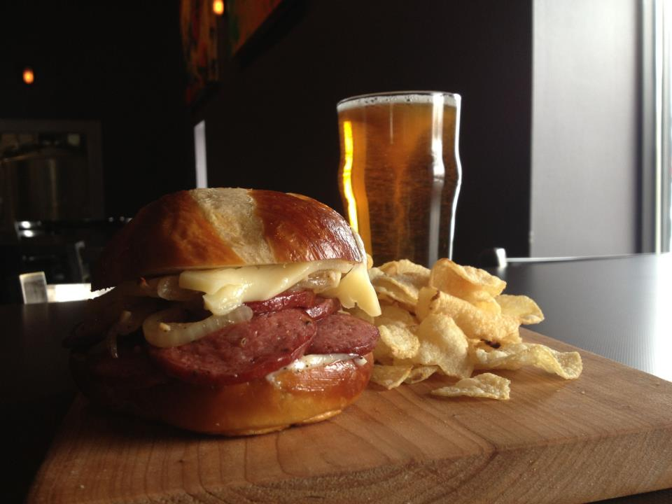
Even if you don’t like beer, you should visit for this sandwich! (So says my level 1 friends)
So when you’re looking for something to do head over to Karben4, grab some grub and a brew, and have a great time! And don’t forget to take home a growler full of brewing delight!
